Beyond
Mapping III
|
Map
Analysis book with companion CD-ROM
for hands-on exercises and further reading |
SpatialSTEM Has Deep Mathematical Roots — provides
a conceptual framework for a map-ematical treatment
of mapped data
Map-ematically Messing with Mapped Data — discusses
the nature of grid-based mapped data and Spatial Analysis operations
Paint by Numbers Outside the Traditional Statistics Box — discusses
the nature of Spatial Statistics operations
Simultaneously Trivializing and
Complicating GIS — describes
a mathematical structure for spatial analysis operations
Infusing Spatial Character into Statistics — describes
a statistical structure for spatial statistics operations
Depending on Where is What
— develops an organizational
structure for spatial statistics
Spatially
Evaluating the T-test — illustrates
the expansion of traditional math/stat procedures to operate on map variables
to spatially solve traditional non-spatial equations
Organizing Geographic Space for
Effective Analysis — an
overview of data organization for grid-based map analysis
To Boldly Go Where No Map Has Gone Before — identifies
Lat/Lon as a Universal Spatial Key for joining database tables
The Spatial Key to Seeing the Big Picture — describes
a five step process for generating grid map layers from spatially tagged data
Laying the Foundation for SpatialSTEM: Spatial
Mathematics, Map Algebra and Map Analysis — discusses the
conceptual foundation and intellectual shifts needed for SpatialSTEM
Recasting Map Analysis Operations for General
Consumption — reorganizes
ArcGIS’s Spatial Analyst tools into the SpatialSTEM framework that extends
traditional math/stat procedures
Note: The processing and figures discussed in this topic were derived using MapCalcTM
software. See www.innovativegis.com to download a
free MapCalc Learner version with tutorial materials for classroom and
self-learning map analysis concepts and procedures.
<Click here>
right-click to download a printer-friendly version of this topic (.pdf).
(Back to the Table of Contents)
______________________________
SpatialSTEM Has Deep
Mathematical Roots
(GeoWorld, January 2012)
Recently my interest has been captured by a new arena and expression
for the contention that “maps are data”—spatialSTEM (or sSTEM for
short)—as a means for redirecting education in general, and GIS education in
particular. I suspect you have heard of
STEM (Science, Technology, Engineering and Mathematics) and the educational
crisis that puts U.S. students well behind many other nations in these
quantitatively-based disciplines.
While Googling around the globe makes for
great homework in cultural geography, it doesn’t advance quantitative
proficiency, nor does it stimulate the spatial reasoning skills needed for
problem solving. Lots of folks from
Freed Zakaria to Bill Gates to President Obama are
looking for ways that we can recapture our leadership in the quantitative
fields. That’s the premise of spatialSTEM–
that “maps are numbers first, pictures later” and we do mathematical things to
mapped data for insight and better understanding of spatial patterns and
relationships within decision-making contexts.
This contention suggests that there is a map-ematics
that can be employed to solve problems that go beyond mapping, geo-query,
visualization and GPS navigation. This
column’s discussion about the quantitative nature of maps is the first part of
a three-part series that sets the stage to fully develop this thesis— that
grid-based Spatial Analysis Operations are extensions of
traditional mathematics (Part 2 investigating map math, algebra, calculus,
plane and solid geometry, etc.) and that grid-based Spatial
Statistics Operations are extensions of traditional statistics
(Part 3 looking at map descriptive statistics, normalization, comparison,
classification, surface modeling, predictive statistics, etc.).
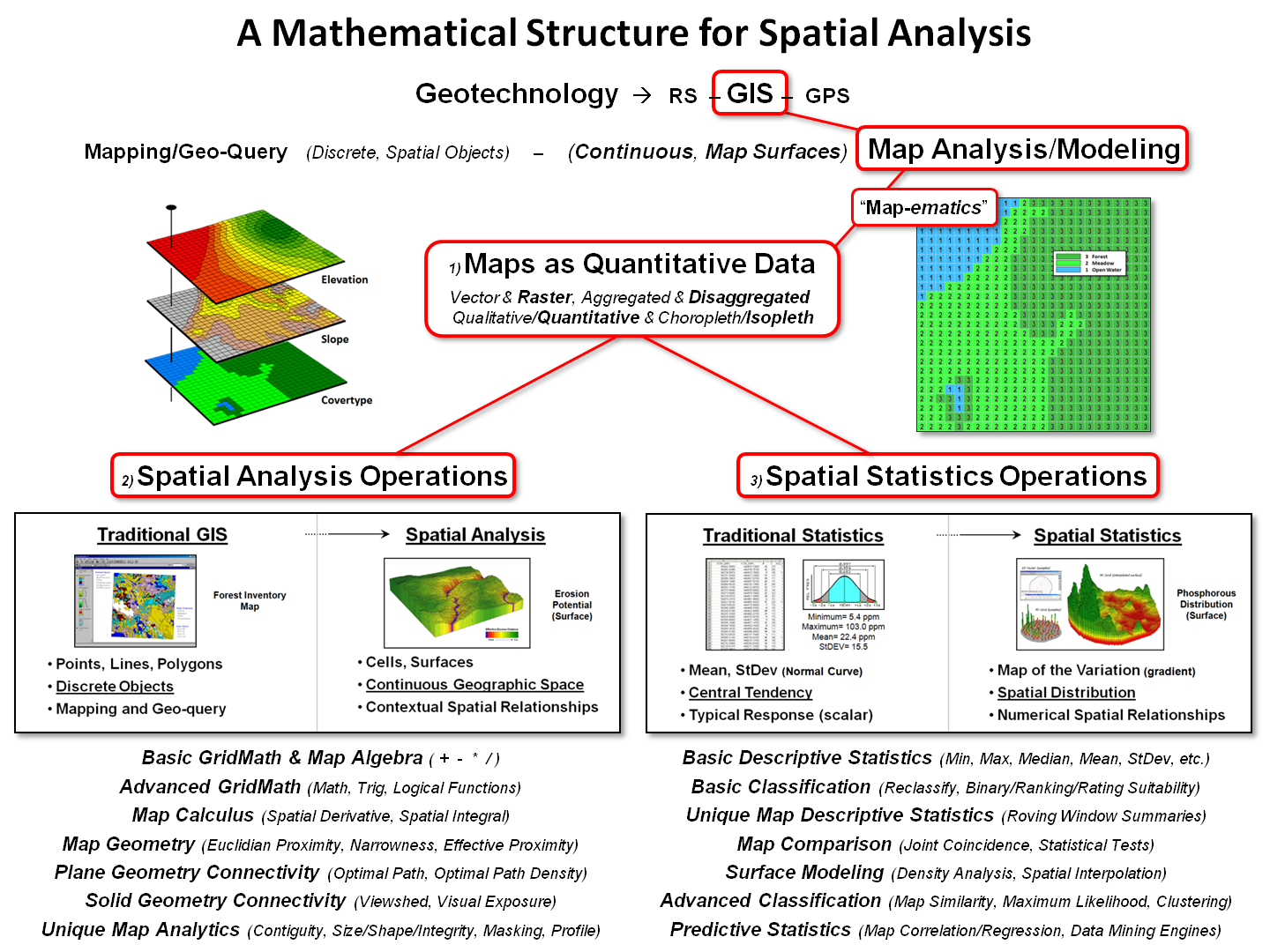
Figure 1. Conceptual
overview of the SpatialSTEM framework.
Figure 1 outlines the important components of map analysis and modeling
within a mathematical structure that has been in play since the 1980s (see
author’s note). Of the three disciplines
forming Geotechnology (Remote Sensing, Geographic Information Systems and
Global Positioning System), GIS is at the heart of converting mapped data into
spatial information. There are two
primary approaches used in generating this information—Mapping/Geo-query
and Map Analysis/Modeling.
The major difference between the two approaches lies in the structuring
of mapped data and their intended use.
Mapping and geo-query utilizes a data structure akin to manual mapping
in which discrete spatial objects (points, lines and polygons)
form a collection of independent, irregular features to characterize geographic
space. For example, a Water map might
contain categories of Spring (points), Stream (lines)
and Lake (polygons) with the features scattered throughout a landscape.
Map analysis and modeling procedures, on the other hand, operate on continuous
map variables (termed map surfaces) composed of thousands upon
thousands of map values stored in geo-registered matrices. Within this context, a Water map no longer
contains separate and distinct features but is a collection of adjoining grid
cells with a map value indicating the characteristic at each location (e.g.,
Spring=1, Stream= 2 and Lake= 3).
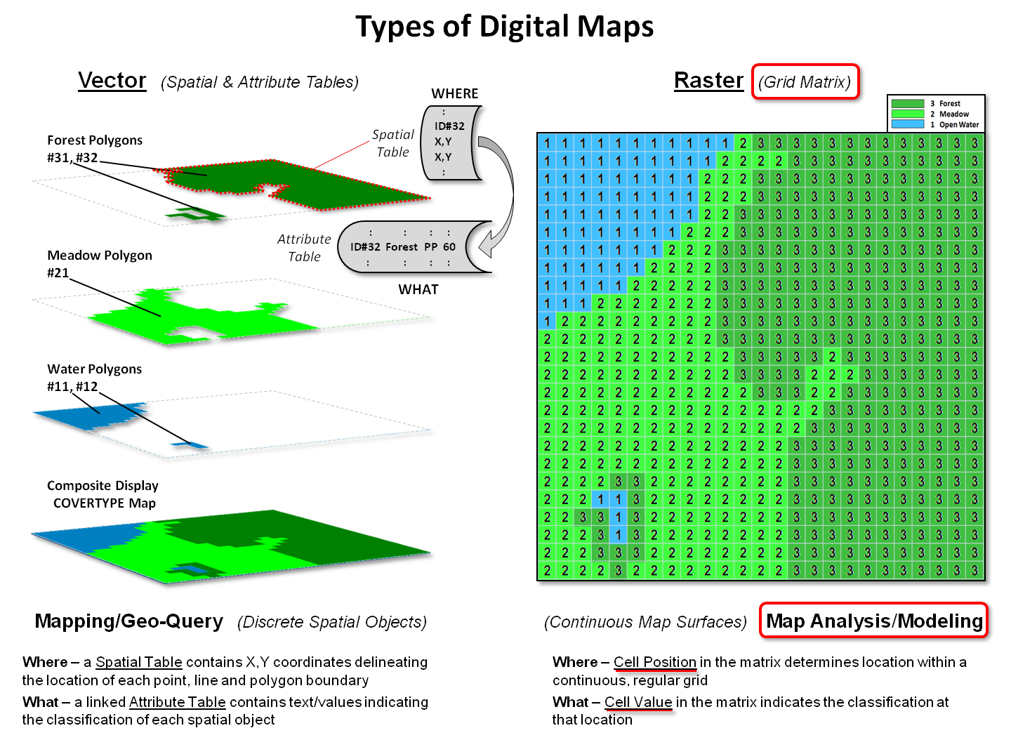
Figure 2. Basic data structure for
Vector and Raster map types.
Figure 2 illustrates two broad types of digital maps, formally termed Vector
for storing discrete spatial objects and Raster for storing continuous
map surfaces. In vector format, spatial
data is stored as two linked data tables.
A “spatial table” contains all of the X,Y
coordinates defining a set of spatial objects that are grouped by object
identification numbers. For example, the
location of the Forest polygon identified on the left side of the figure is
stored as ID#32 followed by an ordered series of X,Y
coordinate pairs delineating its border (connect-the-dots).
In a similar manner, the ID#s and X,Y
coordinates defining the other cover type polygons are sequentially listed in
the table. The ID#s link the spatial
table (Where) to a corresponding “attribute table” (What) containing
information about each spatial object as a separate record. For example, polygon ID#31 is characterized
as a mature 60 year old Ponderosa Pine (PP) Forest stand.
The right side of figure 2 depicts raster storage of the same cover
type information. Each grid space is
assigned a number corresponding to the dominant cover type present— the “cell
position” in the matrix determines the location (Where) and the “cell value”
determines the characteristic/condition (What).
It is important to note that the raster representation stores
information about the interior of polygons and “pre-conditions geographic
space” for analysis by applying a consistent grid configuration to each grid
map. Since each map’s underlying data
structure is the same, the computer simply “hits disk” to get information and
does not have to calculate whether irregular sets of points, lines or polygons
on different maps intersect.
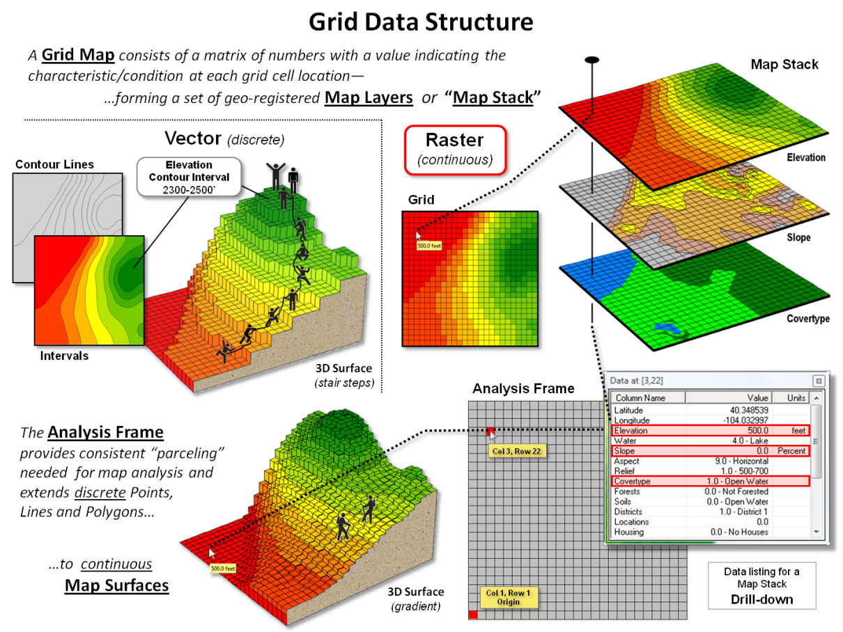
Figure 3. Organizational
considerations and terminology for grid-based mapped data.
Figure 3 depicts the fundamental concepts
supporting raster data. As a comparison
between vector and raster data structures consider how the two approaches
represent an Elevation surface. In
vector, contour lines are used to identify lines of constant elevation and
contour interval polygons are used to identify specified ranges of
elevation. While contour lines are
exacting, they fail to describe the intervening surface configuration.
Contour intervals describe the interiors but
overly generalize the actual “ups and downs” of the terrain into broad ranges
that form an unrealistic stair-step configuration (center-left portion of
figure 3). As depicted in the figure,
rock climbers would need to summit each of the contour interval “200-foot
cliffs” rising from presumed flat mesas.
Similarly, surface water flow presumably would cascade like waterfalls
from each contour interval “lake” like a Spanish multi-tiered fountain.
The upshot is that within a mathematical context, vector maps are ineffective representations of real-world gradients and actual movements and flows over these surfaces— while contour line/interval maps have formed colorful and comfortable visualizations for generations, the data structure is too limited for modern map analysis and modeling.
The remainder of figure 3 depicts the basic Raster/Grid organizational
structure. Each grid map is termed a Map
Layer and a set of geo-registered layers constitutes a Map Stack. All of the map layers in a project conform to
a common Analysis Frame with a fixed number of rows and columns at a
specified cell size that can be positioned anywhere in geographic space. As in the case of the Elevation surface in
the lower-left portion of figure 3, a continuous gradient is formed with subtle
elevation differences that allow hikers to step from cell to cell while
considering relative steepness. Or
surface water to sequentially stream from a location to its steepest downhill
neighbor thereby identifying a flow-path.
The underlying concept of this data structure is that grid cells for
all of the map layers precisely coincide, and by simply accessing map
values at a row, column location a computer can “drill” down through the map
layers noting their characteristics. Similarly,
noting the map values of surrounding cells identifies the characteristics
within a location’s vicinity on a given map layer, or set of map layers.
Keep in mind that while terrain elevation is the most common example of
a map surface, it is by no means the only one.
In natural systems, temperature, barometric pressure, air pollution
concentration, soil chemistry and water turbidity are but a few examples of
continuous mapped data gradients. In
human systems, population density, income level, life style concentration,
crime occurrence, disease incidence rate all form continuous map surfaces. In economic systems, home values, sales
activity and travel-time to/from stores form map variables that that track spatial
patterns.
In fact the preponderance of spatial data is easily and best
represented as grid-based continuous map surfaces that are preconditioned for
use in map analysis and modeling. The
computer does the heavy-lifting of the computation …what is needed is a new
generation of creative minds that goes beyond mapping to “thinking with maps”
within this less familiar, quantitative framework— a SpatialSTEM
environment.
_____________________________
Author’s Notes: My involvement in map analysis/modeling began in the 1970s with doctoral
work in computer-assisted analysis of remotely sensed data a couple of years
before we had civilian satellites. The
extension from digital imagery classification using multivariate statistics and
pattern recognition algorithms in the 70s to a comprehensive grid-based
mathematical structure for all forms of mapped data in the 80s was a natural
evolution. See www.innovativegis.com, select “Online Papers” for a
link to a 1986 paper on “A Mathematical Structure for Analyzing Maps” that
serves as an early introduction to a comprehensive framework for map
analysis/modeling.
Map-ematically Messing with Mapped Data
(GeoWorld, February 2012)
The last section introduced the idea of spatialSTEM for teaching
map analysis and modeling fundamentals within a mathematical context that
resonates with science, technology, engineering and math/stat communities. The discussion established a general
framework and grid-based data structure needed for quantitative analysis of
spatial patterns and relationships. This
section focuses on the nature of mapped data, an example of a grid-math/algebra
application and discussion of extended spatial analysis operations.
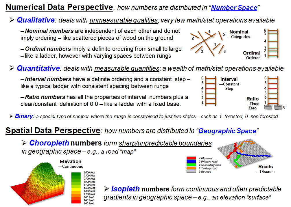
Figure 1. Spatial Data
Perspectives—Where is What.
Figure 1 identifies the two primary perspectives of spatial data—1) Numeric
that indicates how numbers are distributed in “number space” (What
condition) and 2) Geographic that indicated how numbers are distributed
in “geographic space” (Where condition).
The numeric perspective can be grouped into categories of Qualitative
numbers that deal with general descriptions based on perceived “quality” and Quantitative
numbers that deal with measured characteristics or “quantity.”
Further classification identifies the familiar numeric data types of
Nominal, Ordinal, Interval, Ratio and Binary.
It is generally well known that very few math/stat operations can be
performed using qualitative data (Nominal, Ordinal), whereas a wealth of
operations can be used with quantitative data (Interval, Ratio). Only a specialized few operations utilize
Binary data.
Less familiar are the two geographic data types. Choropleth numbers form sharp and
unpredictable boundaries in space, such as the values assigned to the discrete
map features on a road or cover type map.
Isopleth numbers, on the other hand, form continuous and often
predictable gradients in geographic space, such as the values on an elevation
or temperature surface.
Putting the Where and What perspectives of spatial data together, Discrete
Maps identify mapped data with spatially independent numbers
(qualitative or quantitative) forming sharp abrupt boundaries (choropleth),
such as a cover type map. Discrete maps
generally provide limited footholds for quantitative map analysis. On the other hand, Continuous Maps contain
a range of values (quantitative only) that form spatial gradients (isopleth),
such as an elevation surface. They
provide a wealth of analytics from basic grid math to map algebra, calculus and
geometry.
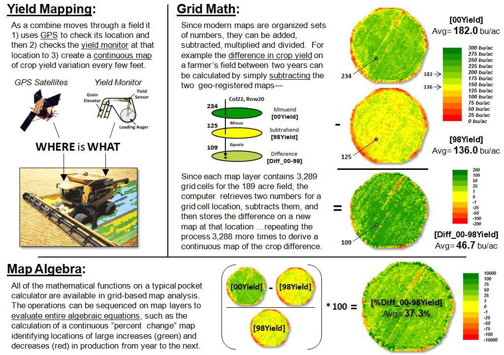
Figure 2. Basic
Grid Math and Algebra example.
Site-specific farming provides a good example of basic grid math and
map algebra using continuous maps (figure 2).
Yield Mapping involves simultaneously recording yield flow and
GPS position as a combine harvests a crop resulting in a grid map of thousands
of geo-registered numbers that track crop yield throughout a field. Grid Math can be used to calculate
the mathematical difference in yield at each location between two years by
simply subtracting the respective yield maps.
Map Algebra extends the processing by spatially evaluating the
full algebraic percent change equation.
The paradigm shift in this map-ematical
approach is that map variables, comprised of thousands of geo-registered
numbers, are substituted for traditional variables defined by only a single
value. Map algebra’s continuous map
solution shows localized variation, rather than a single “typical” value being
calculated (i.e., 37.3% increase in the example) and assumed everywhere the
same in non-spatial analysis.
Figure 3 expands basic Grid Math and Map Algebra into other
mathematical arenas. Advanced Grid
Math includes most of the buttons on a scientific calculator to include
trigonometric functions. For example,
taking the cosine of a slope map expressed in degrees and multiplying it times
the planimetric surface area of a grid cell calculates the surface area of the
“inclined plane” at each grid location.
The difference between planimetric area represented by traditional maps
and surface area based on terrain steepness can be dramatic and greatly affect
the characterization of “catchment areas” in environmental and engineering
models of surface runoff.
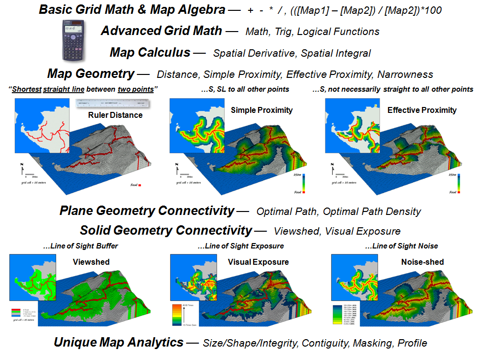
Figure 3. Spatial Analysis
operations.
A Map Calculus expresses such functions as the derivative and
integral within a spatial context. The
derivative traditionally identifies a measure of how a
mathematical function changes as its input changes by assessing the
slope along a curve in 2-dimensional abstract space.
The spatial equivalent calculates a “slope map” depicting the rate of
change in a continuous map variable in 3-dimensional geographic space. For an elevation surface, slope depicts the
rate of change in elevation. For an
accumulation cost surface, its slope map represents the rate of change in cost
(i.e., a marginal cost map). For a
travel-time accumulation surface, its slope map indicates the relative change
in speed and its aspect map identifies the direction of optimal movement at
each location. Also, the slope map of an
existing topographic slope map (i.e., second derivative) will characterize
surface roughness (i.e., areas where slope itself is changing).
Traditional calculus identifies an integral as the
net signed area of a region along a curve expressing a
mathematical function. In a somewhat analogous
procedure, areas under portions of continuous map
surfaces can be characterized. For
example, the total area (planimetric or surface) within a series of
watersheds can be calculated; or the total tax revenue for various
neighborhoods; or the total carbon emissions along major highways; or the net
difference in crop yield for various soil types in a field. In the spatial integral, the net sum of the
numeric values for portions of a continuous map surface (3D) is calculated in a
manner comparable to calculating the area under a curve (2D).
Traditional geometry defines Distance as “the
shortest straight line between two points” and routinely measures it with a
ruler or calculates it using the Pythagorean Theorem. Map Geometry extends the concept of
distance to Simple Proximity by relaxing the requirement of just “two points”
for distances to all locations surrounding a point
or other map feature, such as a road.
A further extension involves Effective Proximity that relaxes “straight
line” to consider absolute and relative barriers to movement. For example effective proximity might
consider just uphill locations along a road or a complex set of variable hiking
conditions that impede movement from a road as a function of slope, cover type
and water barriers.
The result is that the “shortest but not
necessarily straight distance” is assigned to each grid location. Because a straight line connection cannot be
assumed, optimal path routines in Plane Geometry Connectivity (2D space)
are needed to identify the actual shortest routes. Solid Geometry Connectivity (3D space)
involves line-of-sight connections that identify visual exposure among
locations. A final class of operations
involves Unique Map Analytics, such as size, shape, intactness and
contiguity of map features.
Grid-based map analysis takes us well beyond traditional mapping …as
well as taking us well beyond traditional procedures and paradigms of
mathematics. The next installment of spatialSTEM
discussion considers the extension of traditional statistics to spatial
statistics.
_____________________________
Author’s Notes: a table of URL links to further readings on the grid-based map
analysis/modeling concepts, terminology, considerations and procedures described
in this three-part series on spatialSTEM is posted at www.innovativegis.com/basis/MapAnalysis/Topic30/sSTEM/sSTEMreading.htm.
Paint by Numbers Outside the Traditional
Statistics Box
(GeoWorld, March 2012)
The two previous sections described a general framework and approach
for teaching spatial analysis within a mathematical context that resonates with
science, technology, engineering and math/stat communities (spatialSTEM). The following discussion focuses on extending
traditional statistics to a spatial statistics for understanding
geographic-based patterns and relationships.
Whereas Spatial analysis focuses on “contextual relationships”
in geographic space (such as effective proximity and visual exposure), Spatial
statistics focuses on “numerical relationships” within and among mapped
data (figure 1). From a spatial
statistics perspective there are three primary analytical arenas— Summaries,
Comparisons and Correlations.
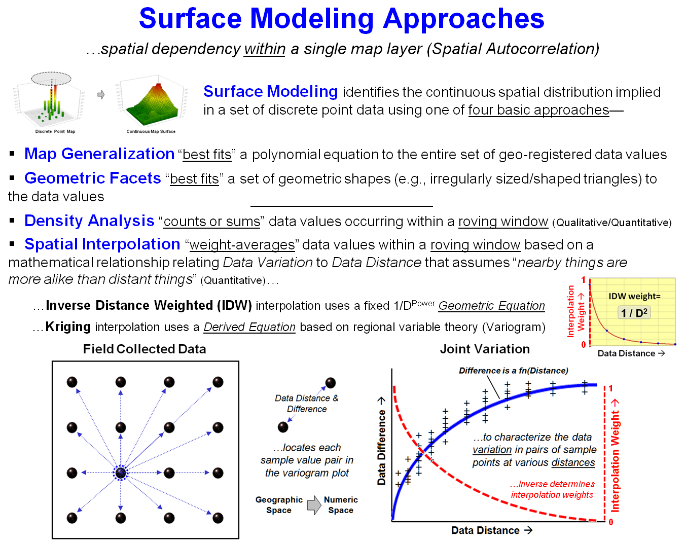
Figure 1. Spatial Statistics uses
numerical analysis to uncover spatial relationships and patterns.
Statistical summaries provide generalizations of the grid values
comprising a single map layer (within), or set of map layers (among). Most common is a tabular summary included in
a discrete map’s legend that identifies the area and proportion of occurrence
for each map category, such as extremely steep terrain comprising 286 acres (19
percent) of a project area. Or for a
continuous map surface of slope values, the generalization might identify the
data range as from 0 to 65% and note that the average slope is 24.4 with a
standard deviation of 16.7.
Summaries among two or more discrete maps generate cross-tabular tables
that “count” the joint occurrence of all categorical combinations of the map layers. For example, the coincidence of steepness and
cover maps might identify that there are 242 acres of forest cover on extremely
steep slopes (16 percent), a particularly hazardous wildfire joint condition.
Map comparison and correlation techniques only apply to continuous
mapped data. Comparisons within a single
map surface involve normalization techniques.
For example, a Standard Normal Variable (SNV) map can be generated to
identify “how unusual” (above or below) each map location is compared to the
typical value in a project area.
Direct comparisons among continuous map surfaces include appropriate
statistical tests (e.g., F-test), difference maps and surface configuration
differences based on variations in surface slope and orientation at each grid
location.
Map correlations provide a foothold for advanced inferential spatial
statistics. Spatial autocorrelation
within a single map surface identifies the similarity among nearby values for
each grid location. It is most often
associated with surface modeling techniques that employ the assumption that
“nearby things are more alike than distant things”—high spatial
autocorrelation—for distance-based weight averaging of discrete point samples
to derive a continuous map surface.
Spatial correlation, on the other hand, identifies the degree of
geographic dependence among two or more map layers and is the foundation of
spatial data mining. For example, a map
surface of a bank’s existing concentration of home equity loans within a city
can be regressed against a map surface of home values. If a high level of spatial dependence exists,
the derived regression equation can be used on home value data for another
city. The resulting map surface of
estimated loan concentration proves useful in locating branch offices.
In practice, many geo-business applications utilize numerous
independent map layers including demographics, life style information and sales
records from credit card swipes in developing spatially consistent multivariate
models with very high R-squared values.
Like most things from ecology to economics to environmental
considerations, spatial expression of variable dependence echoes niche theory
with grid-based spatial statistics serving as a powerful tool for understanding
geographic patterns and relationships.
Figure 2 describes an example of basic surface modeling and the linkage
between numeric space and geographic space representations using
environmentally-oriented mapped data.
Soil samples are collected and analyzed assuring that geographic
coordinates accompany the field samples.
The resulting discrete point map of the field soil chemistry data are
spatially interpolated into a continuous map surface characterizing the data
set’s geographic distribution.
The bottom portion of figure 2 depicts the linkage between Data Space
and Geographic Space representations of the mapped data. In data space, a standard normal curve is
fitted to the data as means to characterize its overall “typical value”
(Average= 22.9) and “typical dispersion” (StDev=
18.7) without regard for the data’s spatial distribution.
In geographic space, the Average forms a flat plane implying that this
value is assumed to be everywhere within +/- 1 Standard Deviation about
two-thirds of the time and offering no information about where values are
likely more or less than the typical value.
The fitted continuous map surface, on the other hand, details the
spatial variation inherent in the field collected samples.
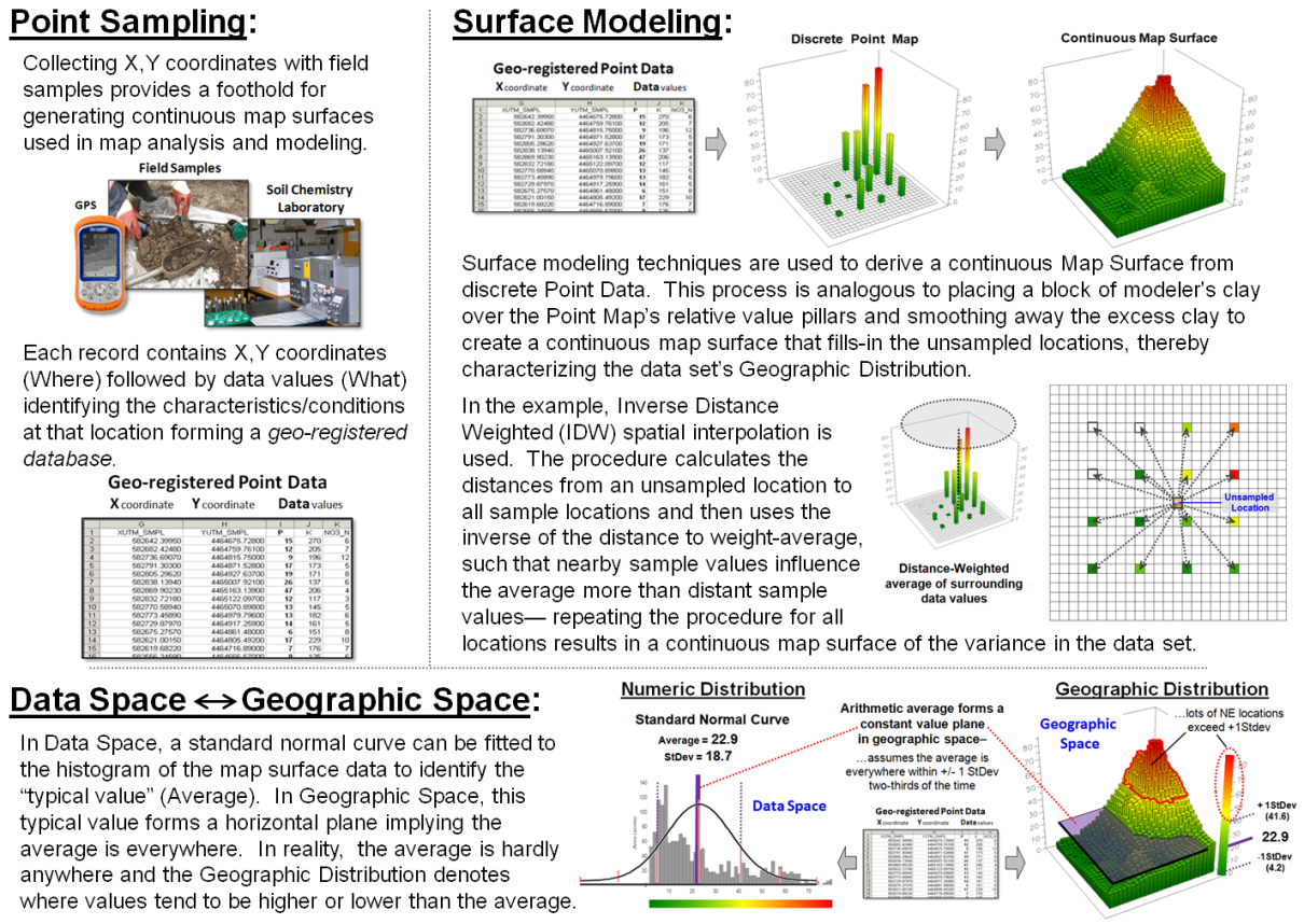
Figure 2. An example of Surface Modeling that derives a continuous map surface from set of
discrete point data.
Nonspatial statistics identifies the “central tendency” of the data,
whereas surface modeling maps the “spatial variation” of the data. Like a Rochart ink blot, the histogram and
the map surface provide two different perspectives. Clicking a histogram pillar identifies all of
the grid cells within that range; clicking on a grid location identifies which
histogram range contains it.
This direct linkage between the numerical and spatial characteristics
of mapped data provides the foundation for the spatial statistics operations
outlined in figure 3. The first four
classes of operations are fairly self-explanatory with the exception “Roving
Window” summaries. This technique first
identifies the grid values surrounding a location, then
mathematically/statistically summarizes the values, assigns the summary to that
location and then moves to the next location and repeats the process.
Another specialized use of roving windows is for Surface Modeling. As described in figure 2, inverse-distance
weighted spatial interpolation (IDW) is the weight-averaged of samples based on
their relative distances from the focal location. For qualitative data, the total number of
occurrences within a window reach can be summed for a density surface.
In figure 3 for example, a map identifying customer locations can be
summed to identify the total number of customers within a roving window to
generate a continuous map surface customer density. In turn, the average and standard deviation
can be used to identify “pockets” of unusually high customer density.
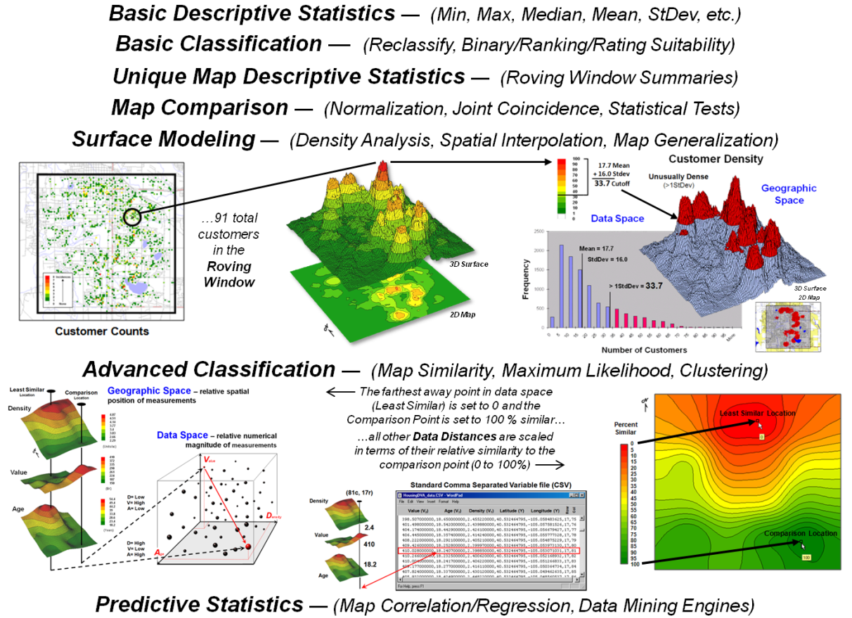
Figure 3. Classes
of Spatial Statistics operations.
Standard multivariate techniques using “data distance,” such as Maximum
Likelihood and Clustering, can be used to classify sets of map variables. Map Similarity, for example, can be used to
compare each map location’s pattern of values with a comparison location’s
pattern to create a continuous map surface of the relative degree of similarity
at each map location.
Statistical techniques, such as Regression, can be used to develop
mathematical functions between dependent and independent map variables. The difference between spatial and
non-spatial approaches is that the map variables are spatially consistent and
yield a prediction map that shows where high and low estimates are to be
expected.
The bottom line in spatial statistics (as well as spatial analysis) is
that the spatial character within and among map layers is taken into account. The grid-based representation of mapped data
provides the consistent framework that needed for these analyses. Each database record contains geographic
coordinates (X,Y= Where) and value fields identifying
the characteristics/conditions at that location (Vi= What).
From this map-ematical view,
traditional math/stat procedures can be extended into geographic space. The paradigm shift from our paper map legacy
to “maps as data first, pictures later” propels us beyond mapping to map
analysis and modeling. In addition, it
defines a comprehensive and common spatialSTEM educational environment
that stimulates students with diverse backgrounds and interests to “think
analytically with maps” in solving complex problems.
_____________________________
Author’s Notes: a table of URL links to further readings on the grid-based map
analysis/modeling concepts, terminology, considerations and procedures
described in this three-part series on spatialSTEM is posted at www.innovativegis.com/basis/MapAnalysis/Topic30/sSTEM/sSTEMreading.htm.
Simultaneously
Trivializing and Complicating GIS
(GeoWorld, April 2012)
Several things seem to be coalescing in my mind (or maybe colliding is
a better word). GIS has moved up the
technology adoption curve from Innovators in the 1970s to Early
Adopters in the 80s, to Early Majority in the 90s, to Late
Majority in the 00s and is poised to capture the Laggards this
decade. Somewhere along this
progression, however, the field seems to have bifurcated along technical and
analytical lines.
The lion’s share of this growth has been GIS’s ever expanding
capabilities as a “technical tool” for corralling vast amounts of
spatial data and providing near instantaneous access to remote sensing images,
GPS navigation, interactive maps, asset management records, geo-queries and
awesome displays. In just forty years
GIS has morphed from boxes of cards passed through a window to a megabuck
mainframe that generated page-printer maps, to today’s sizzle of a 3D
fly-through rendering of terrain anywhere in the world with back-dropped
imagery and semi-transparent map layers draped on top—all pushed from the cloud
to a GPS enabled tablet or smart phone.
What a ride!
However, GIS as an “analytical tool” hasn’t experienced the same
meteoric rise—in fact it might be argued that the analytic side of GIS has
somewhat stalled over the last decade. I
suspect that in large part this is due to the interests, backgrounds, education
and excitement of the ever enlarging GIS tent.
Several years ago (see figure 1 and author’s note 1) I described the
changes in breadth and depth of the community as flattening from the 1970s
through the 2000s. By sheer numbers, the
balance point has been shifting to the right toward general and public users
with commercial systems responding to market demand for more technological advancements.
The 2010s will likely see billions of general and public users with the
average depth of science and technology knowledge supporting GIS nearly
“flatlining.” Success stories in
quantitative map analysis and modeling applications have been all but lost in
the glitz n' flash of the technological whirlwind. The vast potential of GIS to change how
society perceives maps, mapped data and their use in spatial reasoning and
problem solving seems relatively derailed.
In a recent editorial in Science entitled Trivializing Science
Education, Editor-in-Chief Bruce Alberts laments
that “Tragically, we have managed to simultaneously trivialize and complicate
science education” (author’s note 2). A
similar assessment might be made for GIS education. For most students and faculty on campus, GIS
technology is simply a set of highly useful apps on their smart phone that can
direct them to the cheapest gas for tomorrow’s ski trip and locate the nearest
pizza pub when they arrive. Or it is a
Google fly-by of the beaches around Cancun.
Or a means to screen grab a map for a paper on community-based
conservation of howler monkeys in Belize.
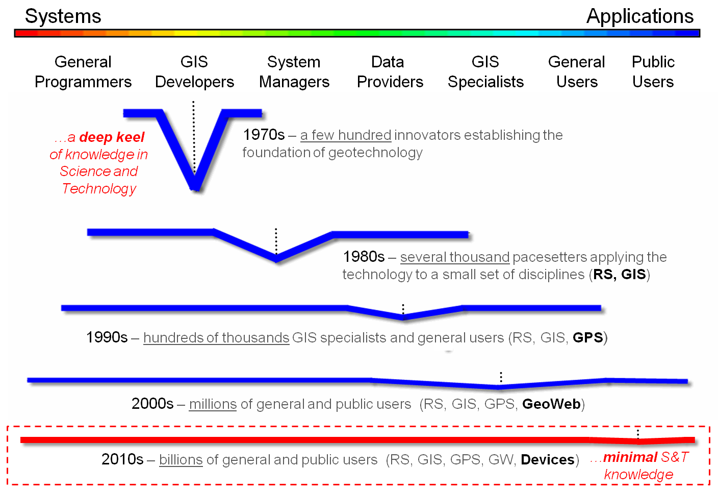
Figure 1. Changes in breadth and
depth of the community.
To a smaller contingent on campus, it is career path that requires
mastery of the mechanics, procedures and buttons of extremely complex commercial
software systems for acquiring, storage, processing, and display spatial
information. Both perspectives are
valid. However neither fully grasps the
radical nature of the digital map and how it can drastically change how we
perceive and infuse spatial information and reasoning into science, policy
formation and decision-making—in essence, how we can “think with maps.”
A large part of missing the mark on GIS’s full potential is our lack of
“reaching” out to the larger science, technology, engineering and math (STEM)
communities on campus by insisting 1) that non-GIS students interested in
understanding map analysis and modeling must be tracked into general GIS
courses that are designed for GIS specialists, and 2) that the material
presented primarily focuses on commercial GIS software mechanics that
GIS-specialists need to know to function in the workplace.
Much of the earlier efforts in structuring a framework for quantitative
map analysis has focused on how the analytical operations work within the
context of Focal, Local and Zonal classification by
Tomlin, or even my own the Reclassify, Overlay, Distance
and Neighbors classification scheme (see top portion of figure 2 and
author’s note 3). The problem with these structuring approaches is that
most STEM folks just want to understand and use the analytical operations
properly—not appreciate the theoretical geographic-related elegance, or code
the algorithm.
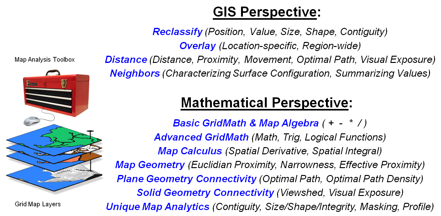
Figure 2. Alternative frameworks for
quantitative map analysis.
The bottom portion of figure 2 outlines restructuring of the basic
spatial analysis operations to align with traditional mathematical concepts and
operations (author’s note 4). This
provides a means for the STEM community to jump right into map analysis without
learning a whole new lexicon or an alternative GIS-centric mindset. For example, the GIS concept/operation of Slope=
spatial “derivative”, Zonal functions= spatial “integral”, Eucdistance= extension of “planimetric distance” and
the Pythagorean Theorem to proximity, Costdistance=
extension of distance to effective proximity considering absolute and relative
barriers that is not possible in non-spatial mathematics, and Viewshed=
“solid geometry connectivity”.
Figure 3 outlines the conceptual development of three of these
operations. The top set of graphics
identifies the Calculus Derivative as a measure of how a mathematical
function changes as its input changes by assessing the slope along a curve in
2-dimensional abstract space—calculated as the “slope of the tangent line” at
any location along the curve. In an
equivalent manner the Spatial Derivative creates a slope map depicting
the rate of change of a continuous map variable in 3-dimensional geographic
space—calculated as the slope of the “best fitted plane” at any location along
the map surface.
Advanced Grid
Math
includes most of the buttons on a scientific calculator to include
trigonometric functions. For example,
calculating the “cosine of the slope values” along a terrain surface and then
multiplying times the planimetric surface area of a grid cell will solve for
the increased real-world surface area of the “inclined plane” at each grid
location.
The Calculus Integral is identified as the “area of a region
under a curve” expressing a mathematical function. The Spatial Integral counterpart
“summarizes map surface values within specified geographic regions.” The data summaries are not limited to just a
total but can be extended to most statistical metrics. For example, the average map surface value
can be calculated for each district in a project area. Similarly, the coefficient of variation ((Stdev
/ Average) * 100) can be calculated to assess data dispersion about the average
for each of the regions.
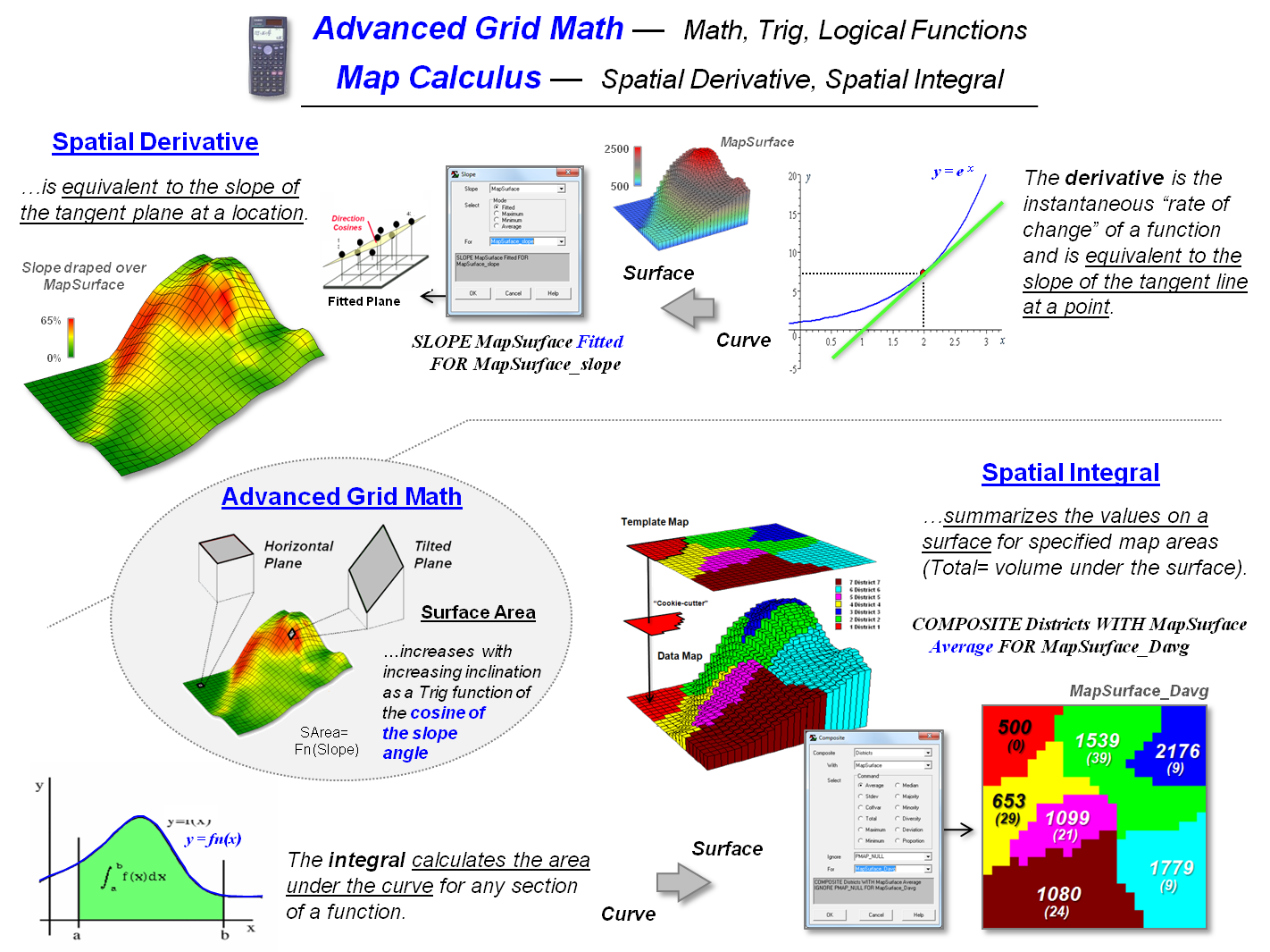
Figure 3. Conceptual extension of
derivative, trigonometric functions and integral to mapped data and map
analysis operations.
By recasting GIS concepts and operations of map analysis within the
general scientific language of math/stat we can more easily educate tomorrow’s
movers and shakers in other fields in “spatial reasoning”—to think of maps as
“mapped data” and express the wealth of quantitative analysis thinking they
already understand on spatial variables.
Innovation and creativity in spatial problem solving is being held
hostage to a trivial mindset of maps as pictures and a non-spatial mathematics
that presuppose mapped data can be collapsed to a single central tendency value
that ignores the spatial variability inherent in the data.
Simultaneously, the “build it (GIS) and they will come (and take our existing
courses)” educational paradigm is not working as it requires potential users to
become a GIS’perts in complicated software
systems.
GIS must take an active leadership role in “leading” the STEM community
to the similarities/differences and advantages/disadvantages in the
quantitative analysis of mapped data—there is little hope that the STEM folks
will make the move on their own. Next
month we’ll consider recasting spatial statistics concepts and operations into
a traditional statistics framework.
_____________________________
Author’s Notes: 1) see
“A Multifaceted GIS Community” in Topic 27, GIS Evolution
and Future Trends in the online book Beyond Mapping III, posted at www.innovativegis.com. 2) Bruce Alberts in
Science, 20 January 2012:Vol. 335 no. 6066 p. 263. 3) see “An Analytical Framework for GIS Modeling” posted at www.innovativegis.com/basis/Papers/Other/GISmodelingFramework/. 4) see “SpatialSTEM: Extending Traditional Mathematics and
Statistics to Grid-based Map Analysis and Modeling” posted at www.innovativegis.com/basis/Papers/Other/SpatialSTEM/.
Infusing
Spatial Character into Statistics
(GeoWorld, May 2012)
The previous section discussed the assertion that we might be simultaneously trivializing and complicating GIS. At the root of the argument was the contention that “innovation and creativity in spatial problem solving is being held hostage to a trivial mindset of maps as pictures and a non-spatial mathematics that presuppose mapped data can be collapsed into a single central-tendency value that ignores the spatial variability inherent in data.”
The discussion described a mathematical framework that organizes the spatial analysis toolbox into commonly understood mathematical concepts and procedures. For example, the GIS concept/operation of Slope= spatial “derivative,” Zonal functions= spatial “integral,” Eucdistance= extension of “planimetric distance” and the Pythagorean Theorem to proximity, Costdistance= extension of distance to effective proximity considering absolute and relative barriers that is not possible in non-spatial mathematics, and Viewshed= “solid geometry connectivity.”
This section does a similar translation to describe a statistical framework for organizing the spatial statistics toolbox into commonly understood statistical concepts and procedures. But first we need to clarify the differences between spatial analysis and spatial statistics. Spatial analysis can be thought of as an extension of traditional mathematics involving the “contextual” relationships within and among mapped data layers. It focuses on geographic associations and connections, such as relative positioning, configurations and patterns among map locations.
Spatial statistics,
on the other hand, can be thought of as an extension of traditional statistics
involving the “numerical” relationships within and among mapped data
layers. It focuses on mapping the
variation inherent in a data set rather than characterizing its central
tendency (e.g., average, standard deviation) and then summarizing the
coincidence and correlation of the spatial distributions.
The top portion of figure 1 identifies the two dominant GIS
perspectives of spatial statistics— Surface Modeling that derives a
continuous spatial distribution of a map variable from point sampled data and Spatial
Data Mining that investigates numerical relationships of map
variables.
The bottom portion of the figure outlines restructuring of the basic
spatial statistic operations to align with traditional non-spatial statistical
concepts and operations (see author’s note).
The first three groupings are associated with general descriptive
statistics, the middle two involve unique spatial statistics operations and the
final two identify classification and predictive statistics.
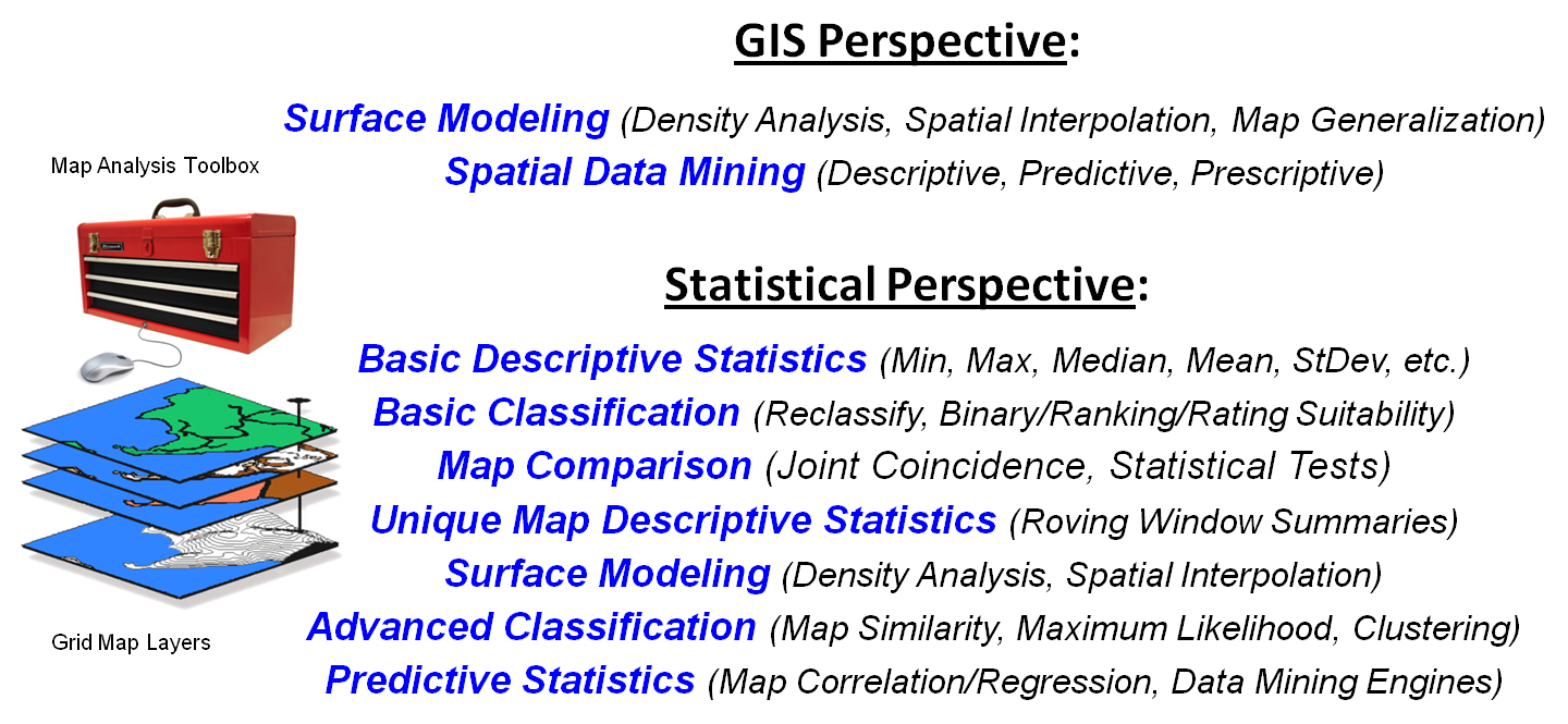
Figure 1. Alternative frameworks for
quantitative map analysis.
Figure 2 depicts the non-spatial and spatial approaches for
characterizing the distribution of mapped data and the direct link between the
two representations. The left side of
the figure illustrates non-spatial statistics analysis of an example set of data
as fitting a standard normal curve in “data space” to assess the central
tendency of the data as its average and standard deviation. In processing, the geographic coordinates are
ignored and the typical value and its dispersion are assumed to be uniformly
(or randomly) distributed in “geographic space.”
The top portion of figure 2 illustrates the derivation of a continuous
map surface from geo-registered point data involving spatial
autocorrelation. The discrete point map
locates each sample point on the XY coordinate plane and extends these points
to their relative values (higher values in the NE; lowest in the NW). A roving window is moved throughout the area
that weight-averages the point data as an inverse function of distance—closer
samples are more influential than distant samples. The effect is to fit a surface that
represents the geographic distribution of the data in a manner that is
analogous to fitting a SNV curve to characterize the data’s numeric distribution. Underlying this process is the nature of the
sampled data which must be numerically quantitative (measurable as continuous
numbers) and geographically isopleth (numbers form continuous gradients in
space).
The lower-right portion of figure 2 shows the direct linkage between
the numerical distribution and the geographic distribution views of the
data. In geographic space, the “typical
value” (average) forms a horizontal plane implying that the average is
everywhere. In reality, the average is
hardly anywhere and the geographic distribution denotes where values tend to be
higher or lower than the average.
Figure 2. Comparison and linkage between spatial and
non-spatial statistics
In data space, a histogram represents the relative occurrence of each
map value. By clicking anywhere on the
map, the corresponding histogram interval is highlighted; conversely, clicking
anywhere on the histogram highlights all of the corresponding map values within
the interval. By selecting all locations
with values greater than + 1SD, areas of unusually high values are located—a
technique requiring the direct linkage of both numerical and geographic
distributions.
Figure 3 outlines two of the advance spatial statistics operations involving spatial correlation among two or more map layers. The top portion of the figure uses map clustering to identify the location of inherent groupings of elevation and slope data by assigning pairs of values into groups (called clusters) so that the value pairs in the same cluster are more similar to each other than to those in other clusters.
The bottom portion of the figure assesses map correlation by
calculating the degree of dependency among the same maps of elevation and
slope. Spatially “aggregated”
correlation involves solving the standard correlation equation for the entire
set of paired values to represent the overall relationship as a single
metric. Like the statistical average, this
value is assumed
to be uniformly (or randomly) distributed in “geographic space” forming a
horizontal plane.
“Localized” correlation, on the other hand, maps the degree of dependency between the two map variables by successively solving the standard correlation equation within a roving window to generate a continuous map surface. The result is a map representing the geographic distribution of the spatial dependency throughout a project area indicating where the two map variables are highly correlated (both positively, red tones; and negatively, green tones) and where they have minimal correlation (yellow tones).
With the exception of unique Map Descriptive Statistics and Surface Modeling classes of operations, the grid-based map analysis/modeling system simply acts as a mechanism to spatially organize the data. The alignment of the geo-registered grid cells is used to partition and arrange the map values into a format amenable for executing commonly used statistical equations. The critical difference is that the answer often is in map form indicating where the statistical relationship is more or less than typical.
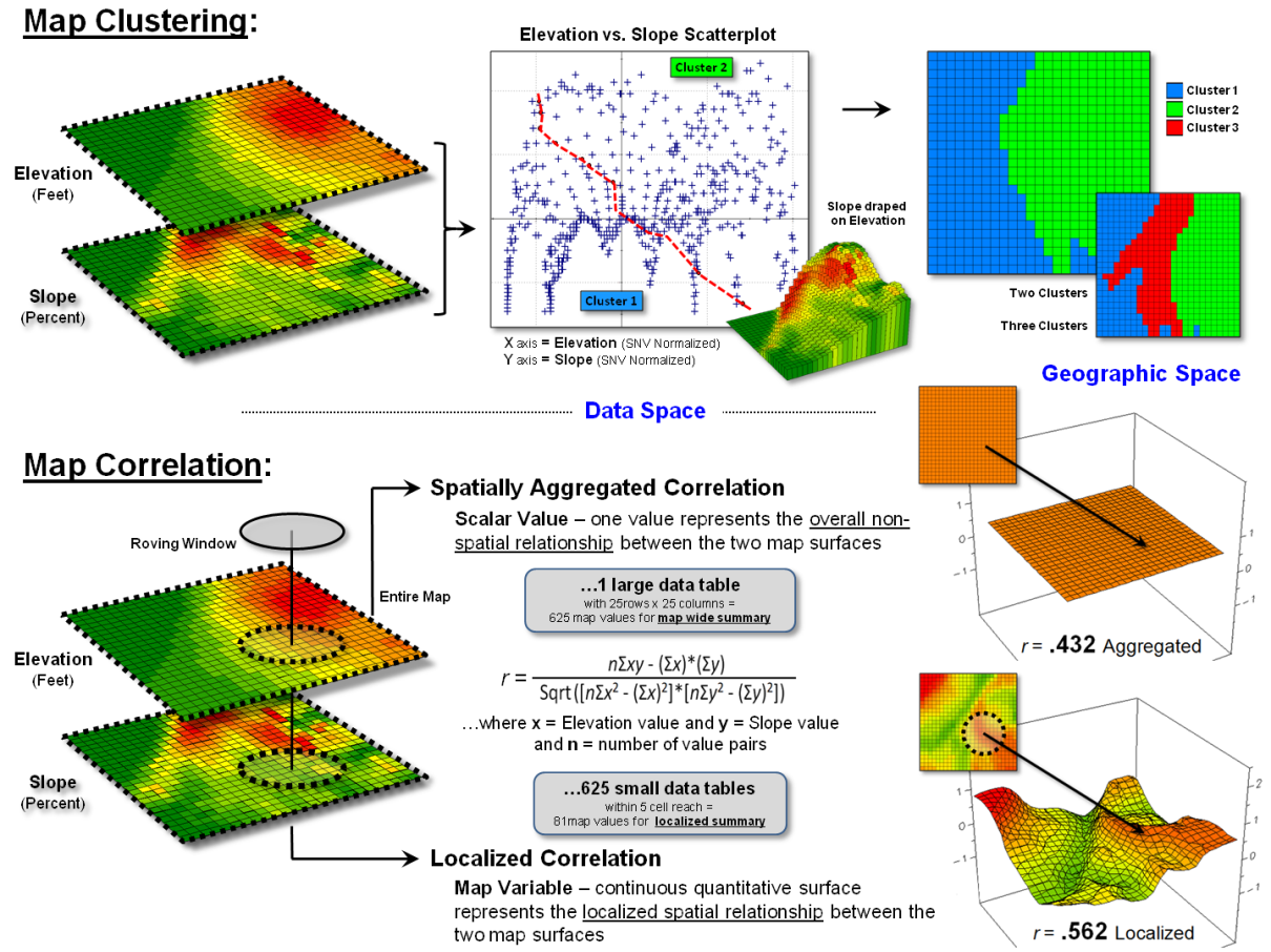
Figure 3. Conceptual extension of
clustering and correlation to mapped data and analysis.
While the technological applications of GIS have soared over the last decade, the analytical applications seem to have flat-lined. The seduction of near instantaneous geo-queries and awesome graphics seem to be masking the underlying character of mapped data— that maps are numbers first, pictures later. However, grid-based map analysis and modeling involving Spatial Analysis and Spatial Statistics is, for the larger part, simply extensions of traditional mathematics and statistics. The recognition by the GIS community that quantitative analysis of maps is a reality and the recognition by the STEM community that spatial relationships exist and are quantifiable should be the glue that binds the two perspectives. That reminds me of a very wise observation about technology evolution—
“Once a new technology rolls over you, if you're not part of the
steamroller, you're part of the road.” ~Stewart Brand, editor
of the Whole Earth Catalog
_____________________________
Author’s Notes: for a more detailed discussion,
see “SpatialSTEM: Extending Traditional Mathematics and Statistics to
Grid-based Map Analysis and Modeling” posted at www.innovativegis.com/basis/Papers/Other/SpatialSTEM/.
Depending
on Where is What
(GeoWorld,
March 2013)
Early procedures in spatial statistics were largely focused on the
characterization of spatial patterns formed by the relative positioning of
discrete spatial objects—points, lines, and polygons. The “area, density, edge, shape, core-area,
neighbors, diversity and arrangement” of map features are summarized by
numerous landscape analysis indices, such as Simpson's Diversity and Shannon's
Evenness diversity metrics; Contagion and Interspersion/Juxtaposition
arrangement metrics; and Convexity and Edge Contrast shape
metrics (see Author’s Note 1). Most of
these techniques are direct extensions of manual procedures using paper maps
and subsequently coded for digital maps.
Grid-based map analysis, however, expands this classical view by the
direct application of advanced statistical techniques in analyzing spatial
relationships that consider continuous geographic space. Some of the earliest applications (circa
1960) were in climatology and used map surfaces to generate isotherms of
temperature and isobars of barometric pressure.
In the 1970s, the analysis of remotely sensed data (raster images)
began employing traditional statistical techniques, such as Maximum
Likelihood Classification, Principle Component Analysis and Clustering
that had been used in analyzing non-spatial data for decades. By the 1990s, these classification-oriented
procedures operating on spectral bands were extended to include the full wealth
of statistical operations, such as Correlation and Regression,
utilizing diverse sets of geo-registered map variables (grid-based map
layers).
It is the historical distinction between “Spatial Pattern
characterization of discrete objects” and “Spatial Relationship analysis
of continuous map surfaces” that identifies the primary conceptual branches
in spatial statistics. The spatial
relationship analysis branch can be further grouped by two types of spatial
dependency driving the relationships— Spatial Autocorrelation involving
spatial relationships within a single map layer, and Spatial
Correlation involving spatial relationships among multiple map
layers (see figure 1).
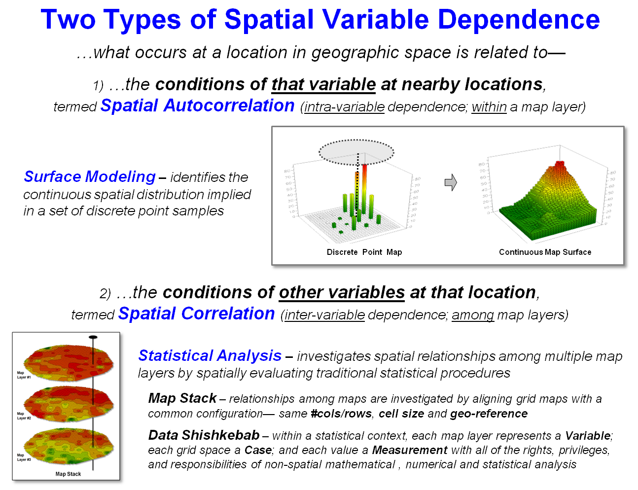
Figure 1. Spatial Dependency involves
relationships within a single map layer (Spatial Autocorrelation) or among
multiple map layers (Spatial Correlation).
Spatial
Autocorrelation follows Tobler’s first law of geography—
that “…near things are more alike than distant things.” This condition provides the foundation for Surface
Modeling used to identify the continuous spatial distribution implied in a
set of discrete point data based on one of four fundamental approaches (see
figure 2 and Author’s Note 2). The first
two approaches—Map Generalization and Geometric Facets—consider
the entire set of point values in determining the “best fit” of a polynomial
equation, or a set of 3-dimentional geographic shapes.
For example, a 1st order polynomial (tilted plane) fitted to
a set of data points indicates its spatial trend with decreasing values
aligning with the direction cosines of the plane. Or, a complex set of abutting tilted
triangular planes can be fitted to the data values to capture significant
changes in surface form (triangular tessellation).
The lower two approaches—Density Analysis and Spatial
Interpolation—are based on localized summaries of the point data utilizing
“roving windows.” Density Analysis counts the number of data points in the
window (e.g., number of crimes incidents within half a kilometer) or computes
the sum of the values (e.g., total loan value within half a kilometer).
However, the most frequently used surface modeling approach is Spatial
Interpolation that “weight-averages” data values within a roving window based
on some function of distance. For
example, Inverse Distance Weighting (IDW) interpolation uses the geometric
equation 1/D Power to greatly diminish the influence of distant data
values in computing the weighted-average.
Figure 2. Surface Modeling involves
generating map surfaces that portray the continuous spatial distribution
implied in a set of discrete point data.
The bottom portion of figure 2 encapsulates the basis for Kriging which
derives the weighting equation from the point data values themselves, instead
of assuming a fixed geometric equation.
A variogram plot of the joint variation among the data values (blue
curve) shows the differences in the values as a function of distance. The inverse of this derived equation (red
curve) is used to calculate the distance affected weights used in
weight-averaging the data values.
The other type of spatial dependency—Spatial Correlation—provides
the foundation for analyzing spatial relationships among map layers. It involves spatially evaluating traditional
statistical procedures using one of four ways to access the geo-registered
data— Local, Focal, Zonal and Global (see figure3
and Author’s Notes 3 and 4). Once the
spatially coincident data is collected and compatibly formatted, it can be
directly passed to standard multivariate statistics packages or to more
advanced statistical engines (CART, Induction or Neural Net). Also, a growing number of GIS systems have
incorporated many of the most frequently used statistical operations.
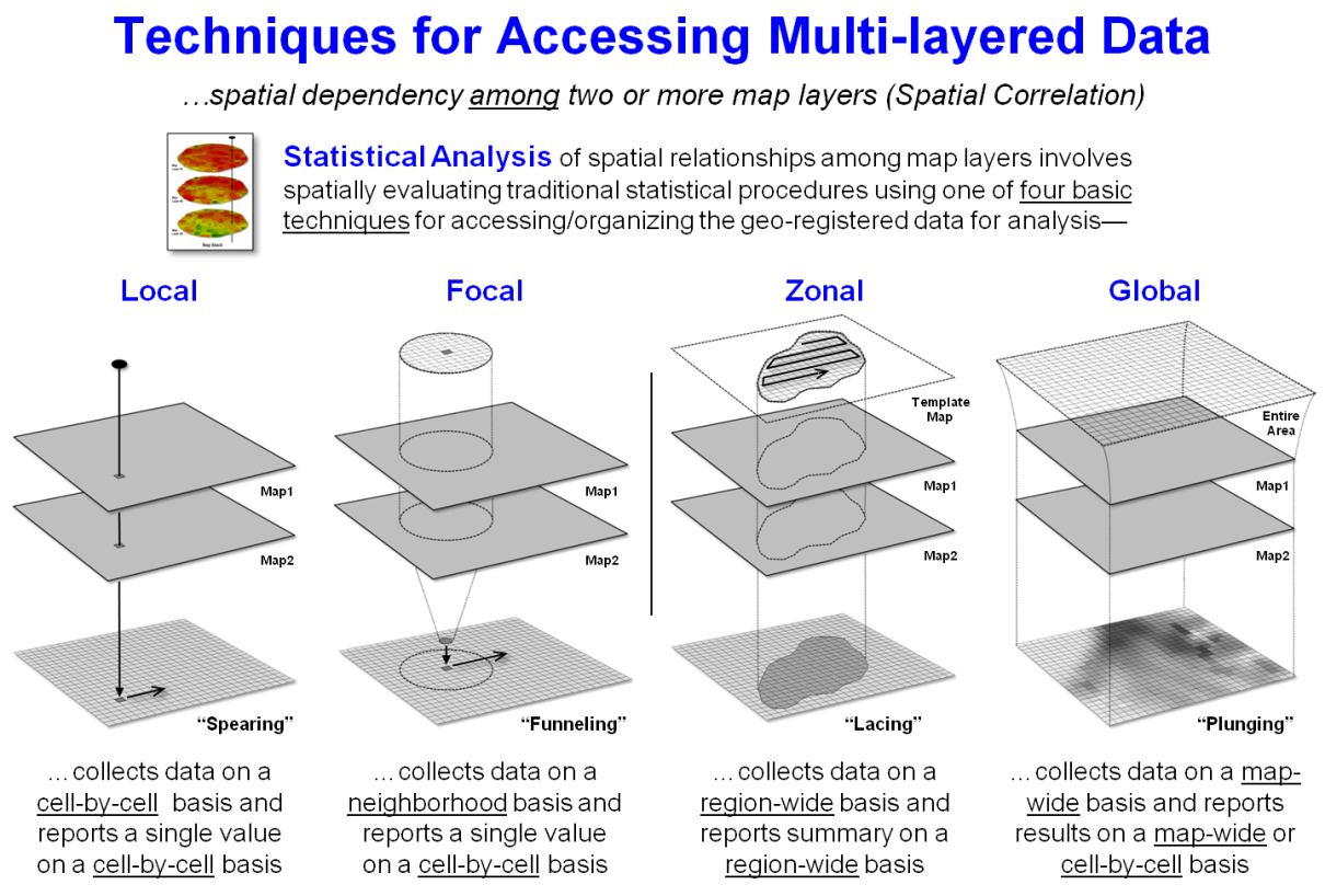
Figure 3. Statistical Analysis of
mapped data involves repackaging mapped data for processing by standard
multivariate statistics or more advanced statistical operations.
The majority of the Statistical Analysis operations simply
“repackage” the map values for processing by traditional statistics
procedures. For example, “Local”
processing of map layers is analogous to what you see when two maps are
overlaid on a light-table. As your eye
moves around, you note the spatial coincidence at each spot. In grid-based map analysis, the cell-by-cell
collection of data for two or more grid layers accomplishes the same thing by
“spearing” the map values at a location, creating a summary (e.g., simple or
weighted-average), storing the new value and repeating the process for the next
location.
“Focal” processing, on the other hand, “funnels” the map layer data
surrounding a location (roving window), creates a summary (e.g., correlation
coefficient), stores the new value and then repeats the process. Note that both local and focal procedures
store the results on a cell-by-cell basis.
The other two techniques (right side of figure 3) generate entirely
different summary results. “Zonal” processing
uses a predefined template (termed a map region) to “lace” together the map
values for a region-wide summary. For
example, a wildlife habitat unit might serve as a template map to retrieve
slope values from a data map of terrain steepness, compute the average of the
values, and then store the result for all of the locations defining the
region. Or maps of animal activity for
two time periods could be accessed and a paired t-test performed to determine
if a significant difference exists within the habitat unit. The interpretation of the resultant map value
assigned to all of the template locations is that each cell is an “element of a
spatial entity having that overall summary statistic.”
“Global” processing isn’t much different from the other techniques in
terms of mechanics, but is radically different in terms of the numerical rigor
implied. In map-wide statistical
analysis, the entire map is considered a variable, each cell a case
and each value a measurement (or instance) in mathematical/statistical
modeling terminology. Within this
context, the processing has “all of the rights, privileges and
responsibilities” afforded non-spatial quantitative analysis. For example, a regression could be spatially
evaluated by “plunging” the equation through a set of independent map variables
to generate a dependent variable map on cell-by-cell basis, or reported as an
overall map-wide value.
So what’s the take-home from all this discussion? It is that maps are “numbers first, pictures
later” and we can spatially discover and subsequently evaluate the spatial
relationships inherent in sets of grid-based mapped data as true map-ematical expressions. All that is needed is a new perspective of
what a map is (and isn’t).
_____________________________
Author’s Notes: in the
online book Beyond Mapping III at www.innovativegis.com/basis/MapAnalysis/,
1) see Topic 9, “Analyzing Landscape Patterns”; 2) see Topics 2, “Spatial
Interpolation Procedures and Assessment” and 8, “Investigating Spatial Dependency”; 3) refers to C. Dana Tomlin’s
four data acquisition classes; 4) for more discussion on data acquisition
techniques, see Topic 22, “Reclassifying and Overlaying Maps,” Section 2
“Getting the Numbers Right.”
Spatially
Evaluating the T-test
(GeoWorld, April 2013)
The previous section
provided everything you ever wanted (or maybe never wanted) to
know about the map-ematical framework for
modern Spatial Statistics. Its
historical roots are in characterizing spatial patterns formed by the relative
positioning of discrete spatial objects—points, lines, and polygons. However, Spatial Data Mining has
expanded the focus to the direct application of advanced statistical techniques
in the quantitative analysis of spatial relationships that consider continuous
geographic space.
From this perspective, grid-based data is viewed as characterizing the
spatial distribution of map variables, as well as the data’s numerical
distribution. For example, in precision
agriculture GPS and yield monitors are used to record the position of a
harvester and the current yield volume every second as it moves through a field
(figure 1). These data are mapped into
the grid cells comprising the analysis frame geo-registered to the field to
generate the 1997 Yield and 1998 Yield maps shown in the figure (3,289 50-foot
grid cells covering a central-pivot field in Colorado).
The deeper green appearance of the 1998 map indicates greater crop
yield over the 1997 harvest—but how different is the yield between the two
years? …where are there greatest
differences? …are the differences
statistically significant?
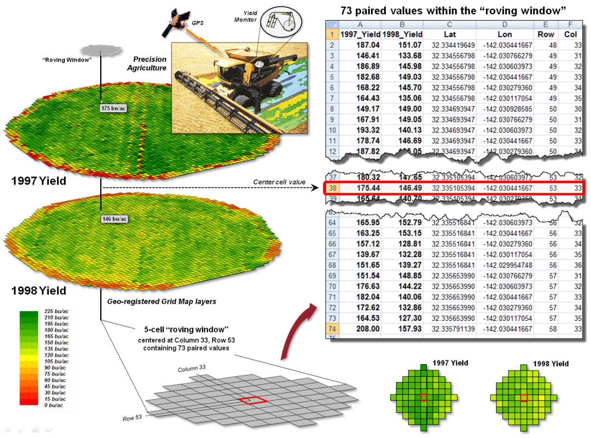
Figure 1. Precision Agriculture yield
maps identify the yield volume harvested from each grid location throughout a
field. These data can be extracted using
a “roving window” to form a localized subset of paired values surrounding a
focal location.
Each grid cell location identifies the paired yield volumes for the two
years. The simplest comparison would be
to generate a Difference map by simply subtracting them. The calculated difference at each location
would tell you how different the yield is between the two years and where the
greatest differences occur. But it
doesn’t go far enough to determine if the differences are “significantly
different” within a statistical context.
An often used procedure for evaluating significant difference is the
paired T-test that assesses whether the means of two groups are statistically
different. Traditionally, an
agricultural scientist would sample several locations in the field and apply
the T-test to the sampled data. But the
yield maps in essence form continuous set of geo-registered sample plots
covering the entire field. A T-test
could be evaluated for the entire set of 3,289 paired yield values (or a
sampled sub-set) for an overall statistical assessment of the difference.
However, the following discussion suggests a different strategy
enabling the T-test concept to be spatially evaluated to identify 1) a
continuous map of localized T-statistic metrics and 2) a binary map the T-test
results. Instead of a single scalar
value determining whether to accept or reject the null hypothesis for an entire
field, the spatially extended statistical procedure identifies where it can be
accepted or rejected—valuable information for directing attention to specific
areas.
The key to spatially evaluating the T-test involves an often used
procedure involving the statistical summary of values within a specified
distance of a focal location, termed a “roving window.” The lower portion of figure 1 depicts a
5-cell roving window (73 total cells) centered on column 33, row 53 in the
analysis frame. The pair of yield values
within the window are shown in the Excel spread sheet
(columns A and B) on the right side of the figure 1.
Figure 2 shows these same data and the procedures used to solve for the
T-statistic within the localized window.
They involve the ratio of the “Mean of the differences” to a normalized
“Standard Deviation of the differences.”
The equation and solution steps are—
TStatistic = dMean / ( dStdev / Sqrt(n) )
Step 1. Calculate the difference (di
= yi − xi) between
the two values for each pair.
Step 2. Calculate the mean difference of the paired observations, dAvg.
Step 3. Calculate the standard deviation of the differences, dStdev.
Step 4. Calculate the T-statistic by dividing the mean difference between the
paired observations by the standard deviation of the difference divided by the
square root of the number of paired values— TStatistic = dAvg /
( dStdev / Sqrt(n) ).
One way to conceptualize the spatial T-statistic solution is to
visualize the Excel spreadsheet moving throughout the field (roving window),
stopping for an instant at a location, collecting the paired yield volume
values within its vicinity (5-cell radius reach), pasting these values into
columns A and B, and automatically computing the “differences” in column C and
the other calculations. The computed
T-statistic is then stored at the focal location of the window and the
procedure moves to the next cell location, thereby calculating the “localized
T-statistic” for every location in the field.
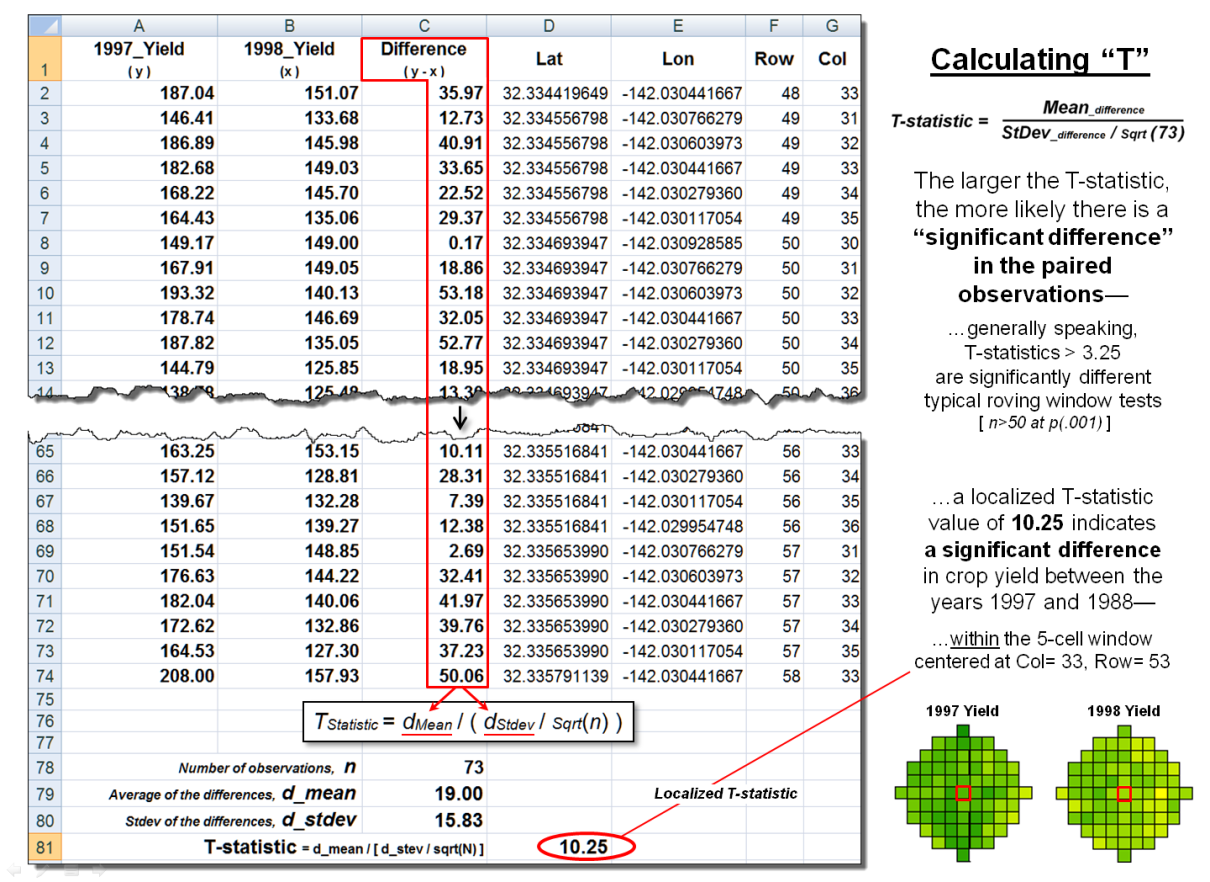
Figure 2. The T-statistic for the set
of paired map values within a roving window is calculated by dividing the Mean
of the Difference to the Standard Deviation of the Mean Differences divided by
the number of paired values.
However, what really happens in the grid-based map analysis solution is
shown in figure 3. Instead of a roving
Excel solution, steps 1 - 3 are derived as a separate map layers using
fundamental map analysis operations. The
two yield maps are subtracted on a cell-by-cell basis and the result is stored
as a new map of the Difference (step 1).
Then a neighborhood analysis operation is used to calculate and store a
map of the “average of the differences” within a roving 5-cell window (step
2). The same operation is used to
calculate and store the map of localized “standard deviation of the
differences” (step 3).
The bottom-left portion of figure 3 puts it all together to derive the
localized T-statistics (step 4). Map
variables of the Mean and StDev of the differences
(both comprised of 3,289 geo-registered values) are retrieved from storage and
the map algebra equation in the lower-left is solved 3,289 times— once for each
map location in the field. The resultant
T-statistic map displayed in the bottom-right portion shows the spatial
distribution of the T-statistic with darker tones indicating larger computed
values (see author’s notes 1 and 2).
The T-test map is derived by simply assigning the value 0 = no
significant difference (yellow) to locations having values less than the
critical statistic from a T-table; and by assigning 1= significant difference
(black) to locations with larger computed values.
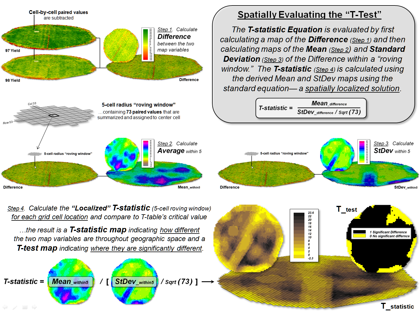
Figure 3. The grid-based map analysis
solution for T-statistic and T-test maps involves sequential processing of map
analysis operations on geo-registered map variables, analogous to traditional, non-spatial algebraic solutions.
The idea of a T-test map at first encounter
might seem strange. It concurrently
considers the spatial distribution of data, as well as its numerical
distribution in generating a new perspective of quantitative data analysis
(dare I say a paradigm shift?). While
the procedure itself has significant utility in its application, it serves to
illustrate a much broader conceptual point— the direct extension of the
structure of traditional math/stat to map analysis and modeling.
Flexibly combining fundamental map analysis
operations requires that the procedure accepts input and generates output in
the same gridded format. This is
achieved by the geo-registered grid-based data structure and requiring that
each analytic step involve—
- retrieval of one or
more map layers from the map stack,
- manipulation that applies
a map-ematical operation to that mapped
data,
- creation of a new map layer
comprised of the newly derived map values, and
- storage of that new map layer back into the map stack for subsequent
processing.
The cyclical nature of the
retrieval-manipulation-creation-storage processing structure is analogous to
the evaluation of “nested parentheticals” in traditional algebra. The logical sequencing of primitive map analysis
operations on a set of map layers (a geo-registered “map stack”) forms the map
analysis and modeling required in quantitative analysis of mapped data (see author’s note
3). As
with traditional algebra, fundamental techniques involving several basic
operations can be identified, such as T-statistic and T-test maps, which are
applicable to numerous research and applied endeavours.
The use of fundamental map analysis operations
in a generalized map-ematical context
accommodates a variety of analyses in a common, flexible and intuitive manner. Also, it provides a familiar mathematical
context for conceptualizing, understanding and communicating the principles of
map analysis and modeling— the SpatialSTEM framework.
_____________________________
Author’s Note:
1) Darian Krieter with DTSgis has developed an ArcGIS
Python script calculating the localized T-statistic available at www.innovativegis.com/basis/MapAnalysis/Topic30/PythonT/;
2) an animated slide for communicating the spatial T-test concept, see www.innovativegis.com/basis/MapAnalysis/Topic30/Spatial_Ttest.ppt,
3) See www.innovativegis.com/basis/Papers/Online_Papers.htm
for a link to an early paper “A Mathematical
Structure for Analyzing Maps.”
Organizing
Geographic Space for Effective Analysis
(GeoWorld, September 2012)
A basic familiarity of the two fundamental data types supporting
geotechnology—vector and raster—is important for understanding map analysis
procedures and capabilities (see author’s note). Vector data is closest to our manual mapping
heritage and is familiar to most users as it characterizes geographic space as collection
of discrete spatial objects (points, lines and polygons) that are easy to
draw. Raster data, on the other hand, describes
geographic space as a continuum of grid cell values (surfaces) that
while easy to conceptualize, requires a computer to implement.
Generally speaking, vector data is best for traditional map display and
geo-query—“where is what,” applications that identify existing
conditions and characteristics, such as “where are the existing gas pipelines
in Colorado” (a descriptive query of existing information). Raster data is best for advanced graphics and
map analysis— “why, so what and what if” applications that analyze
spatial relationships and patterns, such as “where is the best location for a
new pipeline” (a prescriptive model deriving new information).
Figure 1. A raster image is composed
of thousands of numbers identifying different colors for the “pixel” locations
in a rectangular matrix supporting visual interpretation.
Most vector applications involve
the extension of manual mapping and inventory procedures that take advantage of
modern computers’ storage, speed and Internet capabilities (better ways to do
things). Raster applications, however,
tend to involve entirely new paradigms and procedures for visualizing and
analyzing mapped data that advances innovative science (entirely new ways to do
things).
On the advanced graphics front,
the lower-left portion of figure 1 depicts an interactive Google Earth display
of an area in northern Wyoming’s Bighorn Mountains showing local roads
superimposed on an aerial image draped over a 3D terrain perspective. The roads are stored in vector format as an
interconnecting set of line features (vector).
The aerial image and elevation relief are stored as numbers in
geo-referenced matrices (raster).
The positions in a raster image
matrix are referred to as “pixels,” short for picture elements. The value stored at each pixel corresponds to
a displayed color as a combination of red, green and blue hues. For example, the green tone for some of the
pixels portraying the individual tree in the figure is coded as red= 116,
green= 146 and blue= 24. Your eye detects
a greenish tone with more green than red and blue. In the tree’s shadow toward the northwest the
red, green and blue levels are fairly equally low (dark grey). In a raster
image the objective is to generate a visual graphic of a landscape for
visual interpretation.
A raster grid is a different type of raster format where the values
indicate characteristics or conditions at each location in the matrix designed
for quantitative map analysis (spatial analysis and statistics). The elevation surface used to construct a
tilted relief perspective in a Google Earth display is composed of thousands of
matrix values indicating the undulating terrain gradient.
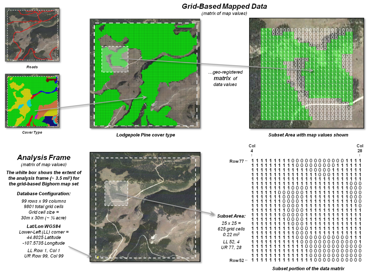
Figure 2. A raster grid contains a
map values for each “grid cell” identifying the characteristic/condition at
that location supporting quantitative analysis.
Figure 2 depicts a raster grid of the vegetation in the Bighorn area by assigning unique classification values to each of the cover types. The upper portion of the figure depicts isolating just the Lodepole Pine cover type by assigning 0 to all of the other cover types and displaying the stored matrix values for a small portion of the project area. While you see the assigned color in the grid map display (green in this example), keep in mind that the computer “sees” the stored matrix of map values.
The lower portion of the figure 2
identifies the underlying organizational structure of geo-registered map
data. An “analysis frame” delineates the
geographic extent of the area of interest and in the case of raster data the
size of each pixel/grid element. In the
example, the image pixel size for the
visual backdrop is less than a foot comprising well over four million values
and the grid cell size for analysis
is 30 meters stored as a matrix with 99 columns and 99 rows totally nearly
10,000 individual cell locations.
For geo-referencing, the
lower-left grid cell is identified as the matrix’s origin (column 1, row1) and
is stored in decimal degrees of latitude and longitude along with other
configuration parameters as a few header lines in the file containing the
matrix of numbers. In most instances,
the huge matrix of numbers is compressed to minimize storage but uncompressed
on-the-fly for display and analytical processing.
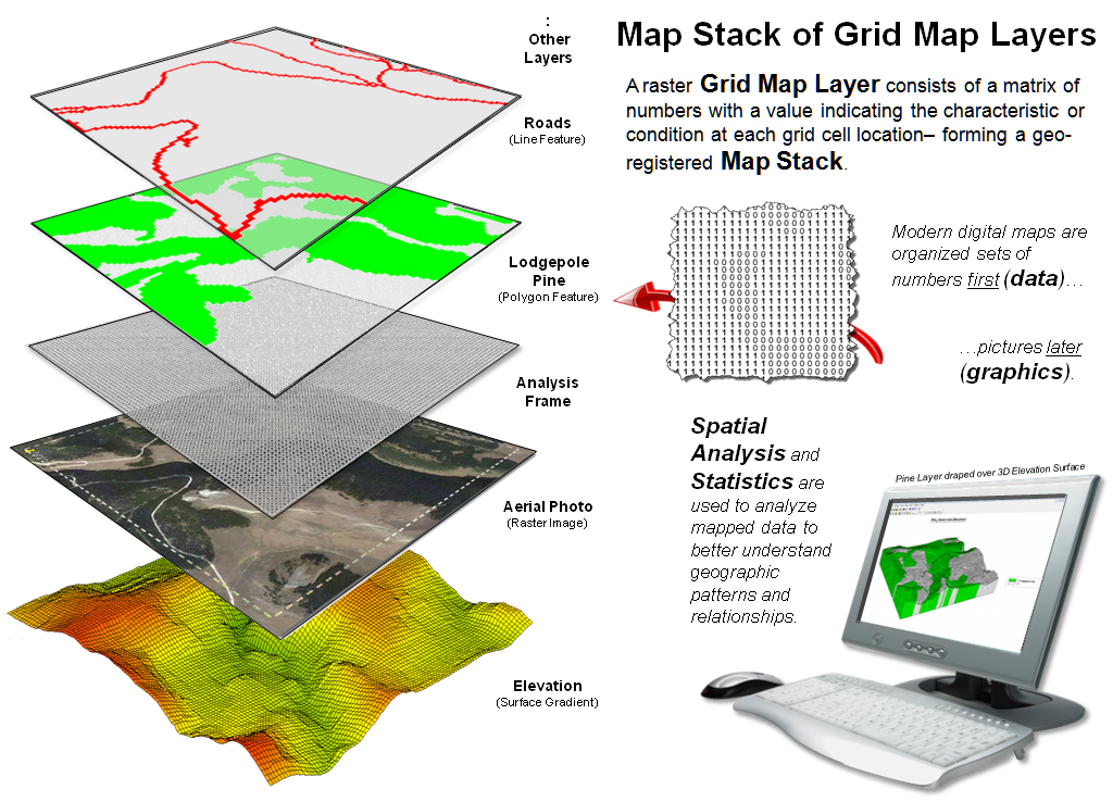
Figure 3. A set of geo-registered map
layers forms a “map stack” organized as thousands upon thousands of numbers
within a common “analysis frame.”
Figure 3 illustrates a broader
level of organization for grid-based data.
Within this construct, each grid map layer in a geographically registered
analysis frame forms a separate theme, such as roads, cover type, image and
elevation. Each point, line and polygon map feature is identified as a grid cell
grouping having a unique value stored in implied matrix charactering a discrete
spatial variable. A surface gradient, on the other hand, is composed of fluctuating
values that track the uninterrupted increases/decreases of a continuous spatial
variable.
The entire set of grid layers
available in a database is termed a map
stack. In map analysis, the
appropriate grid layers are retrieved, their vales map-ematically processed and
the resulting matrix stored in the stack as a new layer— in the same manner as
one solves an algebraic equation, except that the variables are entire grid maps
composed of thousands upon thousands of geographically organized numbers.
The major advantages of grid-based
maps are their inherently uncomplicated data structure and consistent parsing
within a holistic characterization of geographic space—just the way computers
and math/stat mindsets like it. No sets
of irregular spatial objects scattered about an area that are assumed to be
completely uniform within their interiors… rather, continuously defined spatial
features and gradients that better align with geographic reality and, for the
most part, with our traditional math/stat legacy.
The next section’s discussion
builds on this point by extending grid maps and map analysis to “a universal
key” for unlocking spatial relationships and patterns within standard database
and quantitative analysis approaches and procedures.
_____________________________
Author’s Notes: For a more detailed discussion of vector and raster data types and
important considerations, see Topic 18, “Understanding Grid-based Data” in the
online book Beyond Mapping III posted at www.innovativegis.com/basis/MapAnalysis/.
To Boldly Go Where No Map
Has Gone Before
(GeoWorld, October 2012)
Previous sections have described a mathematical framework (dare I say a
“map-ematical” framework?) for quantitative
analysis of mapped data. Recall that Spatial
Analysis operations investigate the “contextual” relationships within
and among maps, such as variable-width buffers that account for intervening
conditions. Spatial Statistics
operations, on the other hand, examine the “numerical” relationships,
such as map clustering to uncover inherent geographic patterns in the data.
The cornerstone of these capabilities lies in the grid-based nature of
the data that treats geographic space as continuous map surfaces composed of
thousands upon thousands of cells with each containing data values that
identify the characteristics/conditions occurring at each location. This simple matrix structure provides a
detailed account of the unique spatial distribution of each map variable and a
geo-registered stack of map layers provides the foothold to quantitatively
explore their spatial patterns and relationships.
The most fundamental and ubiquitous grid form is the Latitude/Longitude
coordinate system that enables every location on
the Earth to be specified by a pair of numbers. The upper portion of figure 1, depicts a 2.50 Lat/Lon grid forming a
matrix of 73 rows by 144 columns= 10,512 cells in total with each cell having
an area of about 18,735mi2.
The lower portion of the figure shows that the data could be stored in
Excel with each spreadsheet cell directly corresponding to a geographic grid
cell. In turn, additional map layers
could be stored as separate spreadsheet pages to form a map stack for
analysis.
Of course this resolution is far too coarse for most map analysis
applications, but it doesn’t have to be.
Using the standard single precision floating point storage of Lat/Long
coordinates expressed in decimal degrees, the precision tightens to less than
half a foot anywhere in the world (365214 ft/degree * 0.000001= .365214 ft *12
= 4.38257 inches or 0.11132 meters).
However, current grid-based technology limits the practical resolution
to about 1m (e.g., Ikonos satellite images) to 10m
(e.g., Google Earth) due to the massive amounts of data storage required.
For example, to store a 10m grid for the state of Colorado it would
take over two and half billion grid cells (26,960km²= 269,601,000,000m² / 100m²
per cell= 2,696,010,000 cells). To
store the entire earth surface it would take nearly a trillion and a half cells
(148,300,000km2 = 148,000,000,000,000m2 /
100m² per cell= 1,483,000,000,000 cells).
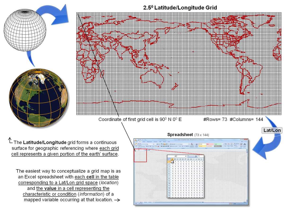
Figure 1. Latitude and Longitude
coordinates provide a universal framework for parsing the earth’s surface into
a standardized set of grid cells.
At first these storage loads seem outrageous but with distributed cloud
computing the massive grid can be “easily” broken into manageable
mouthfuls. A user selects an area of
interest and data for that area is downloaded and stitched together. For example, Google Earth responds to your
screen interactions to nearly instantaneously download millions of pixels,
allowing you to pan/zoom and turn on/off map layers that are just a drop in the
bucket of the trillions upon trillions of pixels and grid data available in the
cloud.
Figure 2 identifies another, more practical mechanism for storage using
a relational database. In essence, each
of the conceptual grid map spreadsheets can be converted to an interlaced
format with a long string of numbers forming the columns (data fields); the
rows (records) identify the information available each of the individual grid
cells that form the reference grid.
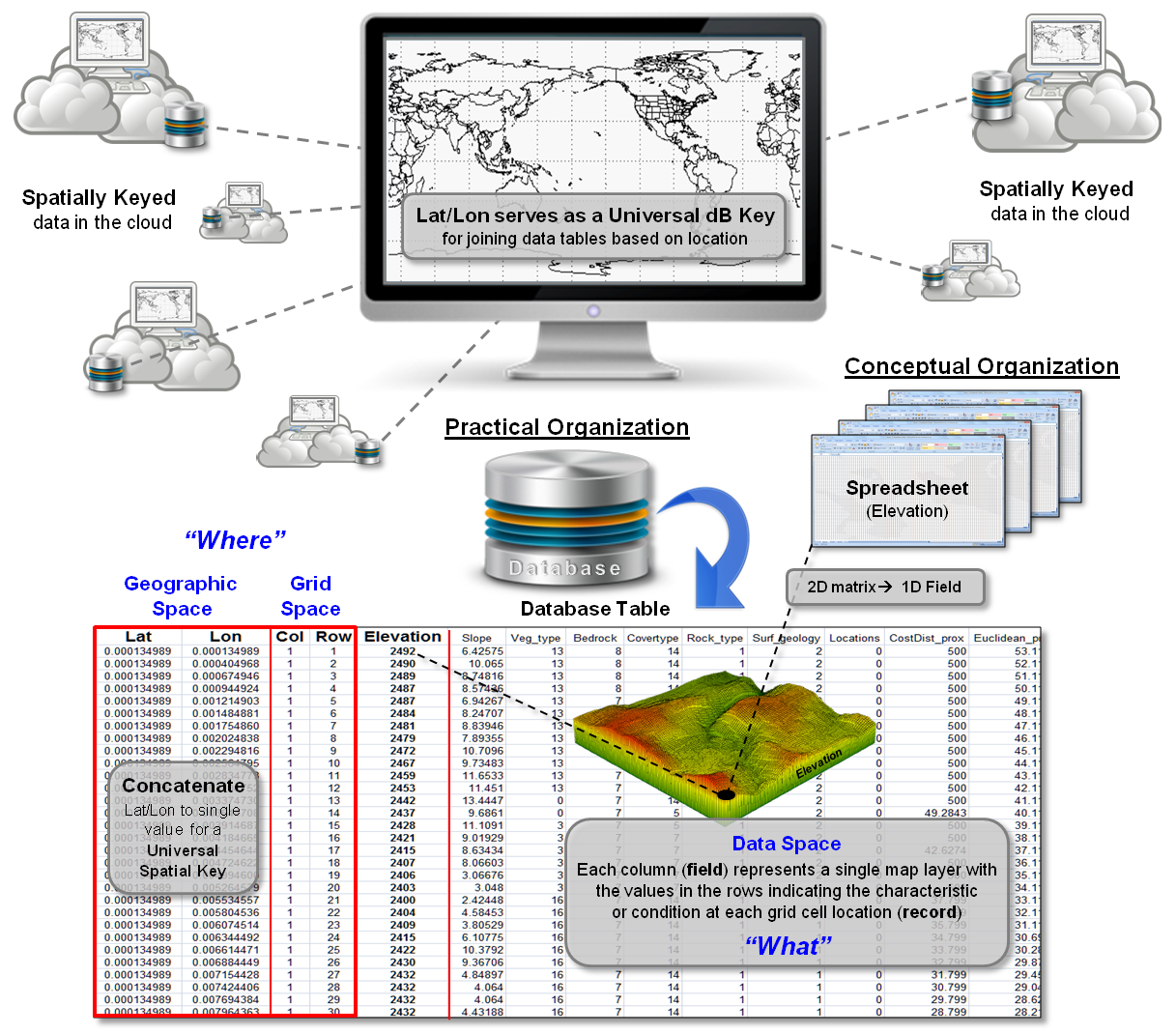
Figure 2. Within a relational
database, Lat/Lon forms a Universal DBMS Key for joining tables.
For fairly small areas of up to a million or so cells this is an
excellent way to store grid maps as their spatial coincidence is inherent in
the organization and the robust standard set of database queries and processing
operations is available. Larger grids
use more advanced, specialized mechanisms of storage to facilitate data
compression and virtual paging of fully configured grid layers.
But the move to a relational database structure is far more important
than simply corralling mega-gulps of map values. It provides a “Universal DBMS Key” that can
link seemingly otherwise disparate database tables (see Authors Note). The process is similar to a date/time stamp,
except the “where information” provides a spatial context for joining data
sets. Demographic records can be linked
to resource records that in turn can be linked to business records, health
records, etc— all sharing a common Lat/Lon address.
All that is necessary is to tag your data with its Lat/Lon coordinates
(“where” it was collected) just as you do with the date/time (“when” it was
collected) …not a problem with the ubiquitous availability and increasing
precision of GPS that puts a real-time tool for handling detailed spatial data
right in your pocket. In today’s
technology, most GPS-enabled smart phones are accurate to a few meters and
specialized data collection devices precise to a few centimeters.
Once your data is stamped with its “spatial key,” it can be linked to
any other database table with spatially tagged records without the explicit
storage of a fully expanded grid layer.
All of the spatial relationships are implicit in the relative
positioning of the Lat/Lon coordinates.
For example, a selection operation might be to identify of all health
records jointly occurring within half a kilometer of locations that have high
lead concentrations in the top soil. Or,
locate all of the customer records within five miles of my store; better yet,
within a ten-minute drive from a store.
Geotechnology is truly a mega-technology that will forever change how
we perceive and process spatial information.
Gone are the days of manual measurements and specialized data formats
that have driven our mapping legacy.
Lat/Lon coordinates move from cross-hairs for precise navigation
(intersecting lines) to a continuous matrix of spaces covering the globe for
consistent data storage (grid cells).
The recognition of a universal spatial key coupled with spatial
analysis/statistics procedures and GPS/RS technologies provides a firm foothold
“to boldly go where no map has gone before.”
_____________________________
Author’s Note: See the online book Beyond Mapping III posted at www.innovativegis.com/basis/MapAnalysis/,
Topic 28, “Spatial Data Mining in Geo-Business,” section on The Universal Key
for Unlocking GIS’s Full Potential (October 2011 column).
The Spatial Key to Seeing the
Big Picture
(GeoWorld, September 2013)
The previous section described the standard Latitude/Longitude grid as
a “Universal Spatial dB Key” that is comparable to the date/time tagging of
records in most database systems. With
general availability of GPS coordinates on most data collection devices,
cameras, smartphones and tablets, earth position can be easily stamped with
each data record. Couple that with
geo-coding by street address and most data collected today has a triplet of
numbers indicating location (where), as well as characteristic/condition
(what)—XY and Value designating “where is what.”
Data flowing from a “spatially aware database” can be thought of as a
faucet spewing data that meets a query (figure 1). In turn, each value flows to the appropriate
grid cell based on its Lat/Lon tag. The
process can be conceptualized as the “what” attributes aligning within an
analysis frame (matrix of numbers) that characterizes the spatial pattern/distribution
inherent in a set of data.
While the long history of quantitative data analysis focused on the numerical
distribution of data, quantitative analysis of the spatial distribution
of geospatial data provides an new frontier for understanding spatial patterns
and relationships influencing most physical, biological, environmental,
economic, political and cultural systems.
The recognition, development and application of this fresh math/stat
paradigm (sort of a “map-ematics”) promises to revolutionize
how we extract and utilize information from field collected data (see Author’s
Note 1).
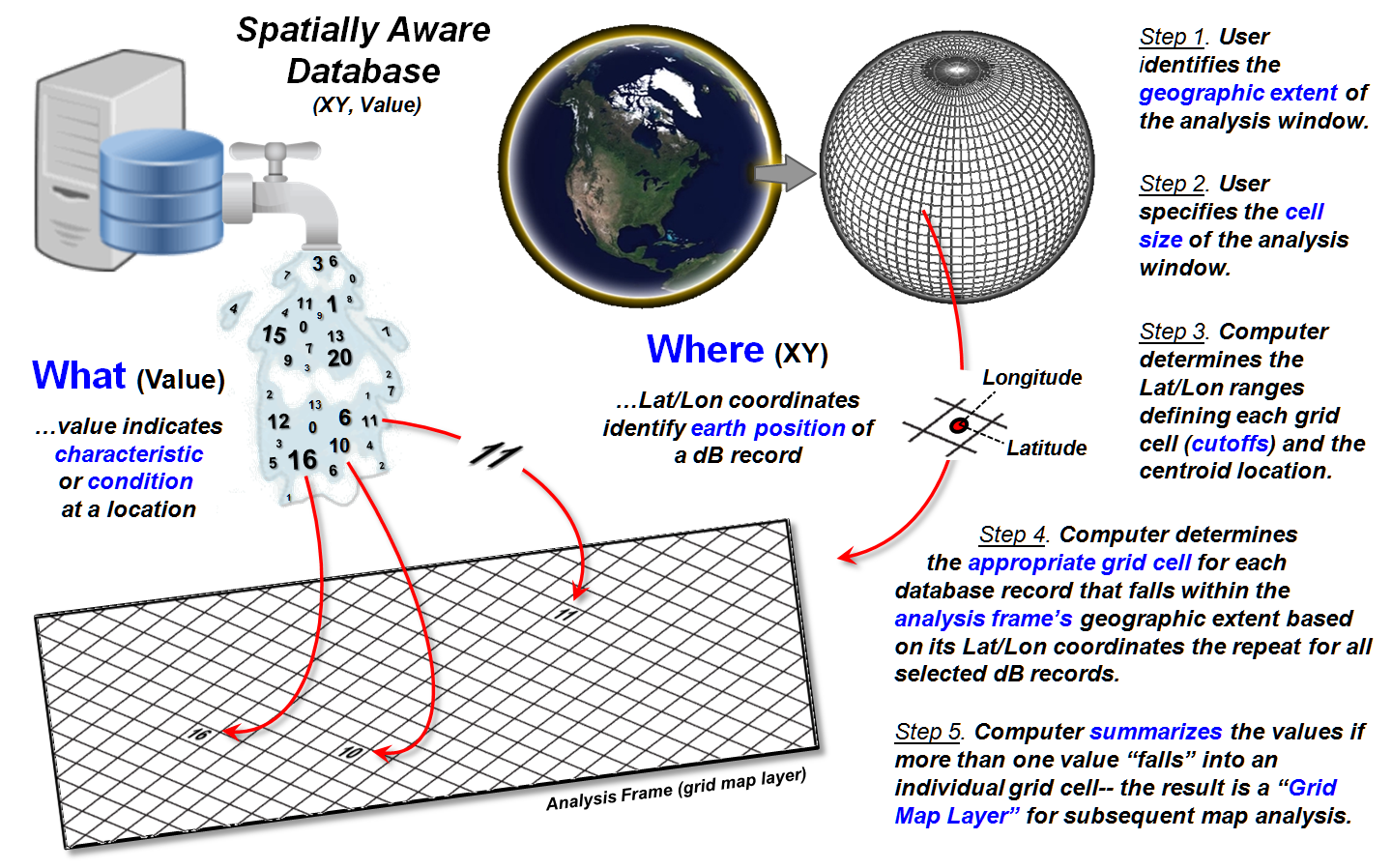
Figure 1. Steps in generating a grid
map layer from spatially tagged data.
Converting spatially tagged data into grid maps is outlined on the
right side of figure 1 as a five step process.
The user first identifies the “geographic extent” of an area of interest
by interactively dragging a box on a map or by entering Lat/Lon coordinates for
the boundary (Step 1).
An appropriate “cell size” for analysis is then entered as length of a
side of an individual grid cell (Step 2).
The smaller the cell size the higher the spatial resolution affording
greater detail in positioning but resulting in exponentially larger matrices
for storage. User judgment is applied to
balance the precision (correct placement), accuracy (correct characterization)
and storage/performance demands (see Author’s Note 2).
In Step 3, the computer divides
the lengths of the NS and EW sides of the project area extent by the cell size
to determine the number of rows and columns of a matrix (termed the Analysis Frame) used to store grid layer
information (map variables). This establishes
an algorithm for determining the Lat/Lon ranges defining each grid cell and its
centroid position. Considerations and
implications surrounding this technically tricky step (3D curved earth to 2D
flat matrix) are reserved for later discussion.
Based on the positioning
algorithm’s calculations, each geo-tagged value flowing from the database can
be placed in the appropriate row/column position in the analysis frame’s matrix
(Step 4). The processing is repeated for
all of the selected dB records. If more
than one value “falls” into a grid cell the values are summarized on-the-fly
(Step 5).
Figure 2 depicts the
considerations surrounding the summary of multiple data values sharing a single
grid cell. The condition can be
conceptualized as a “shish kebab of numbers” that needs to be reduced to an
overall value that best typifies the actual characteristic/condition at that
location.
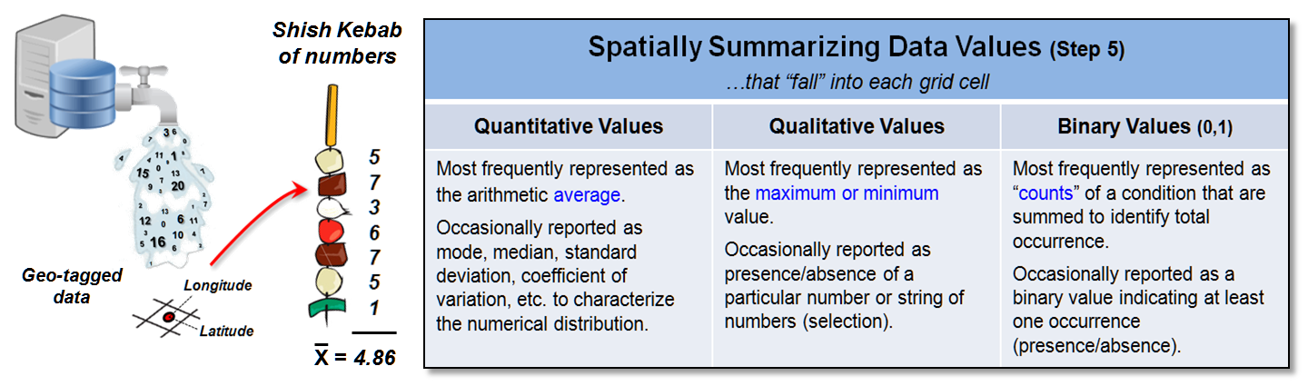
Figure 2. Summarizing
multiple data values falling in a single grid cell.
The data type of the numbers determines the summary techniques
available. Most often quantitative values
are averaged as shown in the figure but other statistical metrics can be used
depending on the application.
Qualitative values are typically assigned the maximum or minimum value
encountered in the string. Binary
values, such as crime occurrence, are usually summed to identify total count of
instances at each grid location.
The result of the five step procedure creates a grid map layer
identifying the “discrete” spatial pattern of the data that is analogous
to a histogram in non-spatial statistics.
In most applications, spatial interpolation or density analysis
techniques are used to derive a continuous grid map layer characterizing
the spatial distribution of the data which is analogous to fitting a standard
normal curve to a histogram (see Author’s Note 3). Once in this generalized form, most
traditional quantitative analysis techniques (plus some spatially unique
techniques) can be applied to investigate the spatial distribution, as well as
the numerical distribution of the data.
The muddling concerns in applying the Lat/Lon grid as a Universal
Spatial dB Key is in representing curved 3D earth positions as flat 2D cells of
a matrix. Figure 3 shows the reality of
the grid cell shape that morphs from squares to stretched rectangles to
elongated trapezoids with north/south movement away from the equator (see
Author’s Note 4).
Relatively small changes in the length of a degree of “latitude
parallels” occur because of polar flattening— earth is an oblique spheroid
instead of a perfect sphere due to centrifugal forces as the earth spins. However huge changes occur for “longitude
meridians” as the lines converge at the poles— a degree of longitude is widest
at the equator and gradually shrinks to zero at the poles.
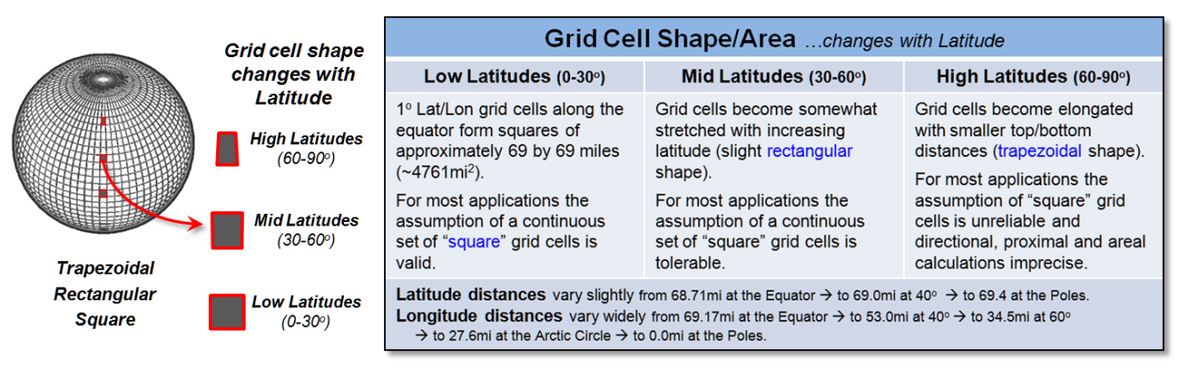
Figure 3. The area and shape of
Lat/Lon grid cells varies with increasing latitude.
The bottom line is that directly representing the Lat/Lon grid as a
two-dimensional matrix can be unreliable for large project areas at the higher
latitudes. However two caveats are in
play. One is that projection algorithms
can be applied on-the-fly to transform the curved 3D coordinates to a planar
representation and then back to lat/Lon.
The other is that for many applications involving relatively small
project areas at low or mid latitudes, the positional precision tolerable. The notion of “tolerable” precision is what
most differentiates “mapping” from “map analysis.” While neighbors and armies fight over inches
in the placement of borders, most data analysts are more accommodating and
satisfied knowing things are much higher (or lower) over there as compared to
here—a few inches or feet (or even miles in some cases) misplacement doesn’t
obscure the big picture of the spatial distribution and relationships.
_____________________________
Author’s Notes:
1) See, Topic 30, “A Math/Stat Framework for Grid-based Map Analysis and Modeling;”
2) see Introduction, section 2, “Determining
Exactly Where Is What;” 3) see Topic 2, “Spatial Interpolation Procedures and
Assessment” and Topic 7, “Linking Data Space and Geographic Space” in the online
book Beyond Mapping III posted at www.innovativegis.com/basis/. 4) For a detailed discussion of latitude and
longitude considerations see www.ncgia.ucsb.edu/giscc/units/u014/u014.html
in the NCGIA Core Curriculum in Geographic Information Science, by Anthony P. Kirvan and edited by Kenneth Foote.
Laying the Foundation
for SpatialSTEM: Spatial Mathematics, Map Algebra and Map
Analysis
(GeoWorld, October 2013)
Mathematics in general and geometry and trigonometry in particular have
long been the keystone to mapping—from Spatial Mathematics that enables the
development of mapped data; to a generalized Map Algebra for expressing math/stat
relationships among map variables; to a comprehensive Map Analysis toolbox that
extends traditional quantitative data analysis procedures by considering the
spatial distribution and interaction of mapped data layers.
Several years ago, Nigel Waters wrote a short synopsis on “The Most
Beautiful Formulae in GIS” where he described the ten most useful Spatial
Formulae and the ten most useful Attribute-related Formulae chosen for their elegance,
simplicity, and generality, as well as their wide applicability and power (see
author’s note 1). More recently, the
book “Spatial Mathematics: Theory and Practice through Mapping” by Arlinghaus and Kerski further develops the wealth of enabling
Spatial Mathematics equations and techniques (see author’s note 2).
These and a host of similar treatises provide a comfortable conceptual
springboard for STEM disciplines to extend traditional scalar mathematics into
the spatial realm. The digital map expressed
as an organized set of numbers fuels this transition— today “maps are numbers
first, pictures later.” The result is a
generalized Map Algebra (see author’s note 3) enabling a user to add, subtract,
divide, raise to a power, root, log and even differentiate and integrate digital
maps— all of the functionality of a pocket calculator (and then some) operating
on geo-registered stacks of digital maps.
This algebraic framework provides a comprehensive toolbox of primitive mathematical
operations transitioning traditional quantitative data analysis into Map
Analysis that infuses the consideration of spatial patterns and relationships
into the analysis. From this
perspective, the spatial distribution of data is as important as its numerical
distribution in analyzing map variables.
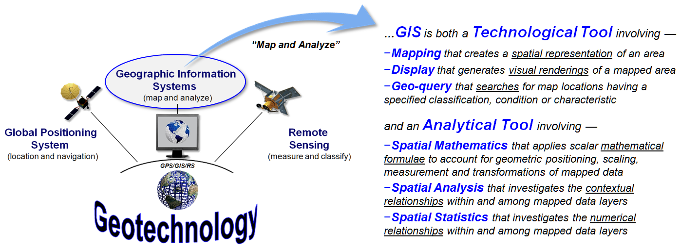
Figure 1. GIS can be viewed as both a
“Technological Tool” and an “Analytical Tool.”
Figure 1 provides a 40,000-foot overview of the evolving field of
Geotechnology, one of the three mega-technologies for the 21st century
as identified by the U.S. Department of Labor (the other two are Biotechnology
and Nanotechnology). The left side of the
figure depicts the “spatial triad” of technologies (GPS, GIS and RS) comprising
Geotechnology that collects, stores, retrieves, processes, and displays digital
mapped data. The mapping and analysis
capabilities of GIS can be characterized as both a “Technological Tool” involving
mapping, display and geo-query and an “Analytical Tool” involving spatial
mathematics, analysis and statistics.
As a technological tool, GIS greatly extends traditional mapping and
inventory techniques involving laborious, inefficient and generally ineffective
manual procedures employed just a few decades ago. Today it is commonplace to get real-time
routing directions, superimposed on an interactive map with a satellite image
backdrop and a street view of your destination; all from a smartphone that rivals
the computing power of a mainframe computer a few decades ago. For the most part, static paper maps have
given way to dynamic digital mapped data that can be interactively viewed and
processed in radically new ways—a revolution that is simply amazing for anyone
over thirty, yet commonplace for those who are younger.
The meteoric rise in the technical expressions of Geotechnology is in
large part due to its easily envisioned extension of its manual mapping and
inventory legacies. Database systems
replaced the walls of file cabinets (attribute data) and digital maps replaced
paper maps (spatial data). Linking the two
data set perspectives spawned a radically new paradigm of what a map is and isn’t
and catapulted mapping to “mega-technology” status.
Is a similar canonic step and radically changed paradigm in the future
for traditional quantitative data analysis concepts, procedures and
applications? What are the impediments
holding back GIS as an analytical tool?
What are the inducements needed for advancing spatially-aware
quantitative data analysis?
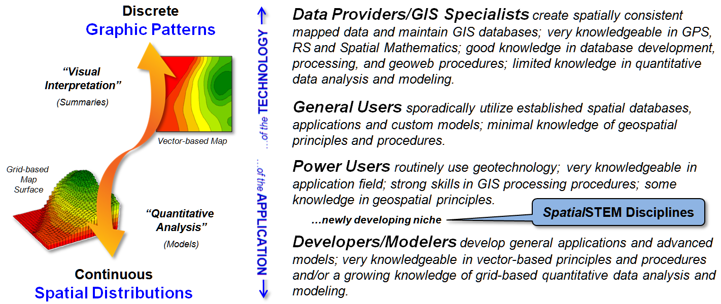
Figure 2. Types of
GIS data, users and applications.
Figure 2 outlines the data, users and application approaches that is fueling
this transformation. A major hurdle is
the historical perspective of maps as being comprised of discrete spatial
objects (point, line and areal patterns) as depicted in the 2D vector-based map
in the upper-left portion of the figure.
While this vector data format is comfortable and ideal for human
visual interpretation, it lacks the spatial specificity and consistency required
by advanced analysis procedures needed by most the STEM research and applications.
Alternatively, raster data depicted in the lower-left portion of
the figure provides a continuous and consistent data form that is preconditioned
for quantitative data analysis. A
grid-based map surface tracks subtle spatial variations of a map variable as an
uninterrupted gradient instead of aggregating the detailed data into discrete
ranges (i.e., contour intervals).
In addition, the matrix structuring provides a consistent “analysis frame”
for a geo-registered stack of map layers for a project area. Within this grid structure the row, column locators
implicitly carry all of the necessary spatial topology relating each grid location
to the positioning of all other locations within a single map layer and among
multiple layers in a geo-registered map stack.
The right side of figure 2 identifies several types of GIS users. Currently, most of the GIS community is
comprised of Data Providers, GIS Specialists, and General Users who are primarily
involved with the technical aspects of GIS and their vector processing expressions—
creating, maintaining and accessing mapped data and then executing standardized
processing routines. These users can be
thought of as “of the technology.”
The Power Users, Developers and Modelers, on the other hand, are more
“of the application.” Within this
context, domain expertise identifies the scope of a problem and the map variables
involved and then map analysis capabilities are used to uncover spatial relationships
that then forms a spatially-aware solution.
It is in this arena that a “newly developing niche for SpatialSTEM” is
poised to take-hold (see author’s note 4).
Einstein noted that “we cannot solve our problems with the same level
of thinking that created them” and that “the formulation of the problem is
often more essential than its solution, which may be merely a matter of
mathematical or experimental skill.”
This thinking suggests that the STEM disciplines need to be actively engaged
and leading the search for spatially-aware solutions to today’s complex spatial
problems. Also, it recognizes that
geospatial technologists need to fully recognize the quantitative nature mapped
data and embrace its analytical potential, as well as its technical application.
However when it comes to Map Analysis (grid-based Spatial Analysis and Spatial
Statistics operations), the old adage that “they who
know not, know not they know not” takes center stage and the status quo paradigms
of science and technology continue to dominate education, research and application
development. As long as a conceptual
chasm exists between the mapping and quantitative analysis communities, spatially-aware
solutions to complex problems will continue to be mostly side-lined.
_____________________________
Author’s Notes:
1) See “The Most Beautiful Formulae in GIS” by Nigel Waters (1995) posted at www.innovativegis.com/basis/MapAnalysis/Topic30/Beautiful_Formulae.pdf. 2) See
“Spatial Mathematics: Theory and
Practice through Mapping” by Sandra Arlinghaus
and Joseph Kerski (2013, www.crcpress.com/product/isbn/9781466505322).
3) The concepts and procedures behind Spatial
Mathematics was introduced by David Unwin with the
University of London (Introductory Spatial Analysis, 1981, Methuen New York) and
subsequently developed as a set-based
Map Algebra for manipulating raster map layers by Dana Tomlin as a doctoral
student at Yale University (Geographic
Information Systems and Cartographic Modeling, 1990, Prentice-Hall, Englewood,
New Jersey). 4) A twelve-part compilation
of Beyond Mapping columns describing the math/stat
framework, classification of procedures and future directions of SpatialSTEM is
posted at www.innovativegis.com/basis/MapAnalysis/Topic30/Topic30.htm.
Recasting Map Analysis Operations
for General Consumption
(GeoWorld, February 2013)
Earlier discussions have suggested that there is “a
fundamental mathematical structure underlying grid-based map analysis and
modeling that aligns with traditional non-spatial quantitative data analysis”
(see Author’s Note 1). This
conceptual framework provides a common foothold for understanding,
communicating and teaching basic concepts, procedures and considerations in
spatial reasoning and analysis resonating with both GIS and non-GIS
communities—a SpatialSTEM schema—that can be applied to any grid-based
map analysis system (see Author’s Note 2).
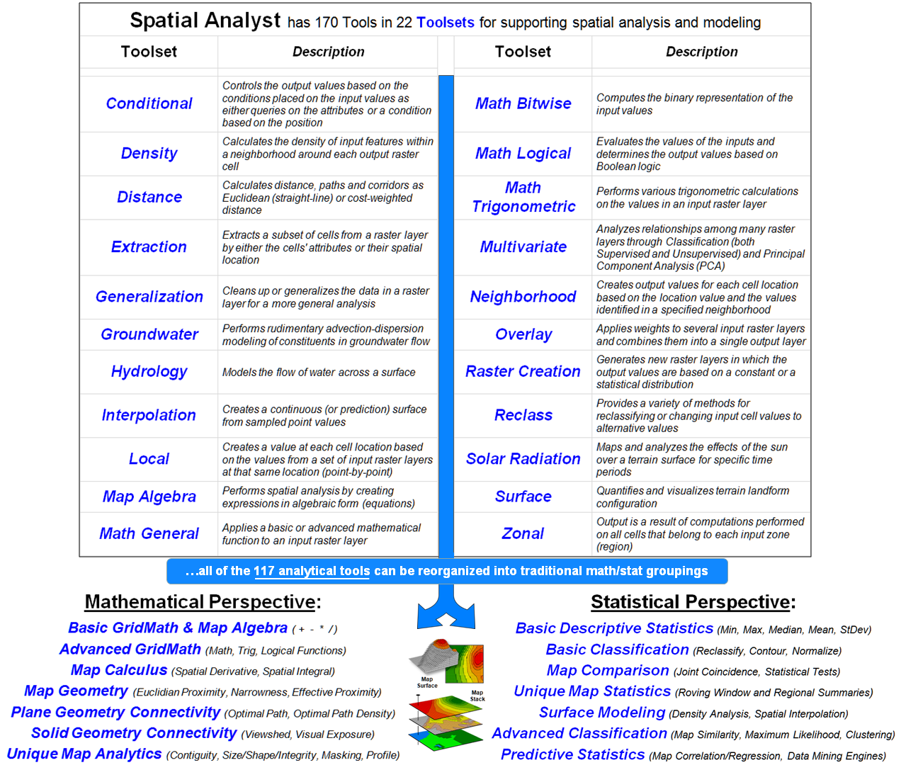
Figure 1. Grid-based map analysis
operations in any GIS system, such as Spatial Analyst, can be reorganized into
commonly understood classes of traditional quantitative data analysis.
For example, the top portion of figure 1 identifies the 22 map analysis
“toolsets” containing over 170 individual “tools” in the Spatial Analyst module
(ArcGIS by Esri). The organization of
the classes of operations involves a mixture of—
-
Traditional math/stat procedures (Conditional,
Map Algebra, Math General, Math Bitwise, Math Logical, Math Trigonometric,
Multivariate, Reclass);
-
Extensions of traditional math/stat procedures (Distance,
Interpolation, Surface);
-
Unique map analysis procedures (Density, Local,
Neighborhood, Overlay, Zonal);
-
Application-specific procedures (Groundwater,
Hydrology, Solar Radiation); and
-
Housekeeping tasks (Extraction, Generalization, Raster Creation).
In large part, this toolset structuring is the result of the module’s
development over-time responding to “business case” demands by clients instead
of a comprehensive conceptual organization.
In contrast, Tomlin’s “Local, Focal, Zonal and Global” classes
characterize the analytical operations on how the input data is obtained for
processing, while my earlier groupings of “Reclassify, Overlay, Distance,
Neighbors and Statistical” reflect the characteristics of the mapped data
generated by the processing.
However, all three of these GIS-based schemas are foreign and confusing
to the vast majority of potential map analysis users (all STEM disciplines) as
they do not align with their traditional quantitative data analysis
experiences. This conceptual disconnect
keeps GIS on the sidelines of the much larger quantitative analysis communities
and reinforces the idea that GIS is a “technical tool” (mapping and geoquery)
not a full-fledged “analytical tool” (spatial analysis and statistics).
The bottom portion of figure 1 identifies the two broad categories of
traditional data analysis— Mathematics and Statistics—broken into seven major
groupings that resonate with non-GIS communities. All of Spatial Analysts’ 117 analytical
operations (the other 53 are “reporting/housekeeping”) can be reorganized into
the commonly recognized quantitative analysis categories.
Figures 2 and 3 at the end of this section show my
initial attempts at the reorganization (see Author’s Note 3).
The bottom line is that the SpatialSTEM framework recasts map analysis
concepts and procedures into a more generally understood organization. Within this general schema, map analysis is
recognized as a set of natural extensions to familiar non-spatial math/stat
operations. For example—
-
A high school math teacher might follow a discussion
of the Pythagorean Theorem with “…but what if there is an impassible barrier
between the two points? The distance is
no longer a straight line but some sort of a ‘bendy-twisty’ route around the
barrier. How would you calculate the
not-necessarily-straight distance? The
‘Splash Algorithm’ does that by…” (you know the rest
of the story).
-
Or a statistics instructor might follow a
lecture on the derivation of the Standard Normal Curve for characterizing the ‘numerical
distribution’ of a data set with “…but what about the ‘spatial distribution’ of
the data? Is data always uniform or
randomly distributed in geographic space?
How could you characterize/visualize the spatial distribution? ‘Spatial Interpolation’ does that by…” (you know the rest of the story).
-
Or an environmental science teacher might
follow a lecture on the use of riparian buffers with “…but are all ‘buffer-feet
the same’? What about the slope of the
surrounding terrain? …and the type of soil? …and the density of vegetation? Wouldn’t an area along a stream that is steep
with an unstable soil and minimal vegetation require a much larger setback than
an area that is flat with stable soils and dense vegetation? How could you create a variable-width buffer
around streams that considers the intervening erosion conditions? A simple ‘sediment loading model does that
by…” (you know the rest of the story).
-
Or a crop scientist who historically
calculated the increase (decrease) in yield over a previous year for a new
genetic variety as the percent change in the total “weigh-wagon” records for an
entire trial field. But with GPS-enabled
yield maps that automatically collect on-the-fly yield measurements as a
harvester moves through a field, a detailed map of the percent change can be
generated by spatially evaluating the standard algebraic equation by… (you know the rest of the story).
-
Or a sales manager can use ‘address
geo-coding’ to sprinkle sales data onto a grid map and then compute ‘roving
window’ totals to generate a sales density surface showing where sales are high
(or low) throughout each of several sales territories. The map analysis can be extended to calculate
areas of unusually high (or low) sales by identifying locations that are more
than one standard deviation above (or below) the average sales density… (you know the rest of the story).
Dovetailing map analysis with traditional quantitative analysis
thinking moves GIS from a “specialty discipline down the hall and to the right”
for mapping and geoquery, to an integrated and active role in the spatial
reasoning needed by tomorrow’s scientists, technologists, decision-makers and
other professionals in solving increasing complex and knurly real-world
problems. From this perspective,
“thinking with maps” becomes a true fabric of society thus fulfilling GIS’s
mega-technology promise.
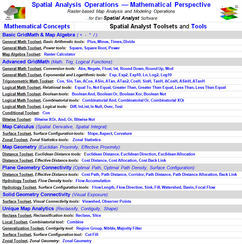
Figure 2. Reorganization
of Spatial Analyst’s analytical “tools” into traditional
mathematical categories.
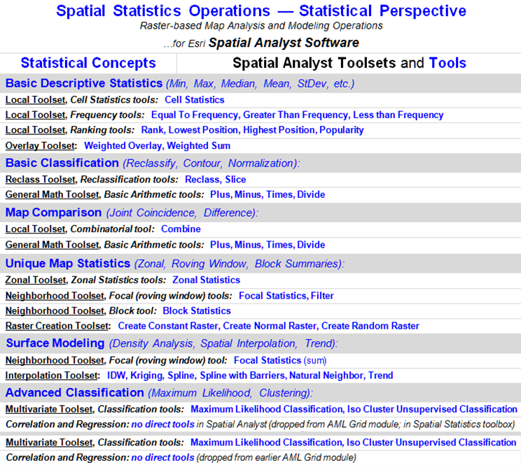
Figure 3. Reorganization
of Spatial Analyst’s analytical “tools” into traditional
statistical categories.
_____________________________
Author’s Note:
1) see the Chronological Listing of Beyond Mapping columns posted at www.innovativegis.com/basis/MapAnalysis/ChronList/ChronologicalListing.htm;
2) for numerous links to papers, PowerPoint slide sets and other materials
describing the SpatialSTEM framework, see www.innovativegis.com/Basis/Courses/SpatialSTEM/;
3) at the same SpatialSTEM posting, see
the white paper entitled “Math/Stat Classification of Spatial Analysis and
Spatial Statistics Tools (Spatial Analyst by Esri)” more detailed description of the recasting of Spatial Analyst’s
operations by traditional non-spatial mathematics and statistics
categories.
(Back to the Table of Contents)