Beyond Mapping III
|
Map
Analysis book with companion CD-ROM
for hands-on exercises and further reading |
A Three-Step Process Identifies Preferred
Routes — describes
the basic steps in Least Cost Path analysis
Consider Multi-Criteria When Routing — discusses
the construction of a discrete “cost/avoidance” map and optimal path corridors
A Recipe for Calibrating and Weighting GIS
Model Criteria — identifies
procedures for calibrating and weighting map layers in GIS models
Think with Maps to Evaluate Alternative
Routes — describes
procedures for comparing routes
’Straightening’ Conversions Improve
Optimal Paths — discusses
a procedure for spatially responsive straightening of optimal paths
Use LCP Procedures to Center Optimal Paths — discusses
a procedure for eliminating “zig-zags” in areas of minimal siting preference
Connect All the Dots to Find Optimal
Paths — describes
a procedure for determining an optimal path network from a dispersed set of end
points
Use Spatial Sensitivity Analysis to Assess
Model Response — develops
an approach for assessing the sensitivity of GIS models
Least Cost Path Review — brief
review of the
Extended Experience Materials — provides
hands-on experience with Optimal Path analysis
Author’s
Notes: The figures in this topic use MapCalcTM
software. An educational CD with online
text, exercises and databases for “hands-on” experience in these and other
grid-based analysis procedures is available for US$21.95 plus shipping and
handling (www.farmgis.com/products/software/mapcalc/
).
<Click
here> right-click to download a printer-friendly version of this topic
(.pdf).
(Back to the Table of Contents)
______________________________
A
Three-Step Process Identifies Preferred Routes
(GeoWorld, July 2003, pg. 20-21)
Suppose you needed to locate the best route for a proposed highway, or pipeline or electric transmission line. What factors ought to be considered? How would the criteria be evaluated? Which factors would be more important than others? How would you be able to determine the most preferred route considering the myriad of complex spatial interactions?
For example, you might be interested identifying the most preferred route for a power line that minimizes its visual exposure to houses. The first step, as shown in figure 1, involves deriving an exposure map that indicates how many houses are visually connected to each map location. Recall from previous discussion that visual exposure is calculated by evaluating a series of “tangent waves” that emanate from a viewer location over an elevation surface (see Map Analysis, Topic 15, Deriving and Using Visual Exposure Maps).
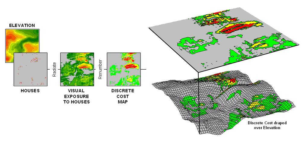
Figure 1. (Step 1) Visual Exposure levels (0-40 times seen) are translated into values indicating relative cost (1=low as grey to 9=high as red) for siting a transmission line at every location in the project area.
This process is analogous to a searchlight rotating on top of a house and marking the map locations that are illuminated. When all of the viewer locations have been evaluated a map of Visual Exposure to houses is generated like the one depicted in the left inset. The specific command (see author’s note) for generating the exposure map is RADIATE Houses over Elevation completely For VisualExposure.
In turn, the exposure map is calibrated into relative preference for siting a power line— from a cost of 1 = low exposure (0 -8 times seen) = most preferred to a cost of 9 = high exposure (>20 times seen) = least preferred. The specific command to derive the Discrete Cost map is RENUMBER VisualExposure assigning1 to 0 through 8 assigning 3 to 8 through 12 assigning 6 to 12 through 20 assigning 9 to 20 through 1000 for DiscreteCost.
The right-side of figure 1 shows the visual exposure cost map draped on the elevation surface. The light grey areas indicate minimal cost for locating a power line with green, yellow and red identifying areas of increasing preference to avoid. Manual delineation of a preferred route might simply stay within the light grey areas. However a meandering grey route could result in a greater total visual exposure than a more direct one that crosses higher exposure for a short stretch.
The Accumulative Cost procedure depicted in figure 2, on the other hand, uses effective distance to quantitatively evaluate all possible paths from a starting location (existing power line tap in this case) to all other locations in a project area. Recall from previous discussion that effective distance generates a series of increasing cost zones that respond to the unique spatial pattern of preferences on the discrete cost map (see Author’s Note 1).
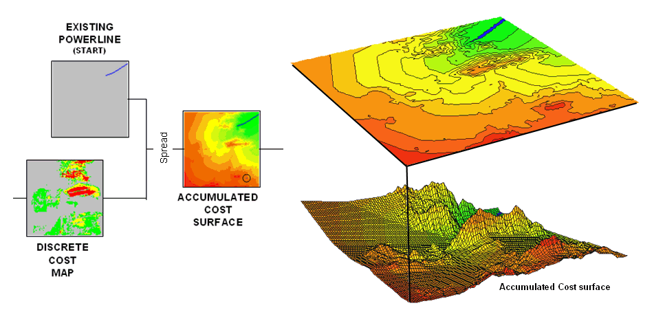
Figure 2. (Step 2) Accumulated Cost from the
existing power line to all other locations is generated based on the Discrete Cost
map.
This process is analogous to tossing a rock into a still pond—one away, two away, etc. With simple “as the crow flies” distance the result is a series of equally spaced rings with constantly increasing cost. However, in this instance, the distance waves interact with the pattern of visual exposure costs to form an Accumulation Cost surface indicating the total cost of routing a route from the power line tap to all other locations—from green tones of relatively low total cost through red tones of higher total cost. The specific command to derive the accumulation cost surface is SPREAD Powerline through DiscreteCost for AccumulatedCost.
Note the shape of the zoomed 3D display of the accumulation surface in figure 3. The lowest area on the surface is the existing power line—zero away from itself. The “valleys” of minimally increasing cost correspond to the most preferred corridors for sighting the new power line on the discrete cost map. The “mountains” of accumulated cost on the surface correspond to areas high discrete cost (definitely not preferred).
The path draped on the surface identifies the most preferred route. It is generated by choosing the steepest downhill path from the substation over the accumulated cost surface using the command STREAM Substation over AccumulatedCost for MostPreferred_Route. Any other route connecting the substation and the existing power line would incur more visual exposure to houses.
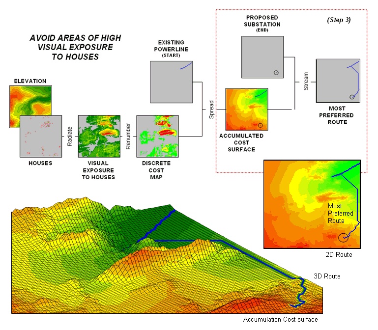
Figure 3. (Step 3) The steepest downhill path from the Substation over the Accumulated Cost
surface identifies the
The three step process (step 1 Discrete Costà step 2 Accumulated Costà step 3 Steepest Path) can be used to help locate the best route in a variety of applications. The next section will expand the criteria from just visual exposure to other factors such as housing density, proximity to roads and sensitive areas. The discussion focuses on considerations in combining and weighting multiple criteria that is used to generate alternate routes.
_________________
Author's Note 1: Map Analysis, Topic 14, Deriving and Using
Travel-Time Maps).
Author’s Note 2: MapCalc Learner (www.redhensystems.com/mapcalc/)
commands are used to illustrate the processing.
The Least Cost Path procedure is available in most grid-based map
analysis systems, such as ESRI’s GRID, using RECLASS to calibrate the discrete
cost map, Costdistance to
generate the accumulation cost surface and PATHDISTANCE to identify the best
path.
Consider Multi-Criteria
When Routing
(GeoWorld, August 2003, pg. 20-21)
Last section described a procedure for identifying the most preferred route for an electric transmission line that minimizes visual exposure to houses. The process involves three generalized steps—discrete costà accumulated costà steepest path.
A map of relative visual exposure is calibrated in terms preference for power line siting (discrete cost) then used to simulate siting a power line from an existing tap line to everywhere in the project area (accumulated cost). The final step identifies the desired terminus of the proposed power line then retraces its optimal route (steepest path) over the accumulated surface.
While the procedure might initially seem unfamiliar and conceptually difficult, the mechanics of its solution is a piece of cake and has been successfully applied for decades. The art of the science is in the identification, calibration and weighting of appropriate routing criteria. Rarely is one factor, such as visual exposure alone, sufficient to identify an overall preferred route.
Figure 1 shows the extension of last month’s discussion to include additional decision criteria. The bottom row of maps characterizes the original objective of avoiding Visual Exposure. The three extra rows in the flowchart identify additional decision criteria of avoiding locations in or near Sensitive Areas, far from Roads or having high Housing Density.
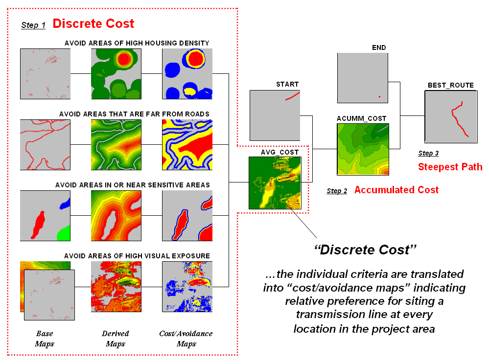
Figure 1. Discrete cost maps identify the relative
preference to avoid certain conditions within a project area.
<click here
to download a PowerPoint slide set describing calibration and weighting>
<click here
to download an animated PowerPoint slide set demonstrating Accumulation Surface
construction>
<click here to download a
short video (.avi) describing Optimal Path analysis>
Recall that Base Maps are field collected data such as elevation, sensitive
areas, roads and houses. Derived Maps use computer processing to
calculate information that is too difficult or even impossible to collect, such
as visual exposure, proximity and density.
The Cost/Avoidance Maps
translate this information into decision criteria. The calibration forms maps that are scaled
from 1 (most preferred—favor siting, grey areas) to 9 (least preferred—avoid
siting, red areas) for each of the decision criteria.
The individual cost maps are combined into a single map by averaging the individual layers. For example, if a grid location is rated 1 in each of the four cost maps, its average is 1 indicating an area strongly preferred for siting. As the average increases for other locations it increasingly encourages routing away from them. If there are areas that are impossible or illegal to cross these locations are identified with a “null value” that instructs the computer to never traverse these locations under any circumstances.
The calibration of the individual cost maps is an important and sensitive step in the siting process. Since the computer has no idea of the relative preferences this step requires human judgment. Some individuals might feel that visual exposure to one house constitutes strong avoidance (9), particularly if it is their house. Others, recognizing the necessity of a new power line, might rate “0 houses seen” as 1 (most preferred), 1 to 2 houses seen as 2 (less preferred), ... through more than 15 houses seen as 9 (least preferred).
In practice, the calibration of the individual criteria is developed through group discussion and consensus building. The Delphi process (see author’s note) is a structured method for developing consensus that helps eliminate bias. It involves iterative use of anonymous questionnaires and controlled feedback with statistical aggregation of group responses. The result is an established and fairly objective approach for setting preference ratings used in deriving the individual discrete cost maps.
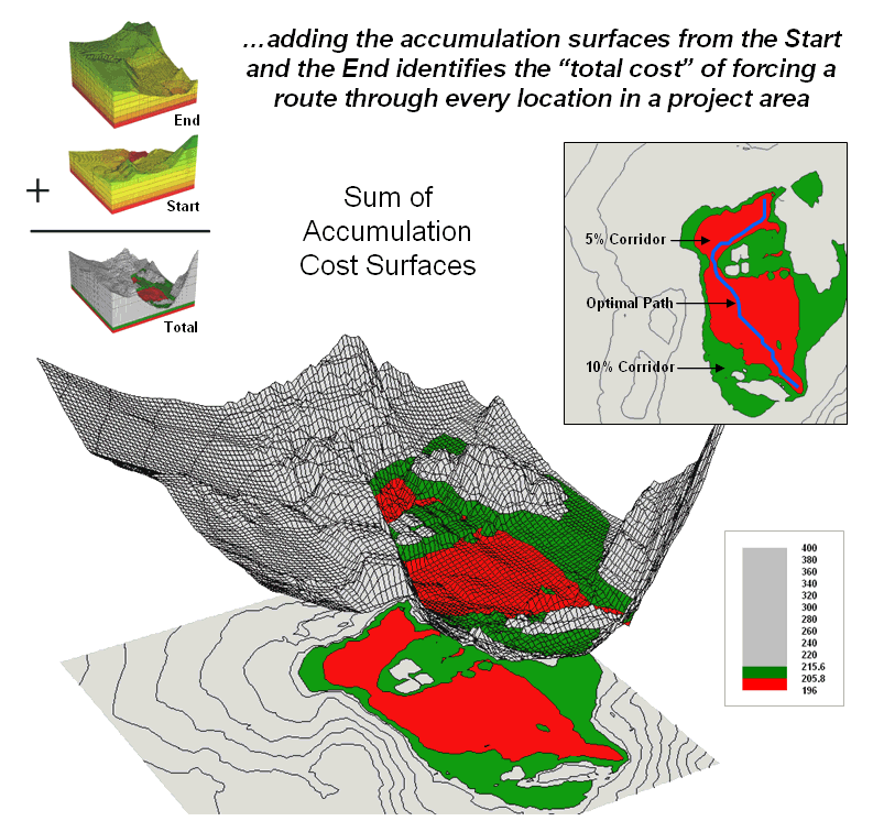
Figure 2. The sum of accumulated surfaces is used to
identify siting corridors as low points on the total accumulated surface.
<click here to download an animated PowerPoint slide set demonstrating Optimal Corridor analysis>
Once an overall Discrete Cost map (step 1) is calculated, the Accumulated Cost (step 2) and Steepest Path (step 3) processing are performed to identify the most preferred route for the power line (see figure 1). Figure 2 depicts a related procedure that identifies a preferred route corridor.
The technique generates accumulation surfaces from both the Start and End locations of the proposed power line. For any given location in the project area one surface identifies the best route to the start and the other surface identifies the best route to the end. Adding the two surfaces together identifies the total cost of forcing a route through every location in the project area.
The series of lowest values on the total accumulation surface (valley bottom) identifies the best route. The valley walls depict increasingly less optimal routes. The red areas in figure 2 identify all of locations that within five percent of the optimal path. The green areas indicate ten percent sub-optimality.
The corridors are useful in delineating boundaries for detailed data collection, such as high resolution aerial photography and ownership records. The detailed data within the macro-corridor is helpful in making slight adjustments in centerline design, or as we will see next month in generating and assessing alternative routes.
____________________________
Author’s Note: <click here to download a PowerPoint slide set summarizing the Routing and Optimal Path process>
A Recipe for Calibrating
and Weighting
(GeoWorld, September 2003, pg. 20-21)
The
past two sections have described procedures for constructing a simple
As in cooking, the implementation of a spatial recipe provides able room for interpretation and varying tastes. For example, one of the criteria in the routing model seeks to avoid locations having high visual exposure to houses. But what constitutes “high” …5 or 50 houses visually impacted? Are there various levels of increasing “high” that correspond to decreasing preference? Is “avoiding high visual exposure” more or less important than “avoiding locations near sensitive areas.” How much more (or less) important?
The answers to these questions are what tailor a model to the specific circumstances of its application and the understanding and values of the decision participants. The tailoring involves two related categories of parameterization—calibration and weighting.
Calibration refers to establishing a consistent scale from 1 (most preferred) to 9 (least preferred) for rating each map layer used in the solution. Figure 1 shows the result for the four decision criteria used in the routing example.
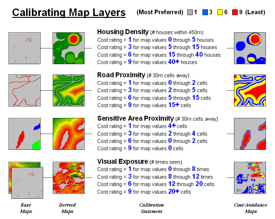
Figure 1. The Delphi Process
uses structured group interaction to establish a consistent rating for each map
layer.
The Delphi Process, developed in the 1950s by the Rand Corporation, is designed to achieve consensus among a group of experts. It involves directed group interaction consisting of at least three rounds. The first round is completely unstructured, asking participants to express any opinions they have on calibrating the map layers in question. In the next round the participants complete a questionnaire designed to rank the criteria from 1 to 9. In the third round participants re-rank the criteria based on a statistical summary of the questionnaires. “Outlier” opinions are discussed and consensus sought.
The development and summary of the questionnaire is critical to Delphi. In the case of continuous maps, participants are asked to indicate cut-off values for the nine rating steps. For example, a cutoff of 4 (implying 0-4 houses) might be recorded by a respondent for Housing Density preference level 1 (most preferred); a cut-off of 12 (implying 4-12) for preference level 2; and so forth. For discrete maps, responses from 1 to 9 are assigned to each category value. The same preference value can be assigned to more than one category, however there has to be at least one condition rated 1 and another rated 9. In both continuous and discrete map calibration, the median, mean, standard deviation and coefficient of variation for group responses are computed for each question and used to assess group consensus and guide follow-up discussion.
Weighting of the map layers is achieved using a portion of the Analytical Hierarchy Process developed
in the early 1980s as a systematic method for comparing decision criteria. The procedure involves mathematically
summarizing paired comparisons of the relative importance of the map
layers. The result is a set map layer
weights that serves as input to a
In the routing example, there are four map layers that define the six direct comparison statements identified in figure 2 (#pairs= (N * (N – 1) / 2)= 4 * 3 / 2= 6 statements). The members of the group independently order the statements so they are true, then record the relative level of importance implied in each statement. The importance scale is from 1 (equally important) to 9 (extremely more important).
This information is entered into the importance table a row at a time. For example, the first statement views avoiding locations of high Visual Exposure (VE) as extremely more important (importance level= 9) than avoiding locations close to Sensitive Areas (SA). The response is entered into table position row 2, column 3 as shown. The reciprocal of the statement is entered into its mirrored position at row 3, column 2. Note that the last weighting statement is reversed so its importance value is recorded at row 5, column 4 and its reciprocal recorded at row 4, column 5.
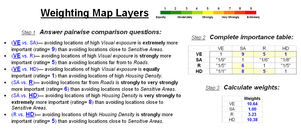
Figure 2. The Analytical Hierarchy Process uses pairwise comparison of map layers to derive their relative importance.
Once the importance table is completed, the map layer weights are calculated. The procedure first calculates the sum of the columns in the matrix, and then divides each entry by its column sum to normalize the responses. The row sum of the normalized responses derives the relative weights that, in turn, are divided by minimum weight to express them as a multiplicative scale (see author’s note for an online example of the calculations). The relative weights for a group of participants are translated to a common scale then averaged before expressing them as a multiplicative scale.
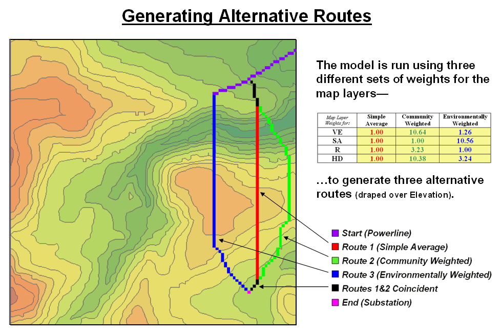
Figure 3. Alternate routes are
generated by evaluating the model using weights derived from different group
perspectives.
Figure 3 identifies alternative routes generated by evaluating different sets of map layer weights. The center route (red) was derived by equally weighting all four criteria. The route on the right (green) was generated using a weight set that is extremely sensitive to “Community” interests of avoiding areas of high Visual Exposure (VE) and high Housing Density (HD). The route on the left (blue) reflects an “Environmental” perspective to primarily avoid areas close to Sensitive Areas (SA) yet having only minimal regard for VE and HD. Next month’s column will investigate qualitative procedures for comparing alternative routes.
_________________
Author's Note: Supplemental discussion and an Excel worksheet demonstrating the
calculations are posted at www.innovativegis.com/basis/,
select “Column Supplements” for Beyond Mapping, September, 2003.
·
Delphi and AHP Worksheet an Excel worksheet templates for
applying the
·
Delphi Supplemental Discussion
describing the application of the
· AHP Supplemental Discussion describing the application of AHP for weighting map layers in GIS suitability modeling
Think with Maps to Evaluate Alternative Routes
(GeoWorld, October 2003, pg. 20-21)
The past three sections have focused on the considerations involved in siting an electric transmission line as representative of most routing models. The initial discussion described a basic three step process (step 1 Discrete Costà step 2 Accumulated Costà step 3 Steepest Path) used to delineate the optimal path.
The next sub-topic focused on using multiple criteria and the
delineation of an optimal path corridor.
The most recent discussion shifted to methodology for calibrating and
weighting
The top portion of Figure 1 identifies the calibration ratings assigned to the four siting criteria that avoid locations of high housing density (HD), far from roads (R), near sensitive areas (SA) and high visual exposure (VE). The bottom portion of the figure identifies weighted preference surfaces reflecting Community and Environmental concerns for siting the power line. The community perspective strongly avoids locations with high housing density (weight= 10.23) and high visual exposure to houses (10.64). The environmental perspective strongly avoids locations near sensitive areas (10.56) but has minimal concern for high housing density and visual exposure (3.24 and 1.26, respectively).
The routing solution based on the different perspectives delineates two alternative routes. Note that the routes bend around areas that are less-preferred (higher map values; warmer tones) as identified on their respective preference surfaces. The optimal path considering one perspective, however, is likely far from optimal considering the other.
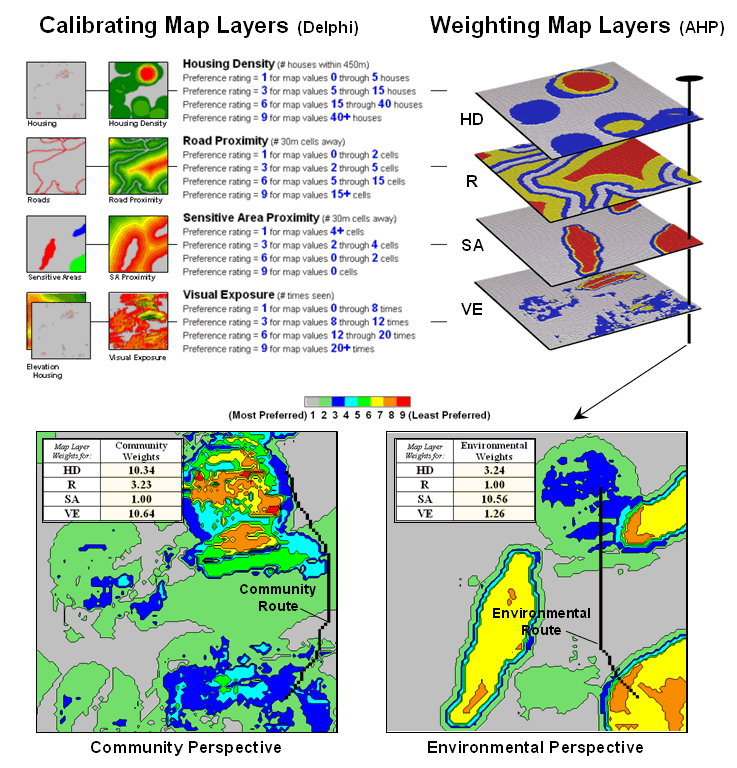
Figure 1. Incorporating different perspectives (model weights) generate alternative preference surfaces for transmission line routing.
One way to compare the two routes is through differences in their preference surfaces. Simple subtraction of the Environmental perspective from the Community perspective results in a difference map (figure 2). For example, if a map location has a 3.50 on the community surface and a 5.17 rating on the environmental surface, the difference is -1.67 indicating a location that is less preferred from an environmental perspective.
The values on the difference map on the right side of the figure identify the relative preference at each map location. The sign of the value tells you which perspective dominates—negative means less preferred by environmental (red tones); positive means less preferred by community (green tones). The magnitude of the value tells you the strength of the difference in perspective—zero indicates no difference (grey); -1.67 indicates a fairly strong difference in opinion.
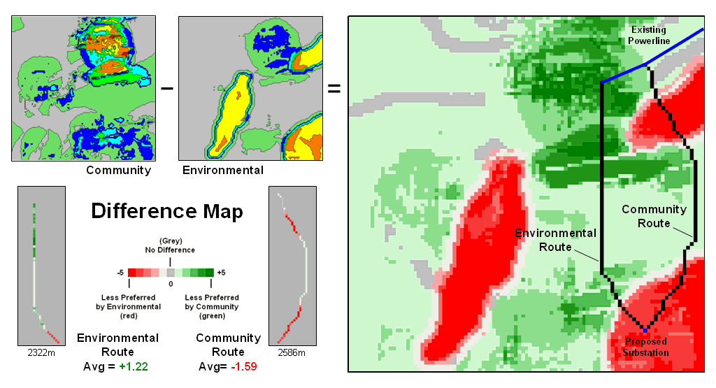
Figure 2. Alternative routes can be compared by their incremental and overall differences in routing preferences.
Alignment of the alternative routes on the difference map provides a visual evaluation. Where a route traverses grey or light tones there isn’t much difference in the siting preferences. However, where dark tones are crossed significant differences exist. The two small insets in the lower left portion mask the differences along the two routes. Note the relative amounts of dark red and green in the two graphics. Nearly half of the Community route is red meaning there is considerable conflict with the environmental perspective. Similarly, the Environmental route contains a lot of green indicating locations in conflict with the community perspective.
The average difference is calculated by region-wide (zonal) summary of values along the entire length of the routes. The +1.22 average for the Environmental route says it is a fairly unfriendly community alternative. Likewise, the -1.59 average for the Community route means it is environmentally unfriendly.
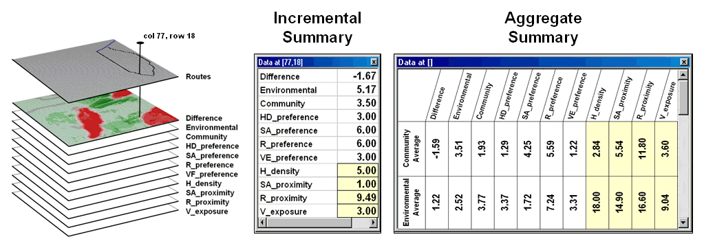
Figure 3. Tabular statistics are
used to assess differences in siting preferences along a route (incremental) or
an overall average for a route (aggregate).
The schematic in figure 3 depicts a “map stack” of the routing data. Mouse-clicking anywhere along a route pops-up a listing of the values for all of map layers (drill-down). In the example, the difference at location column 77, row 18 is -1.67 that means the location is environmentally unfriendly although it is part of the Environmental route. This is caused by the 1.00 SA_proximity map value indicating that the location is just 30 meters from a sensitive area.
In addition to the direct query at a location (incremental summary), a table of the average values for the map layers along the route can be generated (aggregate summary). Note the large difference in average housing density (only 2.84 houses within 450m for the Community route but 18.0 for the Environmental route) and visual exposure (3.60 houses visually connected vs. 9.04).
In practice, several alternative perspectives are modeled
and their routes compared. The
evaluation phase isn’t so much intended to choose one route over another, but
to identify the best set of common segments or slight adjustments in routing
that delineate a compromise. Rarely is
’Straightening’ Conversions
Improve Optimal Paths
(GeoWorld, November 2004, pg. 18-19)
The previous sections have addressed the basics of optimal path routing. The basic Least Cost Path (LPC) method described consists of three basic steps: Discrete Cost Map, Accumulated Cost Surface and Optimal Route (see Author’s Notes). In addition, an optional fourth step to derive an Optimal Corridor can be performed to indicate routing sensitivity throughout a project area.
Key to optimal path analysis is the discrete cost map that
establishes the relative “goodness” for locating a route through any grid cell
in a project area. However, the
traditional
For example, the same optimal solution is generated for both
low and high priced pipe in constructing a pipeline. In the case of higher priced pipe, a
straighter route can save millions of dollars.
What is needed is a modified
Simple geometry-based techniques of line smoothing, such as
spline function fitting, are inappropriate as they fail to consider intervening
conditions and can result in the route being adjusted into unsuitable locations
as it is “smoothed.” The following
discussion describes a robust technique for “straightening” an optimal path
that works within the
The approach modifies the discrete cost map by making disproportional increases to the lower map values. This has the effect of straightening the characteristic minor swings in routing in the more favorable areas (low values) while continuing to avoid unsuitable areas.
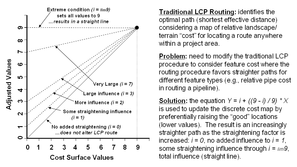
Figure 1. The
The left side of figure 1 graphically depicts the modified
The general conversion equation based on an anchored
straight line is—
Y = i + (( 9 – i ) / 9 ) * X
…and can be extended to the
Adj_Cost_Map
= i + (( 9 – i ) / 9 ) *
Cost_Map
…where all of the values on the discrete cost map are converted. The adjusted cost map is used to derive an accumulated cost surface from the starting location, that in turn is used to derive the optimal path from the ending location.
Figure 2 shows several examples of applying the
The lower portion of the figure shows several straightened
optimal paths. They were derived by
applying the conversion equation to the discrete cost values, then completing
the
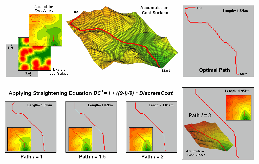
Figure 2. Examples of Applying
the
Also note that the length of the route is progressively shorter for the straightened optimal paths. This information can be used to estimate pipe cost savings ((1.32 – 0.95) / 1.32) * 100 = 28% savings for Path 3). Decision-makers can balance the benefits of the savings in materials with the costs of traversing less-optimal conditions along the straightened route as compared to the non-straighten optimal path.
The traditional unadjusted optimal path is best considering only landscape/terrain conditions, whereas the adjusted path also favors “straightness” wherever possible. In many applications, that’s an improvement on an optimal path (as well as an oxymoron).
______________________________
Author’s Note: see www.innovativegis.com/basis/present/Oil&Gas_04/
, A Web-based Application for Identifying and Evaluating Alternative Pipeline
Routes and Corridors,
Use
(GeoWorld, March 2006, pg. 16-17)
Earlier sections have dealt with basic Least Cost Path (
For example, routing pipelines involves identifying the optimal path between two points considering an overall cost surface of the relative siting preferences throughout a project area. This established procedure works well in areas where there are considerable differences in siting preferences but generates a “zig-zag” route in areas with minimal differences. The failure to identify straight routes under these conditions is inherent in the iterative (wave-like) grid-based distance measurement analysis considering only orthogonal and diagonal movements to adjacent cells.
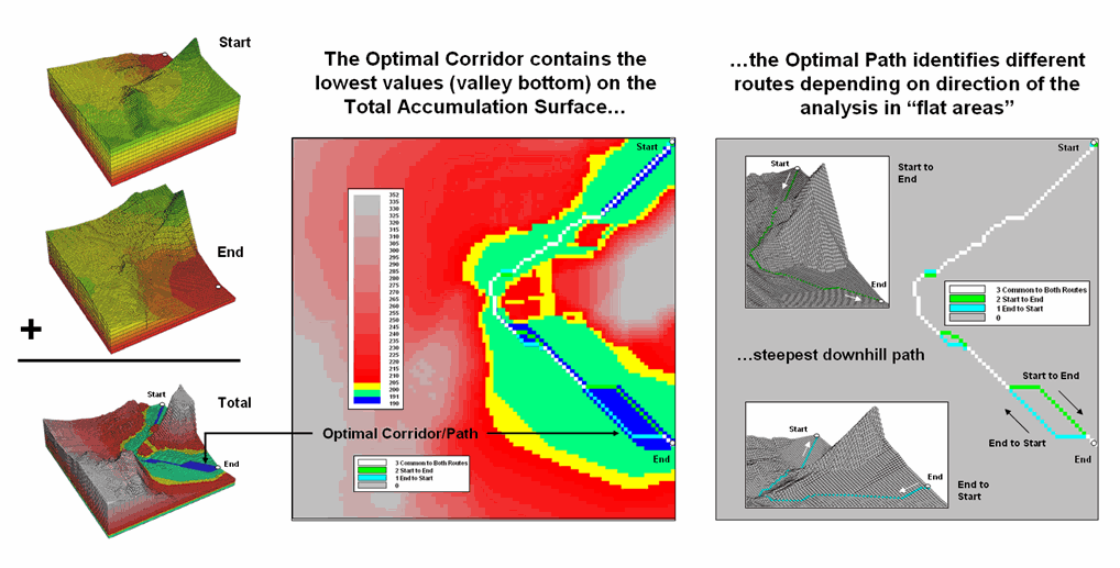
Figure 1. “Flat areas” on the valley bottom of the Total Accumulation
Surface (blue) are the result of artificial differences in optimal paths
induced by grid-based distance measurement restriction to orthogonal and
diagonal movements.
The left side of Figure 1 shows the Optimal Corridor for a proposed route. The central (blue) zone identifies the “valley bottom” of the Total Accumulation Surface that contains the optimal path. The middle zone (green) and outer zone (yellow) identify areas that contain less optimal but still plausible solutions.
The right side of the figure shows what causes the flat areas. The white route identifies the common locations for the optimal paths generated for both ways (Start-to-End and End-to-Start paths). These locations identify the true optimal path in areas with ample preference guidance. However in areas with constant cost surface values, the grid-based procedure seeks orthogonal and diagonal movements instead of a true bisecting line. For the area in the lower-right portion of the project area, the Start to End path (bright green upper route) shifts over and diagonally down. In the same area, the End to Start path (light blue lower route) shifts over and diagonally up.
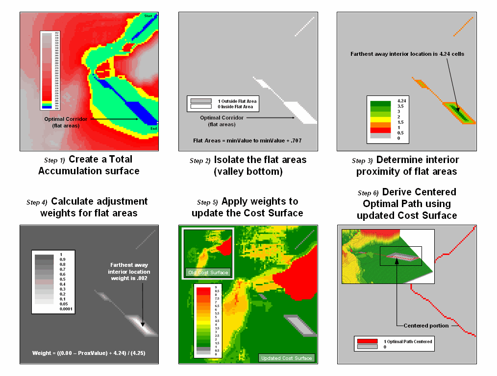
Figure 2. Procedural steps for centering an optimal path in areas with
minimal differences in siting preference.
The true optimal path traversing this area of minimal
difference in siting preferences is a line splitting the difference between the
two directional routes. Figure 2 depicts
the steps for delineating a centered route through these areas. The first step generates a Total Accumulation
Surface in the basic
This map is normally used to identify optimal path corridors, however in this instance it is used to isolate the flat areas in need of centering. A binary map of the flat areas is created in step 2 by reclassifying areas to zero that are from the minimum value on the surface to the minimum value + .707. The .707 value is determined as one-half a diagonal grid space movement of 1.414 cells—the “zig-zag distance” causing the flat areas.
The third step determines the interior proximities for the flat areas, with larger values indicating the center between opposing edges. The proximity values then are converted to adjustment weights from nearly zero to 1.0 (step 4). This process involves inverting the proximity values then normalizing to the appropriate range by using the equation—
Weight = ((0.00 –
ProxValue) + maxProxValue) / (maxProxValue + .01)
The result is a map with the value 1.0 assigned to all locations that do not need centering and increasing smaller fractional weights for areas requiring centering. This map then is multiplied by the original cost surface (step 5) with effect of lowering the cost values where centering is needed. The result is analogous to cutting a groove in the cost surface for the flat areas that forces the optimal path through the centered groove (step 6).
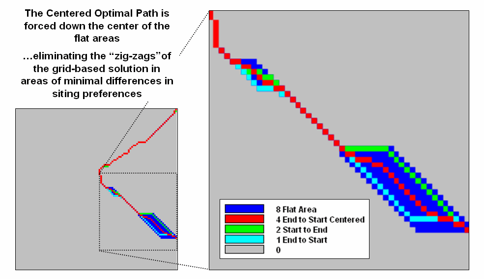
Figure 3. Comparison of directional optimal paths and the centered
optimal path.
Figure 3 shows the results of the centering procedure. The red line bisects the problem areas and
eliminates the direction dependent “zig-zags” of the basic
In practice, an automated procedure for eliminating zig-zags
might not be needed as the optimal route and corridor identified are treated as
a Strategic Phase solution for comparing relative advantages of alternative routes. A set of viable alternative routes is further
analyzed during a Design Phase with a siting team considering additional, more
detailed information within the alternative route corridors. During this phase, the zig-zag portions of
the route are manually centered by the team—the art in the art and science of
Connect
All the Dots to Find Optimal Paths
(GeoWorld, September 2005, pg. 18-19)
Effective Distance forms the foundation for generating
optimal paths. As discussed in the
previous sections, the “Least Cost Path” method for determining the optimal
route of a linear feature is a well-established grid-based
The derivation of the Accumulated Cost Surface is the critical step. It involves calculating the effective distance from a starting location to all other locations considering the “relative preference” for favoring or avoiding certain landscape conditions.
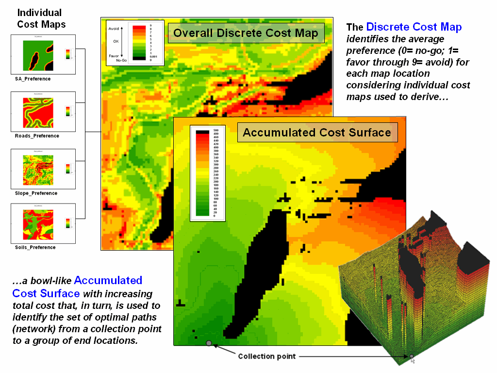
Figure 1. Relative preferences are used to identify the minimal overall
cost of constructing a route from a collection point to all accessible
locations in a project area.
For example, the left side of figure 1 shows a set
individual cost maps for establishing a gathering network of pipelines for a
natural gas field. The thinking is that
routing should 1) avoid areas within or near sensitive areas, 2) avoid
areas that are far from roads, 3) avoid areas of steep terrain, and 4) avoid
areas of unsuitable soils. These
considerations first are calibrated to a common preference scale (0= no-go, 1=
favor through 9= avoid) and then averaged for an overall Discrete Cost Map (favor
green, avoid red and can’t cross black).
In turn, the discrete cost map is used to calculate effective distance (minimal cost) from the collection point to all accessible locations in the project area. The result is the Accumulated Cost Surface shown in 2D and 3D on the right side of figure 1. Note that the surface forms a bowl with the collection point at the bottom, increasing total cost forming the incline (green to red) and the inaccessible locations forming pillars (black).
Normally, a single end point is identified, positioned on the accumulated surface and the steepest downhill path determined to delineate the optimal route between the starting and end points. However in the case of a gathering network, a set of dispersed end points (individual wells) needs to be considered. So how does the computer simultaneously mull over bunches of points to identify the set of Optimal Paths that converge on the collection point?
Actually, the process is quite simple. In an iterative fashion, the optimal path is identified for each of the wells. What is different is the use of a summary grid that counts the number of paths passing through each map location. The map in figure 2 shows the result where red dots identify the individual wells, blue paths individual feeder lines and cooler to warmer tones an increasing number of commonly served wells.
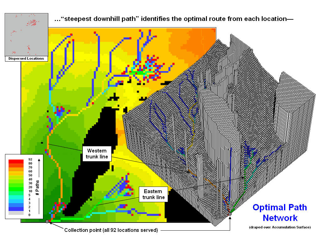
Figure 2. Optimal path density identifies the number of routes passing
through each map location.
The green, yellow and red portions of the network identify trunk lines that service numerous end points (>10 wells). The collection point services all 92 wells (77 from the western trunk line and 15 from the eastern trunk line)
Figure 3 shows the gathering network superimposed on the optimal corridors for the western and eastern trunk lines. The corridors indicate the spatial sensitivity for sighting the two trunk lines—placement outside these areas results in considerable increase in routing costs.
In the example, a pressurized network is assumed. However, a gravity-feed analysis could be performed by analyzing a terrain surface (relative elevation) and hydraulic flows. The process is analogous to delineating watersheds then determining the optimal network trunk lines within each area.
Another extension would be to minimize the length of the feeder lines. For example, the three lines in the upper-left corner might be connected sooner to minimize pipeline materials costs. There are a couple of ways to bring this into the analysis—1) re-run the model using the trunk line as the starting location and/or 2) use a straightening factor as discussed in the previous section.
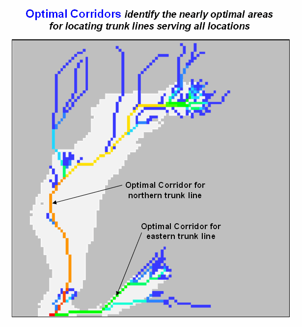
Figure 3. The optimal corridors for routes serving numerous end points
indicate the spatial sensitivity in siting trunk lines.
The ability to identify the number of optimal paths from a set of dispersed end points provides the foothold for deriving an optimal feeder line network. It also validates that modern map analysis capabilities takes us well-beyond traditional mapping to entirely new concepts, techniques and paradigms spawned by the digital map revolution.
Use Spatial
Sensitivity Analysis to Assess Model Response
(GeoWorld, August 2009)
Sensitivity analysis …sounds like 60’s thing involving a lava lamp and a group séance in a semi-conscious fog in an effort to make one more sensitive to others. Spatial sensitivity analysis is kind of like that, but less Kumbaya and more quantitative investigation into the sensitivity of a model to changes in map variable inputs.
The Wikipedia defines Sensitivity Analysis as “the study of how the variation
(uncertainty) in the output of a mathematical model can be apportioned to
different sources of variation in the input of a model.” In more general terms, it investigates the
effect of changes in the inputs of a model to the induced changes in the results.
In its simplest form, sensitivity analysis
is applied to a static equation to determine the effect of input factors, termed
scalar parameters, by executing the equation repeatedly for different parameter
combinations that are randomly sampled from the range of possible values. The result is a series of model outputs that
can be summarized to 1) identify factors that most strongly contribute to
output variability and 2) identify minimally contributing factors.
As one might suspect, spatial sensitivity analysis is a lot more complicated as the geographic arrangement of values within and among the set of map variables comes into play. The unique spatial patterns and resulting coincidence of map layers can dramatically influence their relative importance— a spatially dynamic situation that is radically different from a static equation. Hence a less robust but commonly used approach systematically changes each factor one-at-a-time to see what effect this has on the output. While this approach fails to fully investigate the interaction among the driving variables it provides a practical assessment of the relative influence of each of the map layers comprising a spatial model.
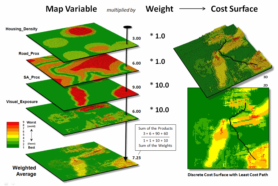
Figure 1.
Derivation of a cost surface for routing involves a weighted average of a set
of spatial considerations (map variables).
The left side of figure 1 depicts a stack of input layers (map variables) that was discussed in the previous discussions on routing and optimal paths. The routing model seeks to avoid areas of 1) high housing density, 2) far from roads, 3) within/near sensitive environmental areas and 4) high visual exposure to houses. The stack of grid-based maps are calibrated to a common “suitability scale” of 1= best through 9= worst situation for routing an electric transmission line.
In turn, a “weighted average” of the calibrated map layers is used to derive a Discrete Cost Surface containing an overall relative suitability value at each grid location (right side of figure 1). Note that the weighting in the example strongly favors avoiding locations within/near sensitive environmental areas and/or high visual exposure to houses (times 10) with much less concern for locations of high housing density and/or far from roads (times 1).
The routing algorithm then determines the path that minimizes the total discrete cost connecting a starting and end location. But how would the optimal path change if the relative importance weights were changed? Would the route realign dramatically? Would the total costs significantly increase or decrease? That’s where spatial sensitivity analysis comes in.
The first step is to determine a standard unit to use in inducing change into the model. In the example, the average of the weights of the base model was used—1+1+10+10= 22/4= 5.5. This change value is added to one of the weights while holding the other weights constant to generate a model simulation of increased importance of that map variable.
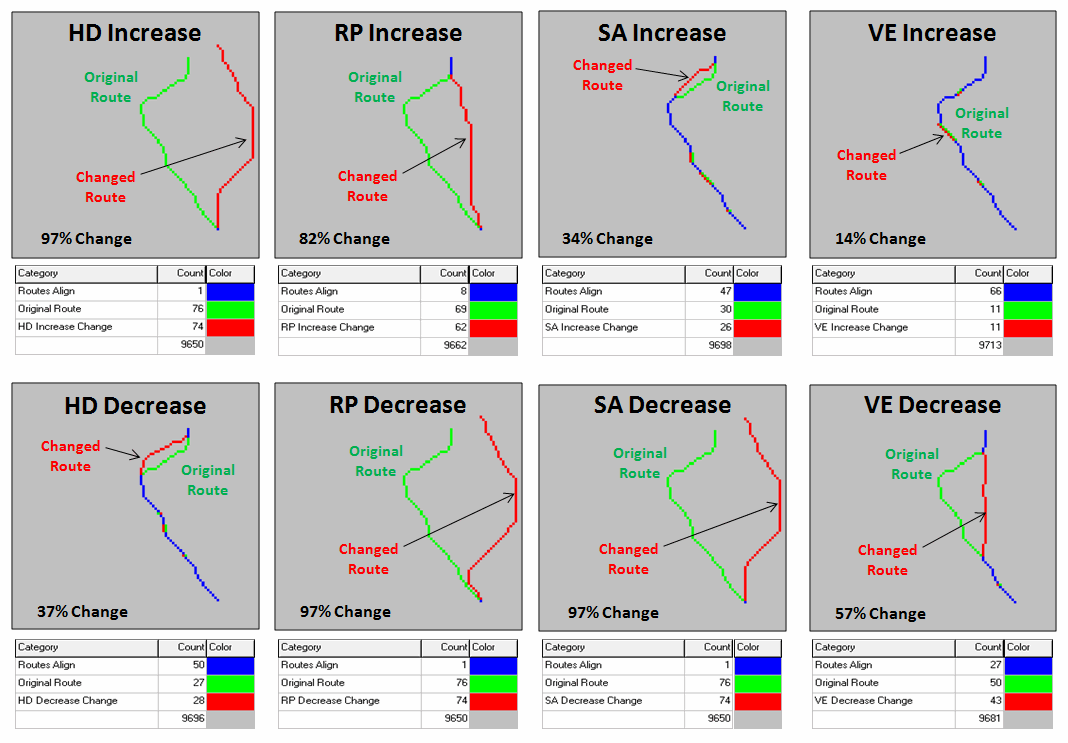
Figure 2.
Graphical comparison of induced changes in route alignment (sensitivity
analysis).
For example, in deriving the sensitivity for an increase in concern for avoiding high housing density, the new weight set becomes HD= 1.0 + 5.5= 6.5, RP= 1.0, SA= 10.0 and VE= 10.0. The top-left inset in figure 2 shows a radical change in route alignment (97% of the route changed) by the increased importance of avoiding areas of high housing density. A similar dramatic change in routing occurred when the concern for avoiding locations far from roads was systematically increased (RPincrease= 82% change). However, similar increases in importance for avoiding sensitive areas and visual exposure resulted in only slight routing changes from the original alignment (SAincrease= 34% and VEincrease=14%).
The lower set of graphics in figure 2 show the induced changes in routing when the relative importance of each map variable is decreased. Note the significant realignment from the base route for the road proximity and sensitive area considerations (RPdecrease= 97% and SAdecrease=97%); less dramatic for the visual exposure consideration (VEdecrease= 57%); and marginal impact for the housing density consideration (HDdecrease= 37%). An important enhancement to this summary technique beyond the scope of this discussion calculates the average distance between the original and realigned routes (see author’s note) and combines this statistic with the percent deflection for a standardized index of spatial sensitivity.
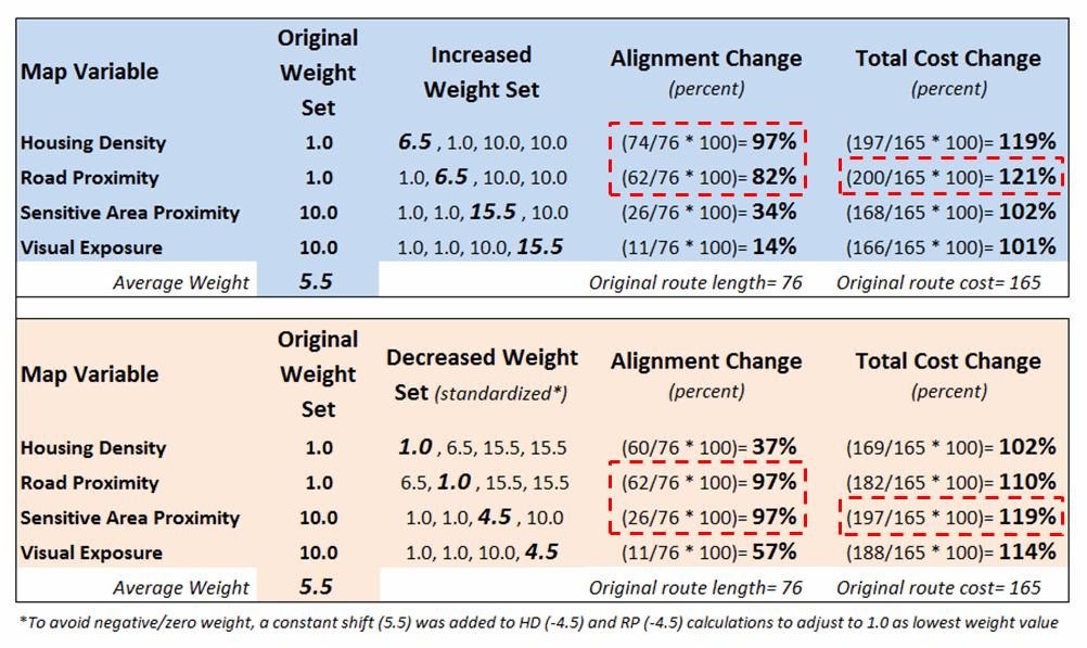
Figure 3. Tabular
Summary of Sensitivity Analysis Calculations.
Figure 3 is a tabular summary of the sensitivity analysis calculations for the techy-types among us. For the rest of us after the “so what” big picture, it is important to understand the sensitivity of any spatial model used for decision-making—to do otherwise is to simply accept a mapped result as a “pig-in-a-poke” without insight into its validity nor an awareness of how changes in assumptions and conditions might affect the result.
_____________________________
Author’s Note: For a discussion of “proximal alignment” analysis used in the enhanced spatial sensitivity index, see the online book Map Analysis, Topic 10, Analyzing Map Similarity and Zoning (www.innovativegis.com/basis/MapAnalysis/).
Least Cost Path (
The Least Cost Path
(LPC) method for determining the optimal route of a linear feature is a
well-established grid-based
The first and critical step establishes the relative “goodness” for locating a pipeline at any grid cell in a project area (figure 1). As described in the Routing Criteria section of this paper individual map layers are calibrated from 1= best to 9= worst conditions for a pipeline. In turn, the calibrated maps are weight-averaged to form logical groups of criteria (see figure 6 in the body of the paper). Finally, the group maps are weight-averaged to derive a Discrete Cost Map as shown.
Note that in the 3D representation of the discrete cost surface, the higher values form “mountains of resistance (cost)” that are avoided if at all possible. The flat (green) areas identify suitable areas and tend to attract pipeline routing; the peaks (red) identify unsuitable areas and tend to repel pipeline routing.
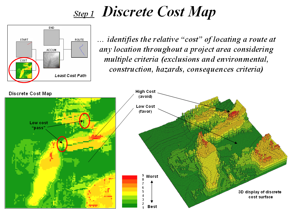
Figure 1. Discrete Cost Map.
Saddle points between areas of high cost act as “passes”
that severely constrain routing in a manner analogous to early explorers
crossing a mountain range. However, the
explorers had to tackle each situation independently as they encountered them
and a wrong choice early in the trek could commit them to punishing route that
was less than optimal. The second and
third steps of the
The second step
of the
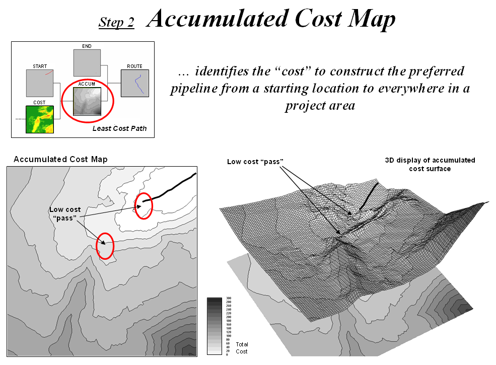
Figure 2. Accumulated Cost Map.
As the expanding ripples move across the discrete cost map an Accumulated Cost Map is developed by recording the lowest accumulated cost for each grid cell. In this manner the total “cost” to construct the preferred pipeline from the starting location to everywhere in the project area is quickly calculated.
Note that the 3D surface has a bowl-like appearance with the starting location at the bottom (0 cost). All of the other locations have increasing accumulated cost values with the increase for each step being a function of the discrete cost of traversing that location. The ridges in the bowl reflect areas of high cost; the valleys represent areas of low cost.
Note the effect around the low cost “pass” areas. The contour lines of accumulated cost seem to shoot out in these areas indicating lower total cost than their surroundings. The same areas in the 3D view appear as saddles along the ridges—points of least resistance (total cost) on the slopping bowl-like surface.
The bowl-like nature of the accumulated cost map is exploited to determine the Optimal Route from any location back to the starting location (figure 3). By simply choosing the steepest downhill path over the surface the path that the wave-front took to reach the end location is retraced.
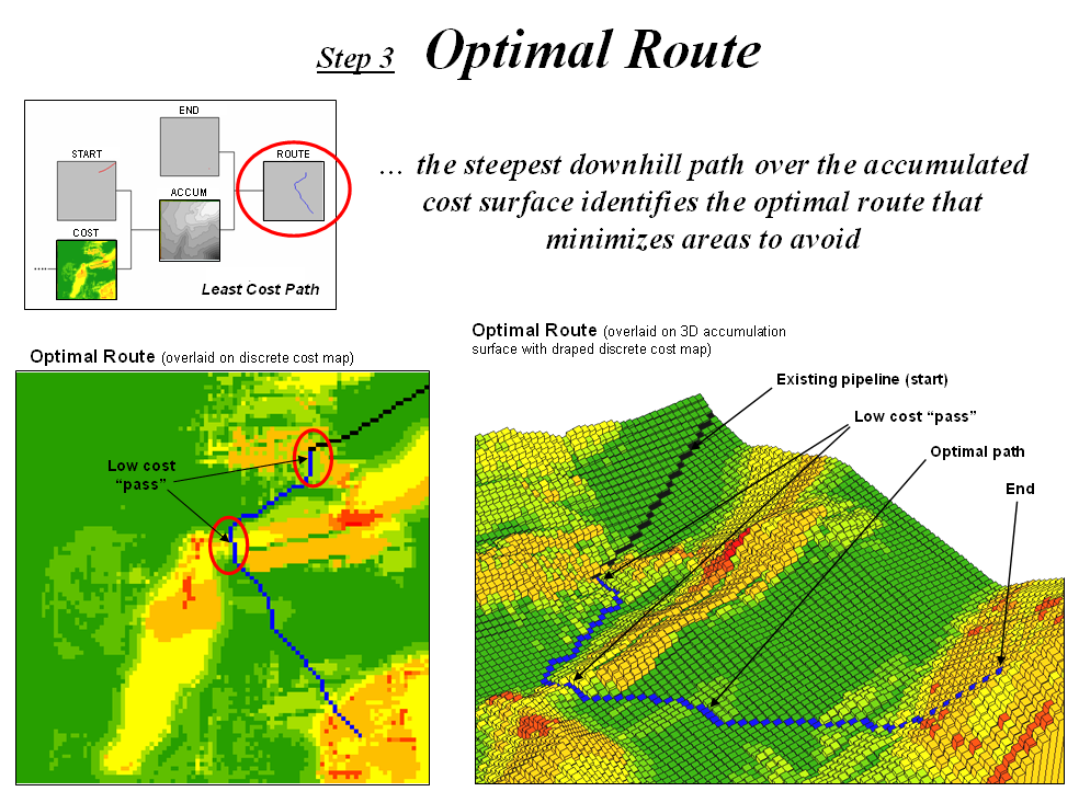
Figure 3. Optimal Route.
By mathematical fact this route will be the line having the lowest total cost connecting the start and end locations. Note that the route goes through the two important “passes” that were apparent in both the discrete and accumulated cost maps.
The optimal corridor identifies the Nth best route. These form a set of “nearly optimal” alternative routes that a siting team might want to investigate. In addition, optimal corridors are useful in delineating boundaries for detailed data collection, such as high resolution aerial photography and ownership records.
The Optimal Corridor Map is created by calculating an accumulation cost map from the end as well as the starting location. The two surfaces are added together to indicate the effective “cost” distance from any location along its optimal path connecting the start the end locations.
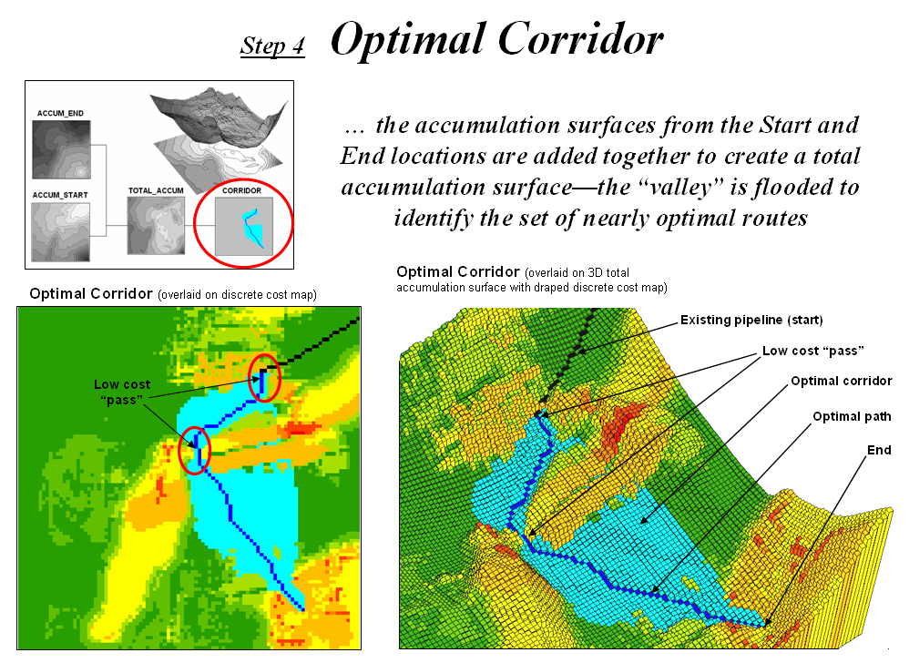
Figure 4. Optimal Corridor.
The lowest value on this map forms the “valley floor” and contains the optimal route. The valley walls depict increasingly less optimal routes. Nearly optimal routes are identified by “flooding” the surface. In the example, a five percent optimal corridor is shown. Notice the “pinch point” along the rout at the location of the low cost “passes.” The corridor is allowed to spread out in areas where there is minimal discrete cost difference but tightly contained around critical locations.
Conclusion
The Least Cost Path
(LPC) method for determining the optimal route and corridor is a
well-established grid-based
The first step of defining the Discrete Cost Map is the most critical as it establishes the relative “goodness” for locating a pipeline at any grid cell in a project area. It imparts expert judgment in calibrating and weighting several routing criteria maps. The remaining steps, however, are mechanical (deterministic) and require no user interaction or expertise.
In most practical applications, the weighting (and sometime
calibration) of the criteria maps are changed to generate alternative
routes. This capability enable the user
to evaluate “…what if” scenarios that reflect different perspectives on the
relative importance of the routing criteria.
When
______________________
Extended
Experience Materials: see www.innovativegis.com/basis/,
select “Column Supplements” for a PowerPoint slide set, instructions and free
evaluation software for classroom or individual “hands-on” experience in
suitability modeling. If you are viewing
this topic online, click on the links below:
·
Powerline Routing Slide Set –
a series of PowerPoint slides describing the grid-based map analysis procedure
for identifying optimal routes described in GeoWorld, July through September,
2003 Beyond Mapping columns. (1564KB).
·
For hands-on experience in
Optimal Path Routing—
o
<click here> to download and
install a free 14-day evaluation copy of MapCalc
Learner software (US$21.95 full purchase price).
o
<click here> to download the Powerline database and place the file in
the folder C:\Program Files\Red Hen Systems\MapCalc\MapCalc Data\.
o
<click here> to download the Powerline script and place the file in
the folder …\MapCalc Data\
Scripts\.
o
Click
Startà Programsà MapCalc Learnerà MapCalc Learner to access the MapCalc Software. Select the Powerline.rgs database you downloaded.
o
![]() Click on the Map Analysis button to pop-up the script editor. Select Scriptà Open and select the Powerline.scr file you downloaded. A series of commands comprising the model
will appear.
Click on the Map Analysis button to pop-up the script editor. Select Scriptà Open and select the Powerline.scr file you downloaded. A series of commands comprising the model
will appear.
o
Double-click
on the first command line Scan Houses Total Within 15 For
Housing_density,
note the dialog box specifications, and press OK to submit the command.
o
![]() Minimize the
script window and use the map display/navigation buttons in the lower toolbar
to explore the output map.
Minimize the
script window and use the map display/navigation buttons in the lower toolbar
to explore the output map.
o
Repeat
the process in sequence using the other command lines while relating the
results to the discussion in this topic and the slide set identified above.
…an additional set of tutorials and example
techniques/applications using MapCalc software is available online at…
http://www.innovativegis.com/basis/, select “Example Applications”
…direct
questions and comments to jberry@innovativegis.com.