Understanding Effective Distance and Connectivity
Joseph K. Berry
…selected
GeoWorld Beyond Mapping columns describing concepts and algorithms in
grid-based analysis of effective distance and connectivity as applied to travel-time,
competition analysis and other contemporary applications.
___________________________________________________________
Part 1 –
Conceptual Framework
The following are
original drafts of Beyond Mapping columns describing the conceptual framework
for establishing effective distance and optimal paths. These columns appeared in
YOU CAN'T
Measuring distance is one of the most
basic map analysis techniques. However,
the effective integration of distance considerations in spatial decisions has
been limited. Historically, distance is
defined as 'the shortest straight-line distance between two points'. While this measure is both easily conceptualized
and implemented with a ruler, it is frequently insufficient for
decision-making. A straight-line route
may indicate the distance 'as the crow flies', but offer little information for
the walking crow or other flightless creature.
It is equally important to most travelers to have the measurement of
distance expressed in more relevant terms, such as time or cost.
Consider the trip to the airport from
your hotel. You could take a ruler and
measure the map distance, then use the map scale to compute the length of a
straight-line route-- say twelve miles.
But you if intend to travel by car it is likely longer. So you use a sheet of paper to form a series
of 'tick marks' along its edge following the zigs and zags of a prominent road
route. The total length of the marks
multiplied times the map scale is the non-straight distance-- say eighteen
miles. But your real concern is when
shall I leave to catch the
The limitation of a map analysis approach
is not so much in the concept of distance measurement, but in its
implementation. Any measurement system
requires two components-- a standard unit and a procedure for
measurement. Using a ruler, the 'unit'
is the smallest hatching along its edge and the 'procedure' is shortest line
along the straightedge. In effect, the
ruler represents just one row of a grid implied to cover the entire map. You just position the grid such that it
aligns with the two points you want measured and count the squares. To measure another distance you merely
realign the grid and count again.
The approach used by most
Computers detest computing squares and
square roots. As the Pythagorean Theorem
is full of them, most
In many applications, however, the shortest
route between two locations may not always be a straight-line. And even if it is straight, its geographic
length may not always reflect a meaningful measure of distance. Rather, distance in these applications is
best defined in terms of 'movement' expressed as travel-time, cost or energy
that may be consumed at rates that vary over time and space. Distance modifying effects are termed barriers,
a concept implying the ease of movement in space is not always constant. A shortest route respecting these barriers
may be a twisted path around and through the barriers. The
There are two types of barriers that are
identified by their effects-- absolute and relative. 'Absolute barriers' are those completely
restricting movement and therefore imply an infinite distance between the
points they separate. A river might be
regarded as an absolute barrier to a non-swimmer. To a swimmer or a boater, however, the same
river might be regarded as a relative barrier.
'Relative barriers' are those that are passable, but only at a cost
which may be equated with an increase in geographical distance-- it takes five
times longer to row a hundred meters than to walk that same distance. In the conceptual framework of tossing a rock
into a pond, the waves crash and dissipate against a jetty extending into the
pond-- an absolute barrier the waves must circumvent to get to the other side
of the jetty. An oil slick characterizes
a relative barrier-- waves may proceed, but at a reduced wavelength (higher
cost of movement over the same grid space).
The waves will move both around and through the oil slick; the one
reaching the other side identifies the 'shortest, not necessarily straight
line'. In effect this is what leads to
the bellhops 'wisdom'-- he tried many routes under various conditions to
construct his experience base. In
In using a
AS THE CROW WALKS...
…Traditional
mapping is in triage. We need to discard
some of the old ineffective procedures and apply new life-giving technology to
others.
Last issue's discussion of distance
measurement with a
Basic to this expanded view of distance
is conceptualizing the measurement process as waves radiating from a
location(s)-- analogous to the ripples caused by tossing a rock in a pond. As the wave front moves through space, it
first checks to see if a potential 'step' is passable (absolute barrier
locations are not). If so, it moves there and incurs the 'cost' of such a
movement (relative barrier weights of impedance). As the wave front proceeds, all possible
paths are considered and the shortest distance assigned (least total impedance
from the starting point). It's similar
to a macho guy swaggering across a rain-soaked parking lot as fast as
possible. Each time a puddle is
encountered a decision must be reached-- slowly go through so as not to slip,
or continue a swift, macho pace around.
This distance-related question is answered by experience, not detailed
analysis. "Of all the puddles I
have encountered in my life", he muddles, "this looks like one I can
handle." A
As the wave front moves through space it
is effectively evaluating all possible paths, retaining only the shortest. You can 'calibrate' a road map such that off
road areas reflects absolute barriers and different types of roads identify
relative ease of movement. Then start
the computer at a location asking it move outward with respect to this complex
friction map. The result is a map
indicating the travel-time from the start to everywhere along the road
network-- shortest time. Or, identify a
set of starting points, say a town's four fire houses, and have them
simultaneously move outward until their wave fronts meet. The result is a map of travel-time to the
nearest firehouse for every location along the road network. But such effective distance measurement is
not restricted to line networks. Take it
a step further by calibrating off road travel in terms of four-wheel 'pumper-truck'
capabilities based on land cover and terrain conditions-- gently sloping
meadows fastest; steep forests much slower; and large streams and cliffs,
prohibitive (infinitely long time).
Identify a forest district's fire headquarters, then move outward
respecting both on- and off-road movement for a fire response surface. The resulting surface indicates the expected
time of arrival to a fire anywhere in the district.
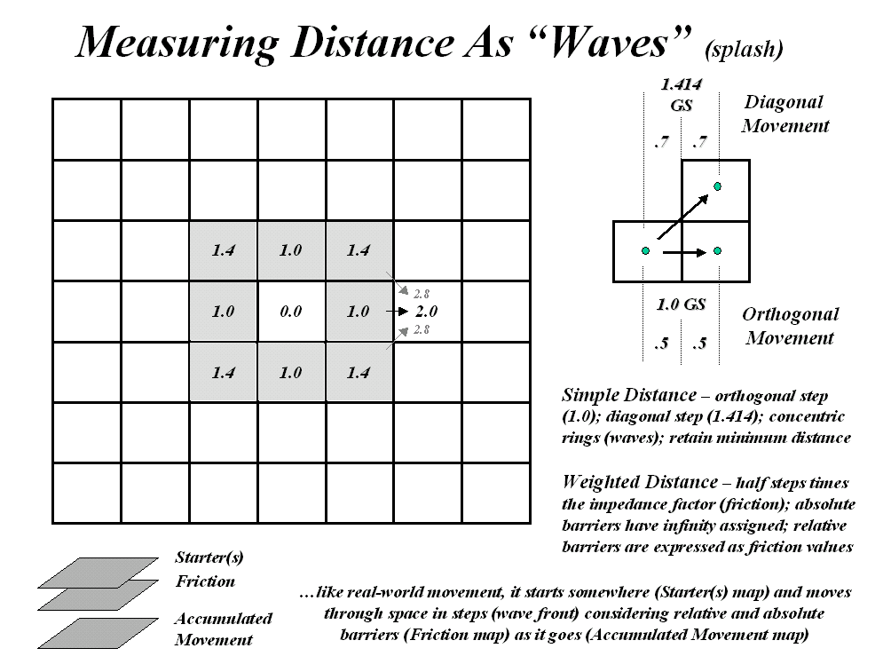
The idea of a 'surface' is basic in
understanding both weighted distance computation and application. The top portion of the accompanying figure
develops this concept for a simple proximity surface. The 'tic marks' along the ruler identify
equal geographic steps from one point to another. If it were replaced with a drafting compass with
its point stuck at the lower left, a series of concentric rings could be drawn
at each ruler tic mark. This is
effectively what the computer generates by sending out a wave front through
unimpeded space. The less than perfect
circles in the middle inset of figure 1 are the result of the relatively coarse
analysis grid used and approximating errors of the algorithm-- good estimates
of distance, but not perfect. The real
difference is in the information content--less spatial precision, but more
utility for most applications.
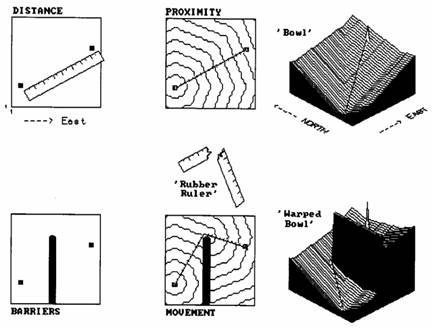
Figure 1.
Measuring Effective Distance.
A three-dimensional plot of simple
distance forms the 'bowl-like' surface on the left side of the figure. It is sort of like a football stadium with
the tiers of seats indicating distance to the field. It doesn't matter which section your in, if
you are in row 100 you had better bring the binoculars. The X and Y axes determine location while the
constantly increasing Z axis (stadium row number) indicates distance from the
starting point. If there were several
starting points the surface would be pockmarked with craters, with the ridges
between craters indicating the locations equidistant between starters.
The lower portion of the figure shows the
effect of introducing an absolute barrier to movement. The wave front moves outward until it
encounters the barrier, then stops. Only
those wave fronts that circumvent the barrier are allowed to proceed to the
other side, forming a sort of spiral staircase (lower middle inset in the
figure). In effect, distance is being
measured by a by a 'rubber ruler' that has to bend around the barrier. If relative barriers are present, an even
more unusual effect is noted-- stretching and compressing the 'rubber
ruler'. As the wave front encounters areas
of increased impedance, say a steep forested area in the fire response example
above, it is allowed to proceed, but at increased time to cross a given unit of
space. This has the effect of
compressing the ruler's tic marks-- not geographic scale in units of feet, but
effect on pumper-truck movement measured in units of time.
Regardless of nature of barriers present,
the result is always a bowl-like surface of distance, termed an 'accumulation'
surface. Distance is always increasing
as you move away from a starter location, forming a perfect bowl if no barriers
are present. If barriers are present,
the rate of accumulation varies with location, and a complex, warped bowl is
formed. But a bowl is formed
nonetheless, with its sides always increasing, just at different rates. This characteristic shape is the basis of
'optimal path' analysis. Note that the
straight line between the two points in the simple proximity 'bowl' in the
figure is the steepest downhill path along the surface-- much like water
running down the surface. This 'steepest
downhill path' retraces the route of the wave front that got to the location
first (in this case, the shortest straight line). Note the similar path indicated on the
'warped bowl' (bottom right inset in the figure). It goes straight to the barrier's corner,
then straight to the starting point-- just as you would bend the ruler (if you
could). If relative barriers were
considered, the path would bend and wiggle in seemingly bazaar ways as it
retraced the wave front (optimal path).
Such routing characterizes the final expansion of the concept of
distance-- from distance to proximity to movement and finally to
'connectivity', the characterization of how locations are connected in
space. Optimal paths are just one way to
characterize these connections.
No, business is not as usual with
KEEP IT SIMPLE STUPID (KISS)...
…but, it's stupid to keep it simple as
simplifying leads to absurd proposals (SLAP).
The last two issues described distance
measurement in new and potentially unsettling ways. Simple distance, as implied by a ruler's
straight line, was expanded to weighted proximity that responds to a
landscape's pattern of absolute and relative barriers to movement. Under these conditions the shortest line
between two points is rarely straight.
And even if it is straight, the geographic length of that line may not
reflect a meaningful measure-- how far it is to the airport in terms of time is
often more useful in decision-making than just mileage. Non-simple, weighted distance is like using a
'rubber ruler' you can bend, squish and stretch through effective barriers,
like the various types of roads you might use to get to the airport.
The concept of delineating a line between
map locations, whether straight or twisted, is termed 'connectivity.' In the case of weighted distance, it
identifies the optimal path for moving from one location to another. To understand how this works, you need to
visualize an 'accumulation surface'-- described in excruciating detail in the
last article as a bowl-like surface with one of the locations at the bottom and
all other locations along rings of successively greater distances. It's like the tiers of seats in a football
stadium, but warped and contorted due to the influence of the barriers.
Also recall that the 'steepest downhill
path' along a surface traces the shortest (i.e., optimal) line to the
bottom. It's like a raindrop running
down a roof-- the shape of the roof dictates the optimal path. Instead of a roof, visualize a lumpy, bumpy
terrain surface. A single raindrop bends
and twists as it flows down the complex surface. At each location along its cascading route,
the neighboring elevation values are tested for the smallest value and the drop
moves to that location; then the next, and the next, etc. The result is a map of the raindrop's
route. Now, conceptually replace the
terrain surface with an accumulation surface indicating weighted distance to
everywhere from a starting location.
Place your raindrop somewhere on that surface and have it flow downhill
as fast as possible to the bottom. The
result is the shortest, but not necessarily straight, line between the two
starting points. It retraces the path of
the 'distance wave' that got there first-- the shortest route whether measured
in feet, minutes, or dollars depending on the relative barrier's calibration.
So much for review, let's expand on the
concept of connectivity. Suppose,
instead of a single raindrop, there was a downpour. Drops are landing everywhere, each selecting
their optimal path down the surface. If
you keep track of the number of drops passing through each location, you have a
'optimal path density surface'. For
water along a terrain surface, it identifies the number of uphill contributors,
termed channeling. You shouldn't unroll
your sleeping bag where there is a lot of water channeling, or you might be
washed to sea by morning. Another
interpretation is that the soil erosion potential is highest at these
locations, particularly if a highly erodible soil is present. Similarly, channeling on an accumulation
surface identifies locations of common best paths-- for example, trunk lines in
haul road design or landings in timber harvesting. Wouldn't you want to site your activity where
it is optimally connected to the most places you want to go?
Maybe, maybe not. How about a 'weighted optimal path density
surface'... you're kidding, aren't you?
Suppose not all of the places you want to go are equally attractive. Some forest parcels are worth a lot more
money than others (if you have seen one tree, you haven't necessarily seen them
all). If this is the case, have the
computer sum the relative weights of the optimal paths through each location;
instead of just counting them. The
result will bias siting your activity toward those parcels you define as more
attractive.
One further expansion, keeping in mind
that
But what would happen if we added the two
accumulation surfaces? The sum
identifies the total length of the best path passing through each
location. 'The optimal path' is identified
as the series of locations assigned the same smallest value-- the line of
shortest length. Locations with the next
larger value belong to the path that is slightly less optimal. The largest value indicates locations along
the worst path. If you want to identify
the best path through any location, ask the computer to move downhill from that
point, first over one surface, then the other.
Thus, the total accumulation surface allows you to calculate the
'opportunity cost' of forcing the route through any location by subtracting the
length of the optimal path from the length of path through that location. "If we force the new highway through my
property it will cost a lot more, but what the heck, I'll be rich." If you subtract the optimal path value (a
constant) from the total accumulation surface you will create a map of
opportunity cost-- the n-th best path map...Whew! Maybe we should stop this assault on
traditional map analysis and keep things simple. But that would be stupid, unless you are a
straight-flying crow.
___________________________________________________________
Part 2 –
Calculating Effective Distance
The following three sections are original drafts
of Beyond Mapping columns discussing the effective distance algorithm. These columns appeared in
DISTANCE
IS SIMPLE AND STRAIGHT FORWARD
For those with a
But what is a ruler? Actually, it is just one row of an implied
grid you have placed over the map. In
essence, the ruler forms a reference grid, with the distance between each
tic-mark forming one side of a grid cell.
You simply align the imaginary grid and count the cells along the
row. That's easy for you, but tough for
a computer. To measure distance like
this, the computer would have to recalculate a transformed reference grid for
each measurement. Pythagoras anticipated
this potential for computer-abuse several years ago and developed the
Pythagorean theorem. The procedure keeps
the reference grid constant and relates the distance between two points as the
hypotenuse of a right triangle formed by the grid's rows and columns. There that's it-- simple, satisfying and
comfortable for the high school mathematician lurking in all of us.
A
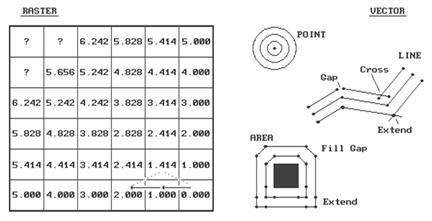
Figure
2. Characterizing Simple Proximity.
The distance to a cell in the next
"ring" is a combination of the information in the previous ring and the
type of movement to the cell. For
example, position Col 4, Row 6 is 1.000 + 1.000= 2.000 grid spaces as the
shortest path is orthogonal-orthogonal.
You could move diagonal-diagonal passing through position Col 5, Row 5,
as shown with the dotted line. But that
route wouldn't be "shortest" as it results in a total distance of
1.414 + 1.414= 2.828 grid spaces. The
rest of the ring assignments involve a similar test of all possible movements
to each cell, retaining the smallest total distance. With tireless devotion, your computer repeats
this process for each successive ring.
The missing information in the figure allows you to be the hero and
complete the simple proximity map. Keep
in mind that there are three possible movements from ring cells into each of
the adjacent cells. (Hint-- one of the
answers is 7.070).
This procedure is radically different
from either your ruler or Pythagoras's theorem.
It is more like nailing your ruler and spinning it while the tic-marks
trace concentric circles-- one unit away, two units away, etc. Another analogy is tossing a rock into a
still pond with the ripples indicating increasing distance. One of the major advantages of this procedure
is that entire sets of "starting locations" can be considered at the
same time. It's like tossing a handful
of rocks into the pond. Each rock begins
a series of ripples. When the ripples
from two rocks meet, they dissipate and indicate the halfway point. The repeated test for the smallest
accumulated distance insures that the halfway "bump" is
identified. The result is a distance
assignment (rippling ring value) from every location to its nearest starting
location.
If your conceptual rocks represented the
locations of houses, the result would be a map of the distance to the nearest
house for an entire study area. Now
imagine tossing an old twisted branch into the water. The ripples will form concentric rings in the
shape of the branch. If your branch's
shape represented a road network, the result would be a map of the distance to
the nearest road. By changing your
concept of distance and measurement procedure, proximity maps can be generated
in an instant compared to the time you or Pythagoras would take.
However, the rippling results are not as
accurate for a given unit spacing. The
orthogonal and diagonal distances are right on, but the other measurements tend
to overstate the true distance. For
example, the rippling distance estimate for position 3,1 is 6.242 grid
spaces. Pythagoras would calculate the
distance as C= ((3**2 + 5**2)) **1/2)= 5.831.
That's a difference of .411 grid spaces, or 7% error. As most raster systems store integer values,
the rounding usually absorbs the error.
But if accuracy between two points is a must, you had better forego the
advantages of proximity measurement.
A vector system, with its extremely fine
reference grid, generates exact Pythagorean distances. However, proximity calculations are not its
forte. The right side of the accompanying
figure shows the basic considerations in generating proximity
"buffers" in a vector system. First, the user establishes the “reach”
of the buffer-- as before, it can be very small for the exacting types, or
fairly course for the rest of us. For
point features, this distance serves as the increment for increasing radii of a
series of concentric circles. Your high
school geometry experience with a compass should provide a good
conceptualization of this process. The
For line and area features, the reach is
used to increment a series of parallel lines about the feature. Again, your compass work in geometry should
rekindle the draftsman's approach. The
A more important concern is how to
account for "buffer bumping."
It's only moderately taxing to calculate the series buffers around
individual features, but it's a monumental task to identify and eliminate any
buffer overlap. Even the most elegant
procedure requires a ponderous pile of computer code and prodigious patience by
the user. Also, the different approaches
produce different results, affecting data exchange and integration among
various systems. The only guarantee is
that a stream proximity map on system A will be different than a stream proximity
map on system B.
Another guarantee is that new concepts of
distance are emerging as
_____________________
As with all Beyond
Mapping articles, allow me to apologize in advance for the "poetic
license" invoked in this terse treatment of a complex subject. Readers interested in more information on
distance algorithms should consult the classic text, The Geography of
Movement, by Lowe and Moryadas, 1975, Houghton Miffen publishers.
RUBBER RULERS...
It must be a joke, like a left-handed
wrench, a bucket of steam or a snipe hunt.
Or it could be the softening of blows in the classroom through enlightened
child-abuse laws. Actually, a rubber
ruler often is more useful and accurate than the old straightedge version. It can bend, compress and stretch throughout
a mapped area as different features are encountered. After all it's more realistic, as the
straight path is rarely what most of us follow.
Last issue established the procedure for
computing simple proximity maps as forming a series of concentric
rings. The ability to characterize the
continuous distribution of simple, straight-line distances to sets of features
like houses and roads is useful in a multitude of applications. More importantly, the
Step DistanceN= .5 * (GSdistance * FfactorN)
Accumulated Distance= Previous + Sdistance1 +
Sdistance2
Minimum Adistance is Shortest, Non-Straight
Distance
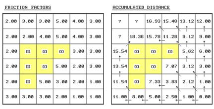
Figure
3. Characterizing Effective Proximity.
A generalized procedure for calculating
effective distance using the friction values is as follows (refer to the
figure).
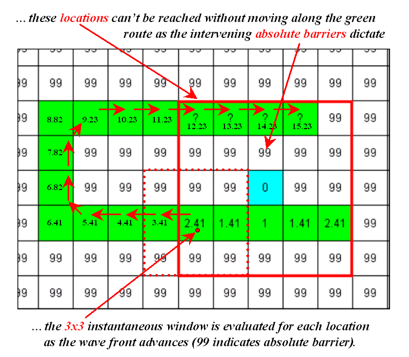
Step 1 - identify the ring cells
("starting cell" 6,6 for first iteration).
Step 2 - identify the set of immediate adjacent
cells (positions 5,5; 5,6; and 6,5 for first iteration).
Step
3 - note the
friction factors for the ring cell and the set of adjacent cells (6,6=1.00;
5,5=2.00; 5,6=1.00; 6,5=1.00).
Step
4 - calculate the distance,
in half-steps, to each of the adjacent cells from each ring cell by multiplying
1.000 for orthogonal or 1.414 for diagonal movement by the corresponding
friction factor...
.5
* (GSdirection * Friction Factor)
For
example, the first iteration ring from the center of 6,6 to the center of
position
5,5 is .5 * (1.414 * 1.00)= .707
.5
* (1.414 * 2.00)= 1.414
2.121
5,6
is .5 * (1.000 * 1.00)= .500
.5
* (1.000 * 1.00)= .500
1.000
6,5
is .5 * (1.000 * 1.00)= .500
.5
* (1.000 * 1.00)= .500
1.000
Step 5 - choose the smallest accumulated
distance value for each of the adjacent cells.
Repeat - for successive rings, the old adjacent
cells become the new ring cells (the next iteration uses 5,5; 5,6 and 6,5 as
the new ring cells).
Whew!
That's a lot of work. Good thing
you have a silicon slave to do the dirty work.
Just for fun (ha!) let's try evaluating the effective distance for
position 2,1...
If you move from position 3,1 its
.5
* (1.000 * 3.00)= 1.50
.5
* (1.000 * 3.00)= 1.50
3.00
plus previous distance= 16.93
equals accumulated distance= 19.93
If you move from position 3,2 its
.5
* (1.414 * 4.00)= 2.83
.5
* (1.414 * 3.00)= 2.12
4.95
plus previous distance= 15.78
equals accumulated distance= 20.73
If you move from position 2,2 its
.5
* (1.000 * 2.00)= 1.00
.5
* (1.000 * 3.00)= 1.50
2.50
plus previous distance= 18.36
equals accumulated distance= 20.86
Finally, choose the
smallest accumulated distance value of 19.93, assign it to position 2,1 and
draw a horizontal arrow from position 3,1.
Provided your patience holds, repeat the process for the last two
positions (answers in the next issue).
The result is a map indicating the
effective distance from the starting location(s) to everywhere in the study
area. If the "friction
factors" indicate time in minutes to cross each cell, then the accumulated
time to move to position 2,1 by the shortest route is 19.93 minutes. If the friction factors indicate cost of haul
road construction in thousands of dollars, then the total cost to construct a
road to position 2,1 by the least cost route is $19,930. A similar interpretation holds for the
proximity values in every other cell.
To make the distance measurement
procedure even more realistic, the nature of the "mover" must be
considered. The classic example is when
two cars start moving toward each other.
If they travel at different speeds, the geographic midpoint along the
route will not be the location the cars actually meet. This disparity can be accommodated by
assigning a "weighting factor" to each starter cell indicating its
relative movement nature-- a value of 2.00 indicates a mover that is twice as
"slow" as a 1.00 value. To
account for this additional information, the basic calculation in Step 4 is
expanded to become
.5
* (GSdirection * Friction Factor * Weighting Factor)
Under the same movement direction and
friction conditions, a "slow" mover will take longer to traverse a
given cell. Or, if the friction is in
dollars, an "expensive" mover will cost more to traverse a given cell
(e.g., paved versus gravel road construction).
I bet your probing intellect has already
taken the next step-- dynamic effective distance. We all know that real movement involves a
complex interaction of direction, accumulation and momentum. For example, a hiker walks slower up a steep
slope than down it. And, as the hike
gets longer and longer, all but the toughest slow down. If a long, steep slope is encountered after
hiking several hours, most of us interpret it as an omen to stop for quiet
contemplation.
The extension of the basic procedure to
dynamic effective distance is still in the hands of
See how far you have come? …from the straightforward interpretation of
distance ingrained in your ruler and Pythagoras's theorem, to the twisted
movement around and through intervening barriers. This bazaar discussion should confirm that
_____________________
As with all Beyond
Mapping articles, allow me to apologize in advance for the "poetic
license" invoked in this terse treatment of a complex subject. Readers with the pMAP Tutorial disk should
review the slide show and tutorial on "Effective Sediment
Loading." An excellent discussion
of effective proximity is in C. Dana Tomlin's text, Geographical Information
Systems and Cartographic Modeling, available through the
COMPUTING
CONNECTIVITY
...all the right connections.
The last couple of articles challenged
the assumption that all distance measurement is the "shortest, straight
line between two points." The
concept of proximity relaxed the "between two points"
requirement. The concept of movement,
through absolute and relative barriers, relaxed the "straight line"
requirement. What's left?
--"shortest," but not necessarily straight and often among sets
points.
Where does all this twisted and contorted
logic lead? That's the point-- connectivity. You know, "the state of being
connected," as Webster would say.
Since the rubber ruler algorithm relaxed the simplifying assumption that
all connections are straight, it seems fair to ask, "then what is the
shortest route, if it isn't straight."
In terms of movement, connectivity among features involves the
computation of optimal paths. It
all starts with the calculation of an "accumulation surface," like
the one shown on the left side of the figure 4.
This is a three-dimensional plot of the accumulated distance table you
completed last month. Remember? Your homework involved that nasty, iterative,
five-step algorithm for determining the friction factor weighted distances of
successive rings about a starting location.
Whew! The values floating above
the surface are the answers to the missing table elements-- 17.54, 19.54 and
19.94. How did you do?
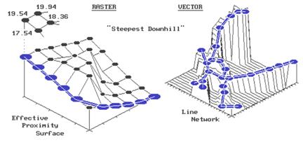
Figure
4. Establishing Shortest, Non-Straight Routes.
But that's all behind us. By comparison, the optimal path algorithm is a
piece of cake-- just choose the steepest downhill path over the accumulated
surface. All of the information about
optimal routes is incorporated in the surface.
Recall, that as the successive rings emanate from a starting location,
they move like waves bending around absolute barriers and shortening in areas
of higher friction. The result is a
"continuously increasing" surface that captures the shortest distance
as values assigned to each cell.
In the "raster" example shown
in the figure, the steepest downhill path from the upper left corner (position
1,1) moves along the left side of the "mountain" of friction in the
center. Successively evaluating the
accumulated distance of adjoining cells and choosing the smallest value
determine the path. For example, the
first step could move to the right (to position 2,1) from 19.54 to 19.94 units
away. But that would be stupid, as it is
farther away than the starting position itself.
The other two potential steps, to 18.36 or 17.54, make sense, but 17.54
makes the most sense as it gets you a lot closer. So you jump to the lowest value at position
1,2. The process is repeated until you
reach the lowest value of 0.0 at position 6,6.
Say, that's where we started measuring
distance. Let's get this right-- first
you measure distance from a location (effective distance map), then you
identify another location and move downhill like a rain drop on a roof. Yep, that's it. The path you trace identifies the route of
the distance wave front (successive rings) that got there first--
shortest. But why stop there, when you
could calculate optimal path density?
Imagine commanding your silicon slave to compute the optimal paths from
all locations down the surface, while keeping track of the number of paths
passing through each location. Like
gullies on a terrain surface, areas of minimal impedance collect a lot of
paths. Ready for another step?--
weighted optimal path density. In this
instance, you assign an importance value (weight) to each starting location,
and, instead of merely counting the number of paths through each location, you
sum the weights.
For the techy types, the optimal path
algorithm for raster systems should be apparent. It's just a couple of nested loops that allow
you to test for the biggest downward step of "accumulated distance"
among the eight neighboring cells. You
move to that position and repeat. If two
or more equally optimal steps should occur, simply move to them. The algorithm stops when there aren't any
more downhill steps. The result is a
series of cells that form the optimal path from the specified
"starter" location to the bottom of the accumulation surface. Optimal path density requires you to build
another map that counts the number paths passing through each cell. Weighted optimal path density sums the
weights of the starter locations, rather than simply counting them.
The vector solution is similar in
concept, but its algorithm is a bit trickier to implement. In the above discussion, you could substitute
the words "line segment" for "cell" and not be too far
off. First, you locate a starting
location on a network of lines. The
location might be a fire station on a particular street in your town. Then you calculate an "accumulation
network" in which each line segment end point receives a value indicating
shortest distance to the fire station along the street network. To conceptualize this process, the raster
explanation used rippling waves from a tossed rock in a pond. This time, imagine waves rippling along a
canal system. They are constrained to
the linear network, with each point being farther away than the one preceding
it. The right side of the accompanying
figure shows a three-dimensional plot of this effect. It looks a lot like a roll-a-coaster track
with the bottom at the fire station (the point closest to you). Now locate a line segment with a
"house-on-fire." The algorithm
hops from the house to "lily pad to lily pad" (line segment end
points), always choosing the smallest value.
As before, this "steepest downhill" path traces the wavefront
that got there first-- shortest route to the fire. In a similar fashion, the concepts of optimal
path density and weighted optimal path density from multiple starting locations
remain intact.
What makes the vector solution testier is
that the adjacency relationship among the lines is not as neatly organized as
in the raster solution. This
relationship, or "topology," describing which cell abuts which cell
is implicit in the matrix of numbers. On
the other hand, the topology in a vector system must be stored in a
database. A distinction between a vertex
(point along a line) and a node (point of intersecting lines) must be
maintained. These points combine to form
chains that, in a cascading fashion, relate to one another. Ingenuity in database design and creative use
of indices and pointers for quick access to the topology are what separates one
system from another. Unfettered respect should
be heaped upon the programming wizards that make all this happen.
However, regardless of the programming
complexity, the essence of the optimal path algorithm remains the same--
measures distance from a location (effective distance map), then locate another
location and move downhill. Impedance to
movement can be a absolute and relative barrier such as one-way streets, no
left turn and speed limits. These
"friction factors" are assigned to the individual line segments, and
used to construct an accumulation distance network in a manner similar to that
discussed last month. It is just that in
a vector system, movement is constrained to an organized set of lines, instead
of an organized set of cells.
Optimal path connectivity isn't the only
type of connection between map locations.
Consider narrowness-- the shortest cord connecting opposing edges. Like optimal paths, narrowness is a two-part
algorithm based on accumulated distance.
For example, to compute a narrowness map of a meadow your algorithm
first selects a "starter" location within the meadow. It then calculates the accumulated distance
from the starter until the successive rings have assigned a value to each of
the meadow edge cells. Now choose one of
the edge cells and determine the "opposing" edge cell that lies on a
straight line through the starter cell.
Sum the two edge cell distance values to compute the length of the
cord. Iteratively evaluate all of the
cords passing through the starter cell, keeping track of the smallest
length. Finally, assign the minimum
length to the starter cell as its narrowness value. Move to another meadow cell and repeat the
process until all meadow locations have narrowness values assigned.
As you can well imagine, this is a
computer-abusive operation. Even with
algorithm trickery and user limits, it will send the best of workstations to
"deep space" for quite awhile.
Particularly when the user wants to compute the "effective
narrowness" (non-straight cords respecting absolute and relative barriers)
of all the timber stands within a 1000x1000 map matrix. But
_________________________________________
…additional
graphic describing the basic algorithm for calculating effective distance.