Applying MapCalc Map Analysis Software
MapCalc Display Types: Most
<click
here> for a printer friendly
version (.pdf)
Summary of MapCalc Display Types.
Understanding the Differences Between Lattice and Grid Display Types. All grid-based data (also referred to as “raster” data) is represented as a matrix of numbers. How the set of map values is displayed can dramatically affect the presentation of the information. MapCalc utilizes two basic display types— Lattice and Grid that can be displayed in 2D or 3D at the click of a button.
 2D Grid Map (elevation surface). A Grid display characterizes the area
formed by cells in the reference grid.
The data is organized like a large spreadsheet— in this example, 100
columns by 100 rows = 10,000 cells. The
inset on the right identifies that a stored value of 9 is at the position Col=
45, Row=14 in the data matrix. The inset
on the left shows this location within the enlarged portion of the map. In generating a 2D Grid display the
computer reads the data matrix and assigns a color based on the stored value
for each grid cell area. For this display
the grid mesh was turned on for reference.
2D Grid Map (elevation surface). A Grid display characterizes the area
formed by cells in the reference grid.
The data is organized like a large spreadsheet— in this example, 100
columns by 100 rows = 10,000 cells. The
inset on the right identifies that a stored value of 9 is at the position Col=
45, Row=14 in the data matrix. The inset
on the left shows this location within the enlarged portion of the map. In generating a 2D Grid display the
computer reads the data matrix and assigns a color based on the stored value
for each grid cell area. For this display
the grid mesh was turned on for reference.
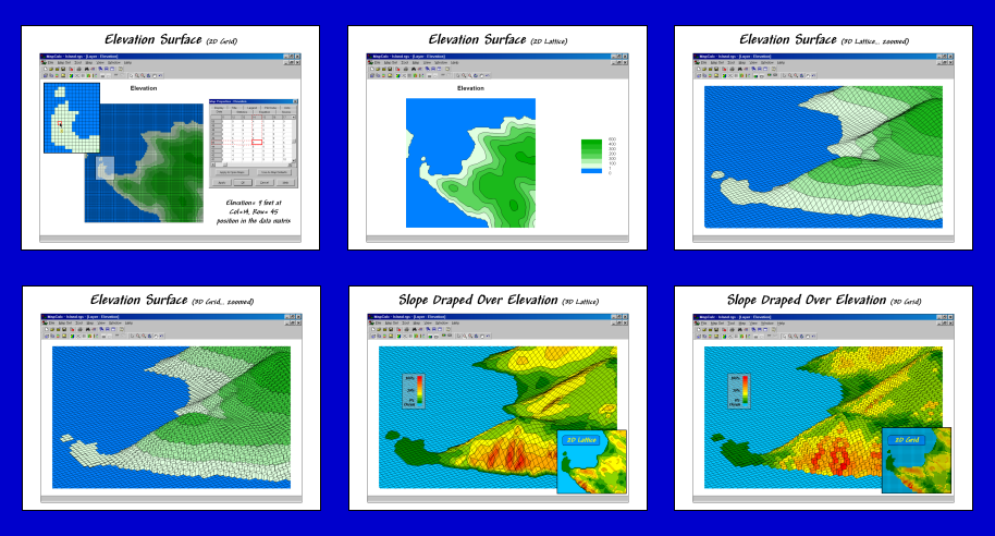
 2D Lattice Map. A Lattice display characterizes the
intersections formed by the lines defining the mesh. The stored values are associated with the line
intersections— not the centers of the grid cells. While this distinction might seem trivial, it
has important effects on geo-registration and the nature of the display.
2D Lattice Map. A Lattice display characterizes the
intersections formed by the lines defining the mesh. The stored values are associated with the line
intersections— not the centers of the grid cells. While this distinction might seem trivial, it
has important effects on geo-registration and the nature of the display.
The shift between cell centers and line intersections is half a grid cell (25m / 2 = 12.5 meters in the example). It is important for mapping software to account for this shift in data import/export as well as display.
Rather than coloring individual cells based on the data, lattice systems derive series of contour lines based on estimated intersections with the grid mesh. For example, if an elevation value of 5 feet is adjacent to one of 15 feet in the data matrix a 10-foot contour line is drawn between them. Connecting all of the implied contour line intersections with the mesh draws the actual contour line… color filling the spaces between contour lines forms a 2D contour map.
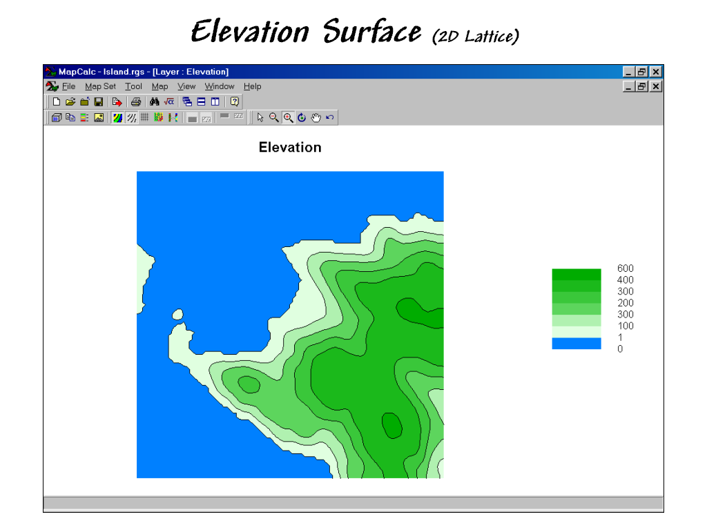
 3D Lattice Map (in plot cube with floor
contours shown). A 3D representation
of lattice data is analogous to draping a fishnet over the map values. Each intersection is raised to a relative
height based on the value at the location.
3D Lattice Map (in plot cube with floor
contours shown). A 3D representation
of lattice data is analogous to draping a fishnet over the map values. Each intersection is raised to a relative
height based on the value at the location.
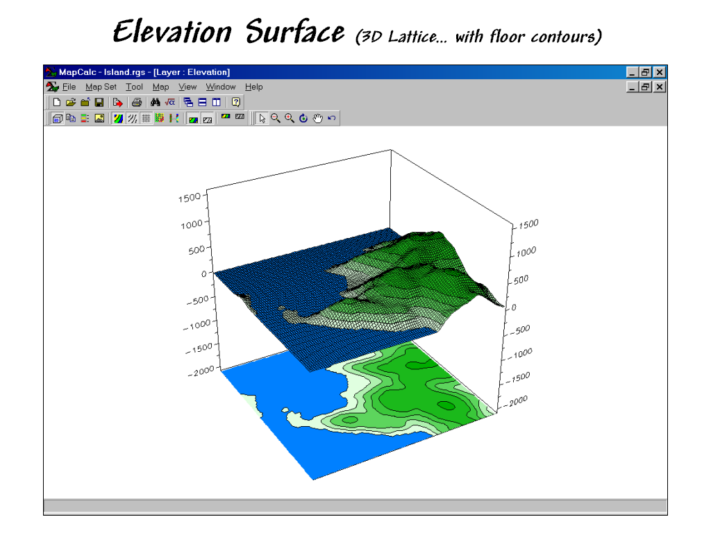
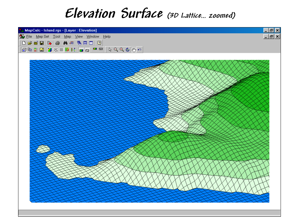 3D Lattice Map (zoomed). A perspective drawing of the fishnet is
achieved by making the lengths of the lines correspond to the relative
differences in the stored map values.
Note the pronounced diamond shapes in the steep areas, while the flat
areas form smaller square-like shapes.
3D Lattice Map (zoomed). A perspective drawing of the fishnet is
achieved by making the lengths of the lines correspond to the relative
differences in the stored map values.
Note the pronounced diamond shapes in the steep areas, while the flat
areas form smaller square-like shapes.
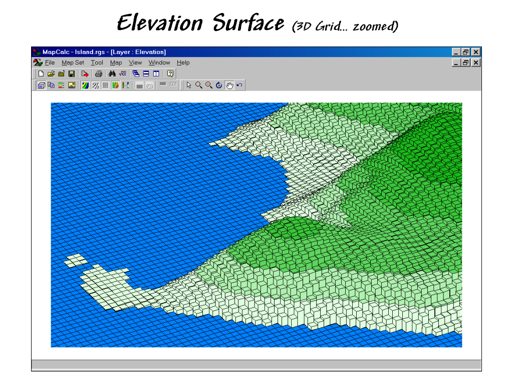 3D Grid Map. The three-dimensional effect in a 3D Grid
map is achieved by “extruding” each cell to a height based on its stored map
value. Hidden line removal retains only
the visible faces of the “bars” depending on viewer position and the spatial
patterns in the data.
3D Grid Map. The three-dimensional effect in a 3D Grid
map is achieved by “extruding” each cell to a height based on its stored map
value. Hidden line removal retains only
the visible faces of the “bars” depending on viewer position and the spatial
patterns in the data.
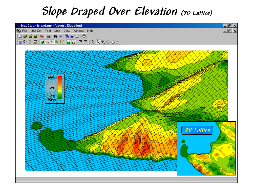 3D Lattice Map (with draped slope map). Information from another map can be draped on
a lattice surface. In this example, the
computed slopes (see MapCalc analysis
operation SLOPE) for the elevation surface are superimposed. Note the precise alignment between the
composite information— green tones in the flat
areas and red tones in the steeper areas.
3D Lattice Map (with draped slope map). Information from another map can be draped on
a lattice surface. In this example, the
computed slopes (see MapCalc analysis
operation SLOPE) for the elevation surface are superimposed. Note the precise alignment between the
composite information— green tones in the flat
areas and red tones in the steeper areas.
 3D Grid Map (with draped slope map). In a similar manner, slope information can be
draped on a 3D Grid display. The
smaller insets in this and the previous figure were constructed by “screen
grabbing” portions of other MapCalc displays and assembling the graphics in
PowerPoint.
3D Grid Map (with draped slope map). In a similar manner, slope information can be
draped on a 3D Grid display. The
smaller insets in this and the previous figure were constructed by “screen
grabbing” portions of other MapCalc displays and assembling the graphics in
PowerPoint.
Summary. Lattice and Grid displays provide different views of mapped data. Traditional 2D displays are best for precise measurements and show all map areas (no information hidden behind ridges). 3D displays, on the other hand, provide a visual sense of the relative relationships among map values and can be rotated for different positions. The draping of information from another map onto a surface can provide a visual grasp of the spatial correlation between two maps— such as the relative positioning of yield contours on a surface map of percent of organic matter, or income levels on a sales density surface.
When attempting to view a map, you should first consider its Data Type (Discrete or Continuous) then decide on the Display Type (Lattice or Grid and 2D or 3D) and finally the Color Intervals/Pallet (Shading Manager) to use.