Beyond Mapping III
|
Map
Analysis book with companion CD-ROM
for hands-on exercises and further reading |
Measuring Distance Is Neither Here nor
There — discusses
the basic concepts of distance and proximity
Use Cells and Rings to
Calculate Simple Proximity
— describes how
simple proximity is calculated
Extend Simple Proximity to Effective
Movement — discusses
the concept of effective distance responding to relative and absolute barriers
Calculate and Compare to Find
Effective Proximity — describes
how effective proximity is calculated
Taking Distance to the Edge — discusses
advance distance operations
Advancing the Concept of Effective Distance — describes the algorithms used in implementing
Starter value advanced techniques
A Dynamic Tune-up for Distance Calculations — describes the algorithms used in implementing
dynamic effective distance procedures involving intervening conditions
A Narrow-minded Approach — describes
how Narrowness maps are derived
Narrowing-In on Absurd Gerrymanders — discusses
how a Narrowness Index can be applied to assess redistricting configurations
Just How Crooked Are Things? — discusses distance-related metrics for assessing crookedness
Note: The processing and figures
discussed in this topic were derived using MapCalcTM
software. See www.innovativegis.com to download a
free MapCalc Learner version with tutorial materials for classroom and
self-learning map analysis concepts and procedures.
<Click here>
right-click to download a printer-friendly version of this topic (.pdf).
(Back to the Table of Contents)
______________________________
Measuring
Distance Is Neither Here nor There
(GeoWorld, April 2005, pg. 18-19)
Measuring
distance is one of the most basic map analysis techniques. Historically, distance is defined as the shortest straight-line
between two points. While
this three-part definition is both easily conceptualized and implemented with a
ruler, it is frequently insufficient for decision-making. A straight-line route might indicate the
distance “as the crow flies,” but offer little information for the walking crow
or other flightless creature. It is
equally important to most travelers to have the measurement of distance
expressed in more relevant terms, such as time or cost.
The
limitation of a map analysis approach is not so much in the concept of distance
measurement, but in its implementation.
Any measurement system requires two components— a standard unit and a procedure for measurement.
Using a ruler, the “unit” is the smallest hatching along its edge and
the “procedure” is the line implied by aligning the straightedge. In effect, the ruler represents just one row
of a grid implied to cover the entire map.
You just position the grid such that it aligns with the two points you
want measured and count the squares (top portion of figure 1). To measure another distance you merely
realign the implied grid and count again.
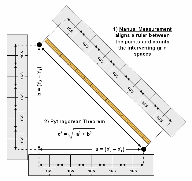
Figure
1. Both Manual Measurement and the Pythagorean
Theorem use grid spaces as the fundamental units for determining the distance between
two points.
In a
Proximity
establishes the distance to all locations surrounding a point— the set of shortest straight-lines
among groups of points.
Rather than sequentially computing the distance between pairs of
locations, concentric equidistance zones are established around a location or
set of locations (figure 2). This
procedure is similar to the wave pattern generated when a rock is thrown into a
still pond. Each ring indicates one “unit
farther away”— increasing distance as the wave moves away. Another way to conceptualize the process is
nailing one end of a ruler at a point and spinning it around. The result is a series of “data zones”
emanating from a location and aligning with the ruler’s tic marks.
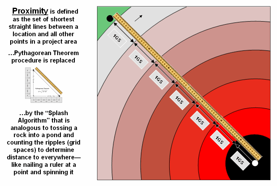
Figure
2. Proximity identifies the set of shortest
straight-lines among groups
of points (distance zones).
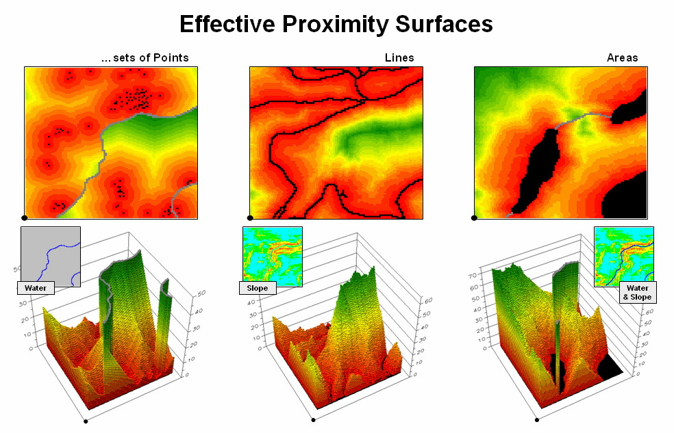
However,
nothing says proximity must be measured from a single point. A more complex proximity map would be
generated if, for example, all locations with houses (set of points) are
simultaneously considered target locations (right side of figure 3).
In
effect, the procedure is like throwing a handful of rocks into pond. Each set of concentric rings grows until the
wave fronts meet; then they stop. The
result is a map indicating the shortest straight-line distance to the nearest
target location (house) for each non-target location. In the figure, the red tones indicate
locations that are close to a house, while the green tones identify areas that
are far from a house.
In a
similar fashion, a proximity map to roads is generated by establishing data
zones emanating from the road network—sort of like tossing a wire frame into a
pond to generate a concentric pattern of ripples (middle portion of figure
3). The same result is generated for a
set of areal features, such as sensitive habitat parcels (right side of figure
3).
Figure
3.
Proximity surfaces can be generated for groups of points, lines or
polygons identifying the shortest distance from all location to the closest
occurrence.
It is
important to note that proximity is not the same as a buffer. A buffer is a discrete spatial object that
identifies areas that are within a specified distance of map feature; all
locations within a buffer are considered the same. Proximity is a continuous surface that
identifies the distance to a map feature(s) for every location in a project
area. It forms a gradient of distances
away composed of many map values; not a single spatial object with one
characteristic distance away.
The 3D
plots of the proximity surfaces in figure 3 show detailed gradient data and are
termed accumulated surfaces. They contain increasing distance values from
the target point, line or area locations displayed as colors from red (close)
to green (far). The starting features
are the lowest locations (black= 0) with hillsides of increasing distance and
forming ridges that are equidistant from starting locations. Next month will focus on how proximity is
calculated—conceptually easy but way too much bookkeeping for even the most
ardent accountant.
Use Cells
and Rings to Calculate Simple Proximity
(GeoWorld, May 2005, pg. 18-19)
The last
section established that proximity is measured by a series of propagating rings
emanating from a starting location—splash algorithm. Since the reference grid is a set of square
grid cells, the rings are formed by concentric sets of cells. In figure 1, the first “ring” is formed by
the three cells adjoining the starting cell in the lower-right corner. The top and side cells represent orthogonal
movement while upper-left one is diagonal.
The assigned distance of the steps reflect the type of movement—orthogonal
equals 1.000 and diagonal equals 1.414.
Figure
1. Simple proximity is generated by summing a
series of orthogonal and diagonal steps emanating from a starting location.
As the
rings progress, 1.000 and 1.414 are added to the previous accumulated distances
resulting in a matrix of proximity values.
The value 7.01 in the extreme upper-left corner is derived by adding 1.414
for five successive rings (all diagonal steps).
The other two corners are derived by adding 1.000 five times (all
orthogonal steps). In these cases, the
effective proximity procedure results in the same distance as calculated by the
Pythagorean Theorem.
Reaching
other locations involve combinations of orthogonal and diagonal steps. For example, the other location in the figure
uses three orthogonal and then two diagonal steps to establish an accumulated
distance value of 5.828. The Pythagorean
calculation for same location is 5.385.
The difference (5.828 – 5.385= .443/5.385= 8%) is due to the relatively
chunky reference grid and the restriction to grid cell movements.
Grid-based
proximity measurements tend to overstate true distances for off-orthogonal/diagonal
locations. However, the error becomes
minimal with distance and use of smaller grids.
And the utility of the added information in a proximity surface often
outweighs the lack of absolute precision of simple distance measurement.
Figure
2 shows the calculation details for the remaining rings. For example, the larger inset on the left
side of the figure shows ring 1 advancing into the second ring. All forward movements from the cells forming
the ring into their adjacent cells are considered. Note the multiple paths that can reach
individual cells. For example, movement
into the top-right corner cell can be an orthogonal step from the 1.000 cell
for an accumulated distance of 2.000. Or
it can be reached by a diagonal step from the 1.414 cell for an accumulated
distance of 2.828. The smaller value is
stored in compliance with the idea that distance implies “shortest.” If the spatial resolution of the analysis grid
is 300m then the ground distance is 2.000 * 300m/gridCell=
600m.In a similar fashion, successive ring movements are calculated, added to
the previous ring’s stored values and the smallest of the potential distance
values being stored. The distance waves
rapidly propagate throughout the project area with the shortest distance to the
starting location being assigned at every location.
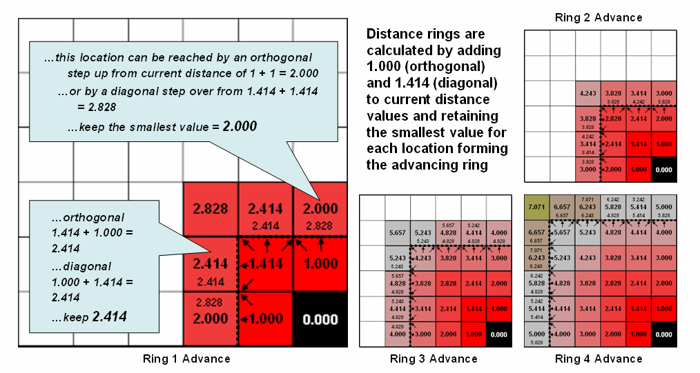
Figure
2. Simple distance rings advance by summing
1.000 or 1.414 grid space movements and retaining the minimal accumulated
distance of the possible paths.
If more
than one starting location is identified, the proximity surface for the next
starter is calculated in a similar fashion.
At this stage every location in the project area has two proximity
values—the current proximity value and the most recent one (figure 3). The two surfaces are compared and the
smallest value is retained for each location—distance to closest starter
location. The process is repeated until
all of the starter locations representing sets of points, lines or areas have
been evaluated.
While
the computation is overwhelming for humans, the repetitive nature of adding
constants and testing for smallest values is a piece of cake for computers
(millions of iterations in a few seconds).
More importantly, the procedure enables a whole new way of representing
relationships in spatial context involving “effective distance” that responds
to realistic differences in the characteristics and conditions of movement
throughout geographic space.
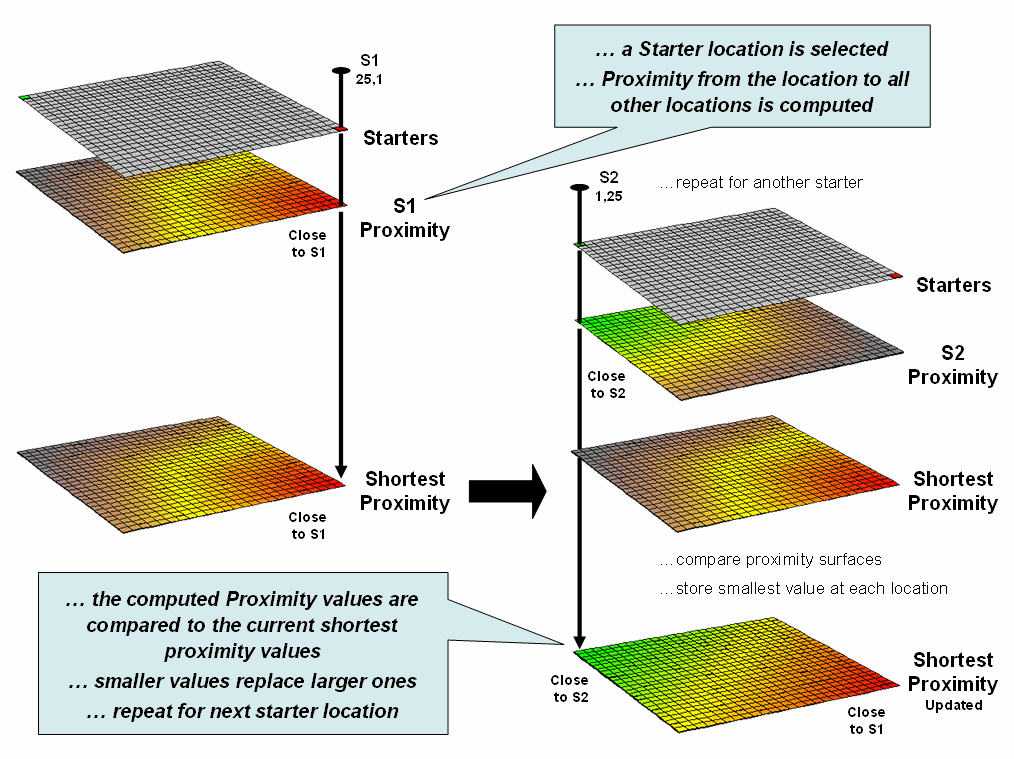
Figure
3. Proximity surfaces are compared and the
smallest value is retained to identify the distance to the closest starter
location.
Extend
Simple Proximity to Effective Movement
(GeoWorld, June 2005, pg. 18-19)
Last
section’s discussion suggested that in many applications, the shortest route
between two locations might not always be a straight-line. And even if it is straight, its geographic length
may not always reflect a traditional measure of distance. Rather, distance in these applications is
best defined in terms of “movement” expressed as travel-time, cost or energy
that is consumed at rates that vary over time and space. Distance modifying effects involve weights
and/or barriers— concepts that imply the relative ease of movement through
geographic space might not always constant.
Figure
1 illustrates one of the effects of distance being affected by a movement characteristic. The left-side of the figure shows the simple
proximity map generated when both starting locations are considered to have the
same characteristics or influence. Note
that the midpoint (dark green) aligns with the perpendicular bisector of the
line connecting the two points and confirms a plane geometry principle you
learned in junior high school.
The
right-side of the figure, on the other hand, depicts effective proximity where
the two starting locations have different characteristics. For example, one store might be considered
more popular and a “bigger draw” than another (Gravity Modeling). Or in old geometry terms, the person starting
at S1 hikes twice as fast as the individual starting at S2— the weighted
bisector identifies where they would meet.
Other examples of weights include attrition where movement changes with
time (e.g., hiker fatigue) and change in mode (drive a vehicle as far as
possible then hike into the off-road areas).
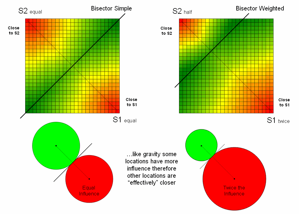
Figure
1. Weighting factors based on the
characteristics of movement can affect relative distance, such as in Gravity Modeling where some starting locations exert more influence.
In
addition to weights that reflect movement characteristics, effective proximity
responds to intervening conditions or barriers. There are two types of barriers
that are identified by their effects— absolute and relative. Absolute
barriers are those completely restricting movement and therefore imply an
infinite distance between the points they separate. A river might be regarded as an absolute
barrier to a non-swimmer. To a swimmer
or a boater, however, the same river might be regarded as a relative barrier identifying areas that
are passable, but only at a cost which can be equated to an increase in
geographical distance. For example, it
might take five times longer to row a hundred meters than to walk that same
distance.
In the conceptual
framework of tossing a rock into a pond, the waves can crash and dissipate
against a jetty extending into the pond (absolute barrier; no movement through
the grid spaces). Or they can proceed,
but at a reduced wavelength through an oil slick (relative barrier; higher cost
of movement through the grid spaces).
The waves move both around the jetty and through the oil slick with the
ones reaching each location first identifying the set of shortest, but not necessarily straight-lines
among groups of points.
The
shortest routes respecting these barriers are often twisted paths around and
through the barriers. The
Figure
2. Effective Proximity surfaces consider the
characteristics and conditions of movement throughout a project area.
The
point features in the left inset respond to treating flowing water as an
absolute barrier to movement. Note that
the distance to the nearest house is very large in the center-right portion of
the project area (green) although there is a large cluster of houses just to
the north. Since the water feature can’t
be crossed, the closest houses are a long distance to the south.
Terrain
steepness is used in the middle inset to illustrate the effects of a relative
barrier. Increasing slope is coded into
a friction map of increasing impedance values that make movement through steep
grid cells effectively farther away than movement through gently sloped
locations. Both absolute and relative
barriers are applied in determining effective proximity sensitive areas in the
right inset.
The
dramatic differences between the concept of distance “as the crow flies”
(simple proximity) and “as the crow walks” (effective proximity) is a bit
unfamiliar and counter-intuitive.
However, in most practical applications, the comfortable assumption that
all movement occurs in straight lines totally disregards reality. When traveling by trains, planes,
automobiles, and feet there are plenty of bends, twists, accelerations and
decelerations due to characteristics (weights) and conditions (barriers) of the
movement.
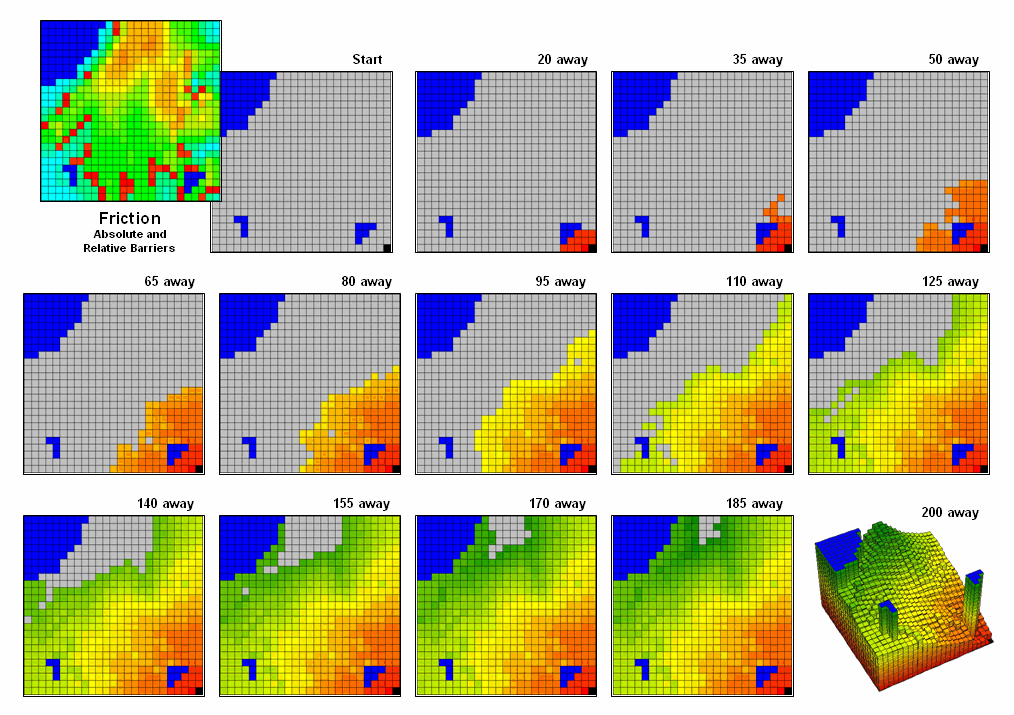
Figure
3.
Effective Distance waves are distorted as they encounter absolute and relative
barriers, advancing faster under easy conditions and slower in difficult areas.
Figure
3 illustrates how the splash algorithm propagates distance waves to generate an
effective proximity surface. The
Friction Map locates the absolute (blue/water) and relative (light blue=
gentle/easy through red= steep/hard) barriers.
As the distance wave encounters the barriers their effects on movement
are incorporated and distort the symmetric pattern of simple proximity waves. The result identifies the “shortest, but not
necessarily straight” distance connecting the starting location with all other
locations in a project area.
Note
that the absolute barrier locations (blue) are set to infinitely far away and
appear as pillars in the 3-D display of the final proximity surface. As with simple proximity, the effective
distance values form a bowl-like surface with the starting location at the
lowest point (zero away from itself) and then ever-increasing distances away
(upward slope). With effective
proximity, however, the bowl is not symmetrical and is warped with bumps and
ridges that reflect intervening conditions— the greater the impedance the
greater the upward slope of the bowl. In
addition, there can never be a depression as that would indicate a location
that is closer to the starting location than everywhere around it. Such a situation would violate the
ever-increasing concentric rings theory and is impossible except on Star Trek
where Spock and the Captain de-materialize then reappear somewhere else without
physically passing through the intervening locations.
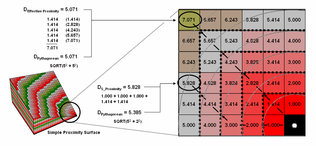
Calculate
and Compare to Find Effective Proximity
(GeoWorld, July 2005, pg. 18-19)
The last
couple of sections have focused on how effective distance is measured in a
grid-based
Figure
1. Effective proximity is generated by summing a
series of steps that reflect the characteristics and conditions of moving
through geographic space.
Figure
1 shows the effective proximity values for a small portion of the results
forming the proximity surface discussed last month. Manual Measurement, Pythagorean Theorem and
Simple Proximity all report that the geographic distance to the location in the
upper-right corner is 5.071 * 300meters/gridCell=
1521 meters. But this simple geometric
measure assumes a straight-line connection that crosses extremely high
impedance values, as well as absolute barrier locations—an infeasible route
that results in exhaustion and possibly death for a walking crow.
The
shortest path respecting absolute and relative barriers is shown as first
sweeping to the left and then passing around the absolute barrier on the right
side. This counter-intuitive route is
formed by summing the series of shortest steps at each juncture. The first step away from the starting
location is toward the lowest friction and is computed as the impedance value
times the type of step for 3.00 *1.000= 3.00.
The next step is considerably more difficult at 5.00 * 1.414= 7.07 and
when added to the previous step’s value yields a total effective distance of
10.07. The process of determining the
shortest step distance and adding it to the previous distance is repeated over
and over to generate the final accumulated distance of the route.
It is
important to note that the resulting value of 49.70 can’t be directly compared
to the 507.1 meters geometric value.
Effective proximity is like applying a rubber ruler that expands and
contracts as different movement conditions reflected in the Friction Map are
encountered. However, the proximity
values do establish a relative scale of distance and it is valid to interpret
that the 49.7 location is nearly five times farther away than the location
containing the 10.07 value.
If the
Friction Map is calibrated in terms of a standard measure of movement, such as
time, the results reflect that measure.
For example, if the base friction unit was 1-minute to cross a grid cell
the location would be 49.71 minutes away from the starting location. What has changed isn’t the fundamental
concept of distance but it has been extended to consider real-world characteristics
and conditions of movement that can be translated directly into decision
contexts, such as how long will it take to hike from “my cabin to any location”
in a project area. In addition, the
effective proximity surface contains the information for delineating the
shortest route to anywhere—simply retrace to wave front movement that got there
first by taking the steepest downhill path over the accumulation surface.
The
calculation of effective distance is similar to that of simple proximity, just
a whole lot more complicated. Figure 2
shows the set of movement possibilities for advancing from the first ring to
the second ring. Simple proximity only
considers forward movement whereas effective proximity considers all possible
steps (both forward and backward) and the impedance associated with each
potential move.
For
example, movement into the top-right corner cell can be an orthogonal step
times the friction value (1.000 * 6.00) from the 18.00 cell for an accumulated
distance of 24.00. Or it can be reached
by a diagonal step times the friction value (1.414 * 6.00) from the 19.00 cell
for an accumulated distance of 30.48.
The smaller value is stored in compliance with the idea that distance
implies “shortest.” The calculations in the
blue panels show locations where a forward step from ring 1 is the shortest,
whereas the yellow panels show locations where backward steps from ring 2 are
shorter.
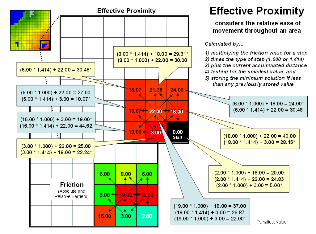
Figure
2. Effective distance rings advance by summing
the friction factors times the type of grid space movements and retaining the
minimal accumulated distance of the possible paths.
The
explicit procedure for calculating effective distance in the example involves:
Step 1) multiplying the friction value for a step
Step 2) times the type of step (1.000 or 1.414)
Step 3) plus the current accumulated distance
Step 4) testing for the smallest value, and
Step 5) storing the minimum solution if less than any previously
stored value.
Extending
the procedure to consider movement characteristics merely introduces an
additional step at the beginning—multiplying the relative weight of the
starter.
The
complete procedure for determining effective proximity from two or more
starting locations is graphically portrayed in figure 3. Proximity values are calculated from one
location then another and stored in two matrices. The values are compared on a cell-by-cell
basis and the shortest value is retained for each instance. The “calculate then compare” process is
repeated for other starting locations with the working matrix ultimately
containing the shortest distance values, regardless which starter location is
closest. Piece-of-cake
for a computer.
Figure
3.
Effective proximity surfaces are computed respecting movement weights and
impedances then compared and the smallest value is retained to identify the
distance to the closest starter location.
Taking
Distance to the Edge
(GeoWorld, August 2005, pg. 18-19)
The
past series of four sections have focused on how simple distance is extended to
effective proximity and movement in a modern
While
the computations of simple and effective proximity might be unfamiliar and
appear complex, once programmed they are easily and quickly performed by modern
computers. In addition, there is a
rapidly growing wealth of digital data describing conditions that impact
movement in the real world. It seems
that all is in place for a radical rethinking and expression of
distance—computers, programs and data are poised.
However,
what seems to be the major hurdle for adoption of this new way of spatial
thinking lies in the experience base of potential users. Our paper map legacy suggests that the
“shortest straight line between two points” is the only way to investigate
spatial context relationships and anything else is disgusting (or at least
uncomfortable).
This
restricted perspective has lead most contemporary
Figure
1. Extended list of advance
distance operations.
The
first portion of figure 1 identifies the basic operations described in the
previous sections. Our traditional thinking
of distance as the “shortest, straight line between two points” is extended to Simple
Proximity by relaxing the assumption that all movement is just between
two points. Effective Proximity
relaxes the requirement that all movement occurs in straight lines. Weighted Proximity extends the
concept of static geographic distance by accounting for different movement
characteristics, such as speed.
The
result is a new definition of distance as the “shortest, not necessarily
straight set of connections among all points.”
While this new definition may seem awkward it is more realistic as very
few things move in a straight line. For
example, it has paved the way for online driving directions from your place to
anywhere …an impossible task for a ruler or Pythagoras.
In
addition, the new procedures have set the stage for even more advanced distance
operations (lower portion of figure 1).
A Guiding Surface can be used to constrain movement up, down or
across a surface. For example, the
algorithm can check an elevation surface and only proceed to downhill locations
from a feature such as roads to identify areas potentially affected by the wash
of surface chemicals applied.
The
simplest Directional Effect involves compass directions, such as only
establishing proximity in the direction of a prevailing wind. A more complex directional effect is
consideration of the movement with respect to an elevation surface—a steep
uphill movement might be considered a higher friction value than movement
across a slope or downhill. This
consideration involves a dynamic barrier that the algorithm must evaluate for
each point along the wave front as it propagates.
Accumulation
Effects
account for wear and tear as movement continues. For example, a hiker might easily proceed
through a fairly steep uphill slope at the start of a hike but balk and pitch a
tent at the same slope encountered ten hours into a hike. In this case, the algorithm merely “carries”
an equation that increases the static/dynamic friction values as the movement
wave front progresses. A natural
application is to have a user enter their gas tank size and average mileage
into MapQuest so it would automatically suggest refilling stops along your
vacation route.
A
related consideration, Momentum Effects, tracks the total
effective distance but in this instance it calculates the net effect of
up/downhill conditions that are encountered.
It is similar to a marble rolling over an undulating surface—it picks up
speed on the downhill stretches and slows down on the uphill ones. In fact, this was one of my first spatial
exercises in computer programming in the 1970s.
The class had to write a program that determined the final distance and
position of a marble given a starting location, momentum equation based on
slope and a relief matrix …all in unstructured FORTRAN.
The
remaining three advanced operations interact with the accumulation surface
derived by the wave front’s movement.
Recall that this surface is analogous to football stadium with each tier
of seats being assigned a distance value indicating increasing distance from
the field. In practice, an accumulation
surface is a twisted bowl that is always increasing but at different rates that
reflect the differences in the spatial patterns of relative and absolute
barriers.
Stepped
Movement
allows the proximity wave to grow until it reaches a specified location, and
then restart at that location until another specified location and so on. This generates a series of effective
proximity facets from the closest to the farthest location. The steepest downhill path over each facet,
as you might recall, identifies the optimal path for that segment. The set of segments for all of the facets
forms the optimal path network connecting the specified points.
The
direction of optimal travel through any location in a project area can be
derived by calculating the Back Azimuth of the location on the
accumulation surface. Recall that the
wave front potentially can step to any of its eight neighboring cells and keeps
track of the one with the least “friction.”
The aspect of the steepest downhill step (N, NE, E, SE, S, SW, W or NW)
at any location on the accumulation surface therefore indicates the direction
of the best path through that location.
In practice there are two directions—one in and one out for each
location.
An even
more bazaar extension is the interpretation of the 1st and 2nd
Derivative of an accumulation surface.
The 1st derivative (rise over run) identifies the change in
accumulated value (friction value) per unit of geographic change (cell
size). On a travel-time surface, the
result is the speed of optimal travel across the cell. The second derivative generates values
whether the movement at each location is accelerating or decelerating.
Chances
are these extensions to distance operations seem a bit confusing,
uncomfortable, esoteric and bordering on heresy. While the old “straight line” procedure from
our paper map legacy may be straight forward, it fails to recognize the reality
that most things rarely move in straight lines.
Effective
distance recognizes the complexity of realistic movement by utilizing a
procedure of propagating proximity waves that interact with a map indicating
relative ease of movement. Assigning
values to relative and absolute barriers to travel enable the algorithm to
consider locations to favor or avoid as movement proceeds. The basic distance operations assume static
conditions, whereas the advanced ones account for dynamic conditions that vary
with the nature of the movement.
So
what’s the take home from this series describing effective distance? Two points seem to define the bottom
line. First, that the digital map is
revolutionizing how we perceive distance, as well as how calculate it. It is the first radical change since
Pythagoras came up with his theorem about 2,500 years ago. Secondly, the ability to quantify effective
distance isn’t limited by computational power or available data; rather our
difficulties in understanding accepting the concept. Hopefully the discussions have shed some
light on this rethinking of distance measurement.
Advancing the Concept of Effective
Distance
(GeoWorld, February 2011)
The previous section described
several advanced distance procedures.
This and the next section expand on those discussions by describing the
algorithms used in implementing the advanced grid-based techniques.
The top portion of figure
1 shows the base maps and procedure used in deriving Static Effective
Distance. The “Starter” map identifies
the locations from which distance will be measured, and their row, column
coordinates are entered into a data stack for processing. The “Friction,” or discrete cost map, notes
conditions that impede movement within a project area—“absolute” barriers
prohibit, while “relative” barriers restrict movement.
Figure 1. The five most common Dynamic
Effective Distance extensions to traditional “cost distance” calculations.
Briefly stated, the basic
algorithm pops a location off the Starter stack, then notes the nature of the
geographic movement to adjacent cells— orthogonal= 1.000 and diagonal=
1.414. It then checks the impedance/cost
for moving into each of the surrounding cells.
If an absolute barrier exists, the effective distance for that location
is set to infinity. Otherwise, the
geographic movement type is multiplied by the impedance/cost on the friction
map to calculate the accumulated cost.
The procedure is repeated as the movement “wave” continues to propagate
like tossing a rock into a still pond.
If a location can be accessed by a shorter wave-front path from the
Starter cell, or from a different Starter cell, the minimum effective distance
is retained.
The “minimize
(distance * impedance)” wave propagation repeats until the Starter stack is
exhausted. The result is a map surface
of the accumulated cost to access anywhere within a project area from its
closest Starter location. The solution
is expressed in friction/cost units (e.g., minutes are used to derive a
travel-time map).
The bottom portion of
figure 1 identifies the additional considerations involved in extending the
algorithm for Dynamic Effective Distance.
Three of the advanced techniques involve special handling of the values
associated with the Starter locations—1) weighted distance, 2) stepped
accumulation and 3) back-link to closest Starter location. Other extensions utilize 4) a guiding surface
to direct movement and 5) look-up tables to update relative impedance based on
the nature of the movement.
Figure 2. Weighted distance takes into account differences in
the relative movement (e.g., speeds) away from different Starter locations.
Figure 2 shows the
results of “weighted distance” that considers differences in movement
characteristics. Most distance
algorithms assume that the character of movement is the same for all Starter
locations and that the solution space between two Starter locations will be a
true halfway point (perpendicular bisector).
For example, if there were two helicopters flying toward each other,
where one is twice as fast as the other, the “effective halfway” meeting is
shifted to an off-center, weighted bisector (upper left). Similarly, two emergency vehicles traveling
at different speeds will not meet at the geographic midpoint along a road
network (lower right).
Weighted distance is
fairly easy to implement. When a Starter
location is popped off the stack, its value is used to set an additional
weighting factor in the effective distance algorithm— minimize ((distance *
impedance) * Starter weight).
The weight stays in effect throughout a Starter location’s evaluation
and then updated for the next Starter location.
Figure 3 shows the
results of “stepped accumulation” distance that considers a series of sequenced
movement steps (see Author’s Note).
In the example, on-road travel-time is first calculated along the road
network from the headquarters Starter location with off-road travel treated as
an absolute barrier. The next step
assumes starting anywhere along the roads and proceeding off-road by ATV with
relative barriers determined by terrain steepness and absolute barriers set to
locations exceeding ATV operating limits (<40% slope). The final step propagates the distance wave
into the very steep areas assuming hiking travel.
Stepped distance is a bit
more complicated to implement. It
involves a series of calls to the effective distance algorithm with the
sequenced Starter maps values used to set the accumulation distance counter— minimize
[Starter value + (distance *
impedance)]. The Starter value for
the first call to calculate effective distance by truck from the headquarters
is set to one (or a slightly larger value to indicate “scramble time” to get to
the truck). As the wave front propagates
each road location is assigned a travel-time value.
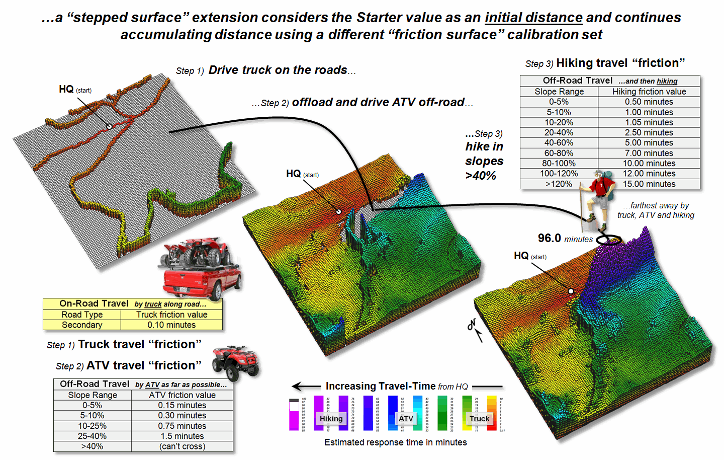
Figure 3. A stepped accumulation surface changes the
relative/absolute barriers calibrations for different modes of travel.
The second call uses the
accumulated travel-time at each road location to begin off-road ATV
movement. In essence the algorithm picks
up the wave propagation where it left off and a different friction map is
utilized to reflect the relative and absolute barriers associated with ATV
travel. Similarly, the third step picks
up where ATV travel left off and distance wave continues into the very steep
slopes using the hiking friction map calibrations. The final result is a complete travel-time
surface identifying the minimum time to reach any grid location assuming the
best mix of truck, ATV and hiking movement.
A third way that Starter
value can be used is as an ID number to identify the Starter location with the
minimum travel-time. In this extension,
as the wave front propagates the unique Starter ID is assigned to the
corresponding grid cell for every location that “beats” (minimizes) all of the
preceding paths that have been evaluated.
The result is a new map that identifies the effectively closest Starter
location to any accessible grid location within a project area. This new map is commonly referred to a “back-link”
map.
In summary, the value on
the Starter map can be used to model weighted effective distance, stepped
movement and back-linked to the closest starting location. The next section considers the introduction
of a guiding surface to direct movement and use of look-up tables to
change the friction “on-the-fly” based on the nature of the movement
(direction, accumulation and momentum).
_____________________________
Author’s Note: For more
information on backcountry emergency response, see www.innovativegis.com/basis/MapAnalysis/Topic29/Topic29.htm,
Topic 29, “Spatial Modeling in Natural Resources,” subsection on “E911 for the
Backcountry.”
A Dynamic Tune-up for
Distance Calculations
(GeoWorld, March 2011)
Last section described
three ways that a “Starter value” can be used to extend traditional effective
distance calculations—by indicating movement weights (gravity model),
indicating a starting/continuing distance value (stepped-accumulation)
and starter ID# for identifying which starter location is the closest (back-link). All three of these extensions dealt with differences
in the nature of the movement itself as it emanates from a location.
The other two extensions
for dynamic effective distance involve differences in the nature of the
intervening conditions—guiding surface redirection and dynamic
impedance based on accumulation, momentum and direction. Figure 1 identifies a “guiding surface”
responding to whether a movement step is uphill, downhill or across based on
the surface’s configuration.
Inset a) on the left-side
of the figure shows a constrained proximity surface that identifies locations
that are up to 200 meters “downhill” from roads. The result forms a “variable-width buffer”
around the roads that excludes uphill locations. The downhill locations within the buffer are
assigned proximity values indicating how close each location is to the nearest
road cell above it. Also note that the
buffer is “clipped” by the ocean so only on-island buffer distances are shown.
Inset b) uses a different
kind of guiding surface— a tilted plane characterizing current flow from the
southwest. In this case, downhill
movement corresponds to “down-current” flows from the two adjacent watersheds. While a simple tilted plane ignores the
subtle twists and turns caused by winds and bathometry differences, it serves
as a first order current movement characterization.
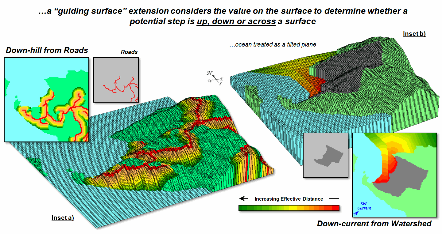
Figure 1. A Guiding Surface can be used to direct or
constrain movement within a project area.
A similar, yet more
detailed guiding surface, is a barometric map derived from weather station data. A “down-wind” map tracks the down surface
(barometric gradient) movement from each project location to areas of lower
atmospheric pressure. Similarly,
“up-surface” movement from any location on a pollution concentration surface
can help identify the probable pathway flow from a pollution source (highest
concentration).
“Dynamic impedance”
involves changes with respect to increasing distance (accumulation), net
movement force (momentum) and interactions between a movement path and its
intervening conditions (direction). The
top portion of figure 2 outlines the use of an “additive factor equation” to
dynamically slow down movement in a manner analogous to compound interest of a
savings account. As a distance wave
propagates from a Starting location, the effective distance of each successive
step is slightly more impeded, like a tired hiker’s pace decreasing with
increasing distance—the last mile of a 20 mile trek seems a lot farther.
The example shows the
calculations for the 11th step of a SW moving wave front (orthogonal
step type= 1.414) with a constant impedance (friction= 1) and a 1% compounding
impedance (rate= .01). The result is an
accumulated hindrance effectively farther by about 25 meters (16.36 – 15.55=.81
* 30m cell size).
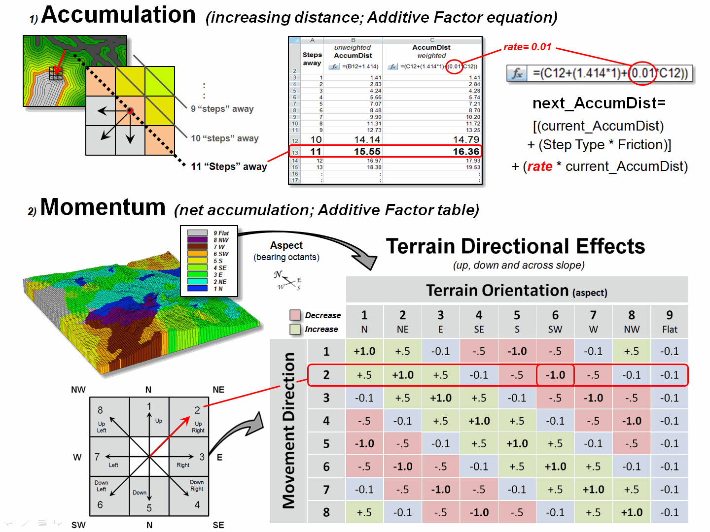
Figure 2. Accumulation and Momentum can be used to account
for dynamic changes in the nature of intervening conditions and assumptions about
movement in geographic space.
The bottom portion of
figure 2 shows the approach for assessing the net accumulation of movement
(momentum). This brings back a very old
repressed memory of a lab exercise in a math/programming course I attempted over
30 years ago. We were given a
terrain-like surface and coefficients of movement (acceleration and
deceleration) of a ball under various uphill and downhill situations. Our challenge was to determine the location
to drop the ball so it would roll the farthest …the only thing I really got was
“dropping the ball.” In looking back, I
now realize that an “additive factor table” could have been a key to the
solution.
The table in the figure
shows the “costs/payments” of downhill, across and uphill movements. For this simplified example, imagine a money
exchange booth at each grid location—the toll or payout is dependent on the
direction of the wave front with respect to the orientation of the surface. If you started somewhere with a $10 bag of
money, depending on your movement path and surface configuration, you would
collect a dollar for going straight downhill (+1.0) but lose a dollar for going
straight uphill (-1.0).
The table summarizes the cost/payout
for all of the movement directions under various terrain conditions. For example, a NE step is highlighted
(direction= 2) that corresponds to a SW terrain orientation (aspect= 6) so your
movement would be straight uphill and cost you a dollar. The effective net accumulation from a given
Starter cell to every other location is the arithmetic sum of costs/payments
encountered—the current amount in the bag at location is your net accumulation;
stop when your bag is empty ($0). In the
real-world, the costs/payments would be coefficients of exacting equations to
determine the depletions/additions at each step.
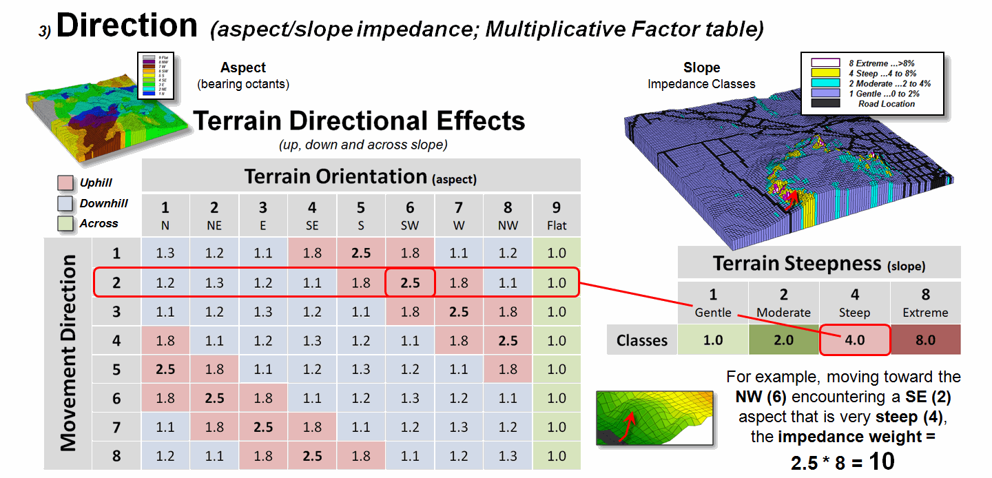
Figure 3. Directional effects of movement with respect to
slope/aspect variations can be accounted for “on-the-fly.”
Figure 3 extends the
consideration of dynamic movement through the use of a “multiplicative factor
table” based on two criteria—terrain aspect and steepness. All trekkers know that hiking up, down or
across slope are radically different endeavors, especially on steep
slopes. Most hiking time solutions,
however, simply assign a “typical cost” (friction) that assumes “the steeper
the terrain, the slower one goes” regardless of the direction of travel. But that is not always true, as it is about
as easy to negotiate across a steep slope as it is to traverse a gentle uphill
slope.
The table in figure 3
identifies the multiplicative weights for each uphill, downhill or across
movement based on terrain aspect. For
example, as a wave front considers stepping into a new location it checks its
movement direction (NE= 2) and the aspect of the cell (SW= 6), identifies the
appropriate multiplicative weight in the table (2,6 position= 2.5), then checks
the “typical” steepness impedance (steep= 4.0) and multiplies them together for
an overall friction value (2.5*4.0=
10.0); if movement was NE on a gentle slope the overall friction value
would be just 1.1.
In effect, moving uphill
on steep slopes is considered nearly 10 times more difficult than traversing across a gentle slope …that
makes a lot of sense. But very few map
analysis packages handle any of the “dynamic movement” considerations (gravity
model, stepped-accumulation, back-link, guiding surface and dynamic impedance)
…that doesn’t make sense.
_____________________________
Author’s Note: For
more information on effective distance procedures,(both
static and dynamic) see www.innovativegis.com/basis/MapAnalysis/Topic25/Topic25.htm, online book Beyond Mapping III, Topic 25, “Calculating Effective
Distance and Connectivity.” Instructors
see readings, lecture and exercise for Week 4, “Calculating Effective Distance”
online course materials at www.innovativegis.com/basis/Courses/GMcourse10/.
A Narrow-minded Approach
(GeoWorld,
June 2009)
In the
previous sections, advanced and sometimes unfamiliar concepts of distance have
been discussed. The traditional
definition of “shortest straight line between two points” for Distance was extended to the concept of Proximity by relaxing the “two points”
requirement; and then to the concept of Movement
that respects absolute and relative barriers by relaxing the “straight line”
requirement (Author’s Note 1).
The
concept of Connectivity is the final
step in this expansion referring to how locations are connected in geographic
space. In the case of effective
distance, it identifies the serpentine route around absolute and through
relative barriers moving from one location to another by the “shortest”
effective path—shortest, the only remaining requirement in the modern
definition of distance. A related
concept involves straight rays in 3-dimensional space (line-of-sight) to
determine visual connectivity among locations considering the intervening
terrain and vegetative cover (Author’s Note 2).
However,
there is yet another concept of connectivity— Narrowness defined as the “shortest cord through a location
connecting opposing edges.” As with all
distance-related operations, the computer first generates a series of concentric
rings of increasing distance from an interior point (grid cell). This information is used to assign distance
to all edge locations. Then the computer
moves around the edge totaling the distances for opposing edges until it
determines the minimum—the shortest cord.
The process is repeated for all map locations to derive a continuous map
of narrowness.
For a
boxer, a map of the boxing ring would have values at every location indicating
how far it is to the ropes with the corners being the narrowest (minimum cord
distance). Small values indicate poor
boxing habitat where one might get trapped and ruthlessly bludgeoned without
escape. For a military strategist,
narrow locations like the Khyber Pass can
prove to be inhospitable habitat as well.
Bambi and
Mama Bam can have a similar dread of the narrow portions of an irregularly
shaped meadow (see figure 1, insets a and b). Traditional analysis suggests that the
meadow's acreage times the biomass per acre determines the herd size that can
be supported. However, the spatial
arrangement of these acres might be just as important to survival as the
caloric loading calculations. The entire meadow could be sort of a Cordon Bleu
of deer fodder with preference for the more open portions, an ample distance
away from the narrow forest edge where danger may lurk. But much of the meadow has narrow places
where patient puma prowl and pounce, imperiling baby Bambi. How can new age wildlife managers explain
that to their kids— survival is just a simple calculation of acres times biomass that is independent of spatial arrangement,
right?
Figure
1. Narrowness determines constrictions within a
map feature as the shortest cord connecting opposing edges.
Many
GIS applications involve more than simple inventory mastication—extent (spatial
table) times characteristic/condition (attribute table). So what is involved in deriving a narrowness
map? …how can it be summarized? …how might one use a narrowness map and its
summary metrics?
The
first step is to establish a simple proximity map from a location and then
transfer this information to the edge cells of the parcel containing the
location (figure 1, insets c and d).
The algorithm then begins at an edge cell, determines its opposing edge
cell along a line passing through the location, sums the distances and applies
an adjustment factor to account for the center cell and edge cell lengths. In the example, the shortest cord is the sum
of the upper-right distance and its lower-left opposing distance plus the
adjustment factor (4.25 + 4.25 + 3.00= 8.50).
All other cords passing through the location are longer (e.g., 6.65 +
11.90 + 3.00= 21.55 for the longest cord).
Actually, the calculations are a bit dicier as
they need to adjust for off-orthogonal configurations …a nuance for the
programmers among you to consider.
Once
the minimum cord is determined the algorithm stores the value and moves to the
next location to evaluate; this is repeated until the narrowness of all of the
desired locations have been derived (figure 2 inset e for just the meadow and f
for the entire area). Notice that there
are two dominant kidney-shaped open areas (green tones)—one in the meadow and
one in the forest. Keep in mind that the
effect of the “artificial edges” of the map extent in this constrained example
would be minimal in a landscape level application.
Figure
2. Summarizing average narrowness for individual parcels.
The
right side of figure 2 (inset g)
illustrates the calculation of the average narrowness for each of the cover
type parcel Narrowness determines constrictions within a map feature (polygon)
as the shortest cord connecting opposing edges, such as a forest opening. It uses a region-wide overlay technique that
computes the average of the narrowness values coinciding with each parcel. A better metric of relative narrowness would
be the ratio of the number of narrow cells (red-tones) to the total number of
cells defining a parcel. For a large
perfectly circular parcel the ratio would be zero with increasing ratios to 1.0
for very narrow shapes, such as very small or ameba-shaped polygons.
_____________________________
Author’s Notes: for background discussion, see 1) Topic 25,
Calculating Effective Distance and Connectivity and 2) Topic 15, Deriving and Using Visual Exposure Maps in the online
book Beyond Mapping III at www.innovativegis.com/basis/MapAnalysis/.
Narrowing-in on Absurd Gerrymanders
(GeoWorld, July 2012)
In light of the current
political circus, I thought a bit of reflection is in order on how GIS has
impacted the geographic stage for the spectacle—literally drawing the lines in
the sand. Since the 1990 census, GIS has
been used extensively to “redistrict” electoral territories in light of
population changes, thereby fueling the decennary turf wars between the
Democrats and Republicans.
Redistricting involves redrawing
of U.S. congressional district boundaries every ten years in response to
population changes. In developing the
subdivisions, four major considerations come into play—
1)
equalizing the
population of districts,
2)
keeping existing
political units and communities within a single district,
3)
creating geographically compact, contiguous districts, and
4)
avoiding the
drafting of boundaries that create partisan advantage or incumbent protection.
Gerrymandering, on the other hand, is the deliberate manipulation of
political boundaries for electoral advantage with minimal regard for the last
three guidelines. The goal of both sides
is to draw district boundaries that achieve the most political gain.
Three
strategies for gerrymandering are applied—
1)
attempt to
concentrate the voting power of the opposition into just a few districts, to
dilute the power of the opposition party outside of those districts (termed
“excess vote”),
2)
diffuse the voting
power of the opposition across many districts, preventing it from having a
majority vote in as many districts as possible (“wasted vote”), and
3)
link distant
areas into specific, party-in-power districts forming spindly tentacles and
ameba-line pseudopods (“stacked”).
For example, the 4th
Congressional District of Illinois is one of the most strangely drawn
and gerrymandered congressional districts in the country (figure 1). Its bent barbell shape is the poster-child of
“stacked” gerrymandering, but Georgia’s flying pig, Louisiana’s stacked
scorpions and North Carolina’s praying mantis districts have equally bizarre
boundaries.
Figure 1. Examples of gerrymandered
congressional districts with minimal compactness.
Coupled
with census and party affiliation data, GIS is used routinely to gerrymander
congressional districts. But from
another perspective, it can be used to assess a district’s shape and through
legislative regulation could impose indices that encourage compactness. A “convexity index” (CI) and a “narrowness
index” (NI) are a couple of possibilities that could rein-in bazaar
gerrymanders.
The boundary configuration of any feature
can be identified as the ratio of its perimeter to its area (see author’s notes
1 and 2). In planimetric space, the
circle has the least amount of perimeter per unit area. Any other shape has more perimeter (see
figure 2), and as a result, a different Convexity Index.
In the
few GIS software packages having this capability, the index uses a "fudge
factor” (k) to account for mixed units (e.g., m for P and m2
for A) to produce a normalized range of values from 1 (very irregularly shaped)
to 100 (very regularly shaped). A
theoretical index of zero indicates an infinitely large perimeter around an
infinitesimally small area (e.g., a line without perimeter or area, just
length). At the other end, an index of
100 is interpreted as being 100 percent similar to a perfect circle. Values in between define a continuum of
boundary regularity that could be used to identify a cutoff of minimal
irregularity that would be allowed in redistricting.
Figure 2. Convexity is characterized as the normalized ratio
of a feature’s perimeter to its area.
Another metric for assessing shape involves calculating “narrowness” within a
map feature. Narrowness can be defined
as the “shortest cord passing through a location that connects opposing edges”
(see author’s note 3). In practice,
narrowness is calculated to a specified maximum distance. Locations with cords exceeding this distance
are simply identified as “open areas.”
In
figure 3, the narrow locations are shown as a color gradient from the most
narrow locations (red=1 cell length= 30m) to minimally narrow (green= 9.9999
*30m= 299.9m) to open areas (grey= >300m). Note the increasing number of narrow
locations as the map features become increasingly less compact.
A
Narrowness Index can be calculated as the ratio of the number of narrow cells
to the number of open cells. For the
circle in the figure, NI= 152/557= .273 with nearly four times as many open
cells than narrow cells. The bug shape
ratio is .848 and the spindly Medusa shape with a ratio of 2.232 has more than
twice as many narrow cells as open cells.
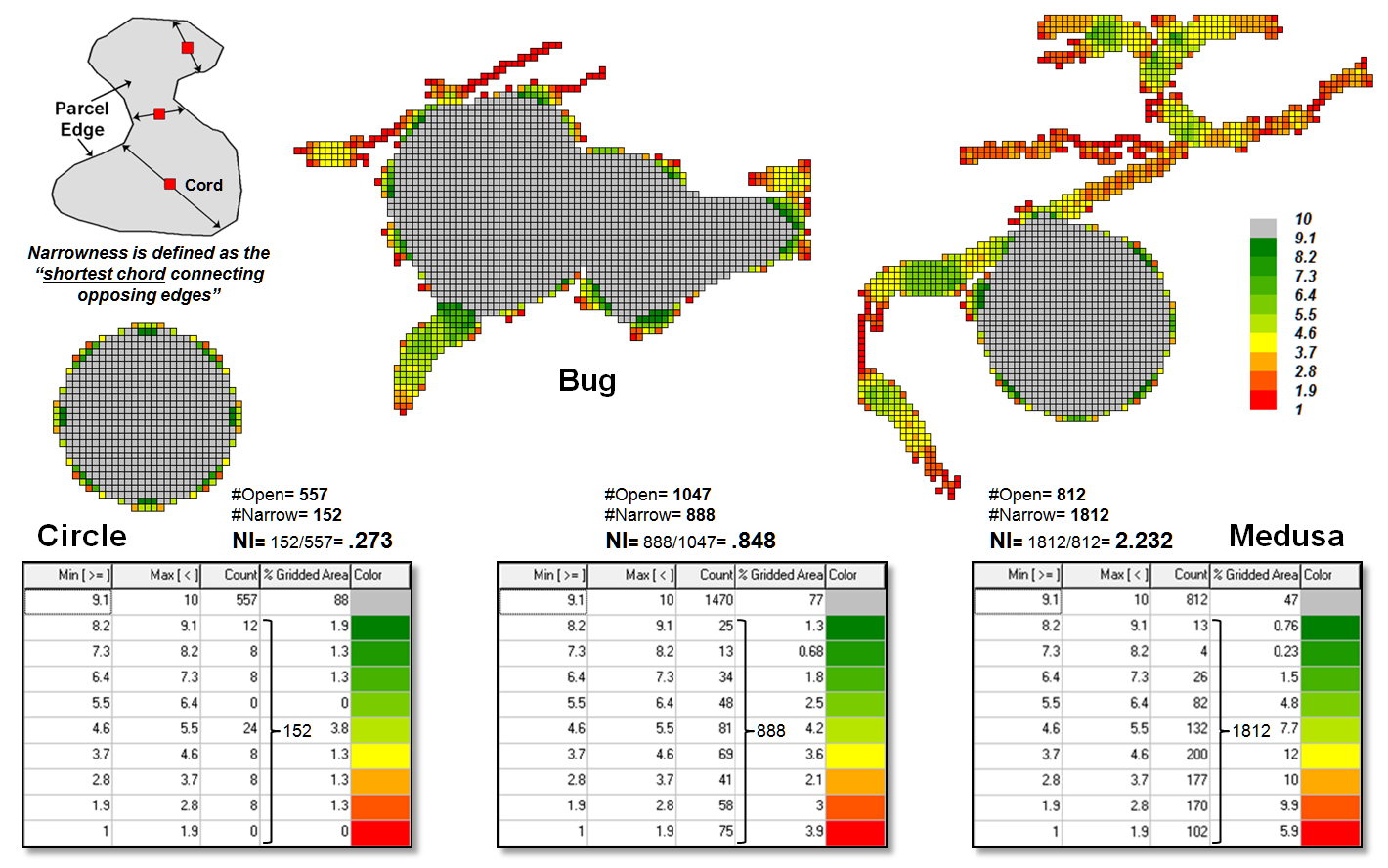
Figure 3. Narrowness is characterized as the shortest cord
connecting opposing edges.
Both
the convexity index and the narrowness index quantify the degree of
irregularity in the configuration of a map feature. However, they provide dramatically different
assessments. CI is a non-spatial index
as it summarizes the overall boundary configuration as an aggregate ratio
focusing on a feature’s edge and can be solved through either vector or raster
processing. NI on the other hand, is a
spatial index as it characterizes the degree and proportion of narrowness
throughout a feature’s interior and only can be solved through raster
processing. Also, the resulting
narrowness map indicates where narrow locations occur, that is useful in
refining alternative shapes.
To
date, the analytical power of GIS has been instrumental in gerrymandering
congressional districts that forge political advantage for whichever political
party is in control after a census. In
engineering an optimal partisan solution the compactness criterion often is
disregarded.
On the
other side of the coin, the convexity and narrowness indices provide a foothold
for objective, unbiased and quantitative measures that assess proposed district
compactness. Including acceptable CI and
NI measures into redistricting criteria would insure that compactness is
addressed— gentlemen (and ladies), start your GIS analytic engines.
_____________________________
Author’s Notes: 1)
Beyond Mapping column on Feature Shape Indices, September 1991, posted at www.innovativegis.com/basis/BeyondMapping_I/Topic5/BM_I_T5.htm#Forest_trees; 2) PowerPoint on Gerrymandering and
Legislative Efficiency by John Mackenzie, Director of Spatial Analysis Lab,
University of Delaware posted at www.udel.edu/johnmack/research/gerrymandering.ppt;
3) Narrowness is discussed in the online book Beyond Mapping III, Topic 25,
Calculating Effective Distance and Connectivity, posted at www.innovativegis.com/basis/MapAnalysis/Topic25/Topic25.htm#Narrowness.
Just How Crooked
Are Things?
(GeoWorld, November 2012)
In a heated presidential
election month this seems to be an apt title as things appear to be twisted and
contorted from all directions. Politics
aside and from a down to earth perspective, how might one measure just how spatially
crooked things are? My benchmark for one
of the most crooked roads is Lombard Street in San Francisco—it’s not only
crooked but devilishly steep. How might you
objectively measure its crookedness?
What are the spatial characteristics?
Is Lombard Street more crooked than the eastern side of Colorado’s
Independence Pass connecting Aspen and Leadville?
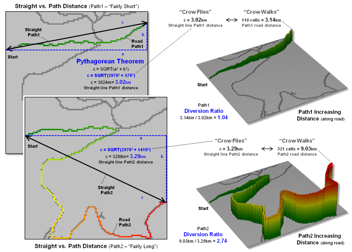
Figure 1. A Diversion Ratio compares a route’s actual path
distance to its straight line distance.
Webster’s Dictionary
defines crooked as “not straight” but there is a lot more to it from a
technical perspective. For example,
consider the two paths along a road network shown in figure 1. A simple crooked comparison characteristic
could compare the “crow flies” distance (straight line) to the “crow walks”
distance (along the road). The straight
line distance is easily measured using a ruler or calculated using the
Pythagorean Theorem. The on-road
distance can be manually assessed by measuring the overall length as a series
of “tick marks” along the edge of a sheet of paper successively shifted along
the route. Or in the modern age, simply ask
Google Maps for the route’s distance.
The vector-based solution
in Google Maps, like the manual technique, sums all of the line segments
lengths comprising the route. Similarly,
a grid-based solution counts all of the cells forming the route and multiplies
by an adjusted cell length that accounts for orthogonal and diagonal movements
along the sawtooth representation. In both instances, a Diversion Ratio can
be calculated by dividing the crow walking distance (crooked) by the crow
flying distance (straight) for an overall measurement of the path’s diversion
from a straight line.
As shown in the figure
the diversion ratio for Path1 is 3.14km / 3.02km = 1.04 indicating that the
road distance is just a little longer than the straight line distance. For Path2, the ratio is 9.03km / 3.29km = 2.74
indicating that the Path2 is more than two and a half times longer than its
straight line. Based on crookedness being
simply “not straight,” Path2 is much more crooked.
Figure 2 depicts an
extension of the diversion ratio to the entire road network. The on-road distance from a starting location
is calculated to identify a crow’s walking distance to each road location
(employing Spatial Analyst’s Cost Distance tool for the Esri-proficient among
us). A straight line proximity surface
of a crow’s flying distance from the start is generated for all locations in a
study area (Euclidean Distance tool) and then isolated for just the road
locations. Dividing the two maps
calculates the diversion ratio for every road cell.
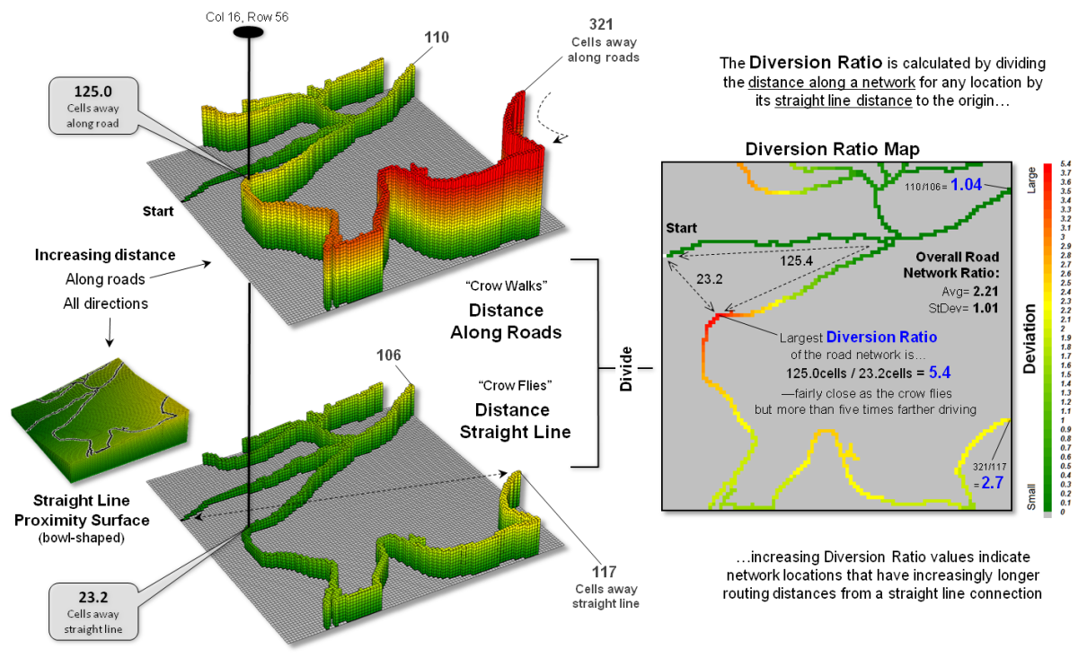
Figure 2. A Diversion Ratio Map identifies the comparison of
path versus straight line distances for every location along a route.
The ratio for the
farthest away road location is 321 cells /117 cells = 2.7, essentially the same
value as computed using the Pythagorean Theorem for the straight line distance. Use of the straight line proximity surface is
far more efficient than repeatedly evaluating the Pythagorean Theorem,
particularly when considering typical project areas with thousands upon
thousands of road cells.
In addition, the
spatially disaggregated approach carries far more information about the
crookedness of the roads in the area.
For example, the largest diversion ratio for the road network is 5.4—crow
walking distance nearly five and a half times that of crow flying
distance. The average ratio for the
entire network is 2.21 indicating a lot of overall diversion from straight line
connection throughout the set of roads.
Summaries for specific path segments are easily isolated from the overall
Diversion Ratio Map— compute once, summarize many. For example, the US Forest Service could
calculate a Diversion Ratio Map for each national forest’s road system and then
simply “pluck-off” crookedness information for portions as needed in harvest or
emergency-response planning.
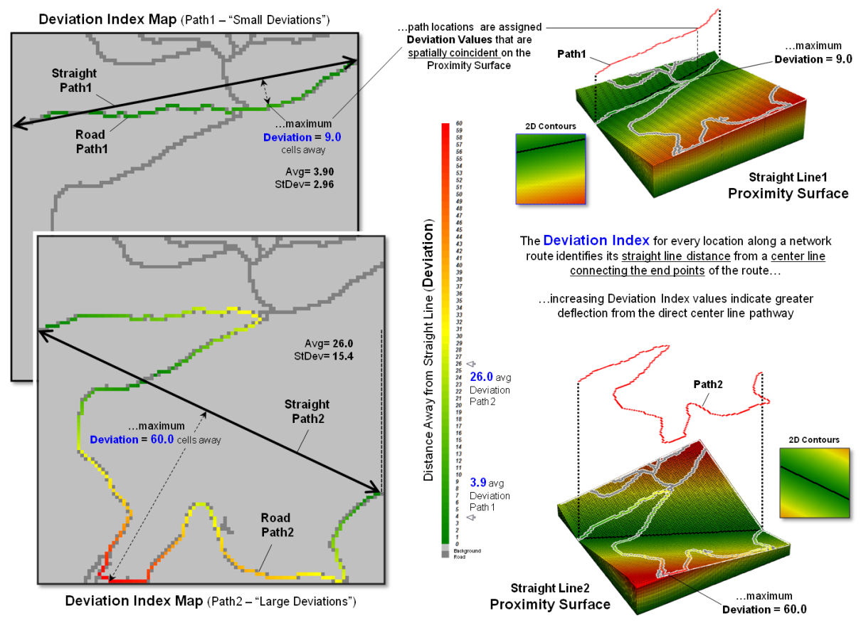
Figure 3. A Deviation Index identifies for every location
along a route the deflection from a path’s centerline.
The Deviation Index
shown in figure 3 takes an entirely different view of crookedness. It compares the deviation from a straight
line connecting a path’s end points for each location along the actual
route. The result is a measure of the
“deflection” of the route as the perpendicular distance from the centerline. If a route is perfectly straight it will
align with the centerline and contain no deflections (all deviation values= 0). Larger and larger deviation values along a
route indicate an increasingly non-straight path.
The left side of figure 3
shows the centerline proximity for Paths 1 and 2. Note the small deviation values (green tones)
for Path 1 confirming that is generally close to the centerline. This confirms that it is much straighter than
Path 2 with a lot of deviation values greater than 30 cells away (red tones). The average deflection (overall Deviation
Index) is just 3.9 cells for Path1 and 26.0 cells for Path2.
But crookedness seems
more than just longer diverted routing or deviation from a centerline. It could be that a path simply makes a big
swing away from the crow’s beeline flight—a smooth curve not a crooked, sinuous
path. Nor is the essence of crookedness
simply counting the number of times that a path crosses its direct route. Both paths in the examples cross the centerline
just once but they are obviously very different patterns. Another technique might be to keep track of
the above/below or left/right deflections from the centerline. The sign of the arithmetic sum would note
which side contains the majority of the deflections. The magnitude of the sum would report how
off-center (unbalanced) a route is. Or maybe
a roving window technique could be used to summarize the deflection angles as the
window is moved along a route.
The bottom line (pun
intended) is that spatial analysis is still in its infancy. While non-spatial math/stat procedures are
well-developed and understood, quantitative analysis of mapped data is very
fertile turf for aspiring minds …any bright and inquiring grad students out
there up to the challenge?
_____________________________
Author’s Note: For a related discussion of characterizing the
configuration of landscape features, see the online book Beyond Mapping I, Topic 5: Assessing Variability, Shape, and Pattern of Map Features
posted at www.innovativegis.com/basis/BeyondMapping_I/Topic5/.
__________________________________
Additional discussion of distance, proximity,
movement and related measurements in
¾ Topic 25, Calculating Effective Proximity
¾ Topic 20, Surface Flow Modeling
¾ Topic 19, Routing and Optimal Paths
¾ Topic 17, Applying Surface Analysis
¾ Topic 15, Deriving and Using Visual Exposure Maps
¾ Topic 14, Deriving and Using Travel-Time Maps
¾ Topic 13, Creating Variable-Width Buffers
¾ Topic 6, Analyzing In-Store Shopping Patterns
¾ Topic 5, Analyzing Accumulation Surfaces