Beyond Mapping
|
Map
Analysis book with companion CD-ROM for hands-on exercises and further reading |
Use a Map-ematical Framework for GIS Modeling — describes a conceptual structure for map
analysis operations and GIS modeling
Getting the Numbers Right — describes an alternative framework based on how
the map values are retrieved to classify analytical operations.
Options Seem Endless When Reclassifying Maps — discusses
the basic reclassifying map operations
Contiguity Ties Things Together — describes
an analytical approach for determining effective contiguity (clumped features)
Overlay Operations Feature a Variety of Options — discusses
the basic overlaying map operations
Computers Quickly Characterize Spatial Coincidence — discusses
several human considerations in implementing
Key Concepts Characterize Unique Conditions — describes
a technique for handling unique combinations of map layers
Use “Shadow Maps” to Understand Overlay Errors — describes
how shadow maps of certainty can be used to estimate error and its propagation
Author’s Notes: The figures in this topic use MapCalcTM software. An educational CD with online text, exercises
and databases for “hands-on” experience in these and other grid-based analysis
procedures is available for US$21.95 plus shipping and handling (www.farmgis.com/products/software/mapcalc/
).
<Click
here> right-click to download a printer-friendly version of this topic
(.pdf).
(Back to the Table of Contents)
______________________________
Use Map-ematical
Framework for
(GeoWorld,
March 2004, pg. 18-19)
As
While map
analysis tools might at first seem uncomfortable, they simply are extensions of
traditional analysis procedures brought on by the digital nature of modern
maps. Since maps are “number first,
pictures later,” a map-ematical
framework can be can be used to organize the analytical operations. Like basic math, this approach uses
sequential processing of mathematical operations to perform a wide variety of
complex map analyses. By controlling the
order that the operations are executed, and using a common database to store
the intermediate results, a mathematical-like processing structure is
developed.
This “map
algebra” is similar to traditional algebra where basic operations, such as
addition, subtraction and exponentiation, are logically sequenced for specific
variables to form equations—however, in map algebra the variables represent
entire maps consisting of thousands of individual grid values. Most of traditional mathematical
capabilities, plus extensive set of advanced map processing operations,
comprise the map analysis toolbox.
In grid-based map
analysis, the spatial coincidence and juxtapositioning of values among
and within maps create new analytical operations, such as coincidence,
proximity, visual exposure and optimal routes.
These operators are accessed through general purpose map analysis
software available in many
There are two
fundamental conditions required by any map analysis package—a consistent data structure and an iterative processing environment. Previous Beyond Mapping columns (July – September,
2002) described the characteristics of a grid-based data structure by
introducing the concepts of an analysis frame, map stack and data types. This discussion extended the traditional
discrete set of map features (points, lines and polygons) to map surfaces that
characterize geographic space as a continuum of uniformly-spaced grid
cells.
The second
condition is the focus of this and the next couple of columns. It provides an iterative processing
environment by logically sequencing map analysis operations and involves: 1) retrieval of one or more map layers from
the database, 2) processing that data
as specified by the user, 3) creation
of a new map containing the processing results, and ) storage of the new map for subsequent processing.
Each new map
derived as processing continues aligns with the analysis frame so it is
automatically geo-registered to the other maps in the database. The values comprising the derived maps are a
function of the processing specified for the “input map(s).”
This cyclical
processing provides an extremely flexible structure similar to “evaluating
nested parentheticals” in traditional math.
Within this structure, one first defines the values for each variable
and then solves the equation by performing the mathematical operations on those
numbers in the order prescribed by the equation. For example, the equation for calculating
percent change in your investment portfolio—
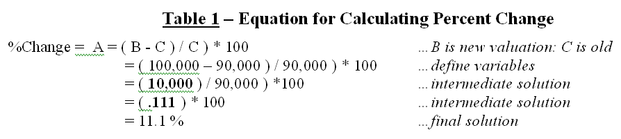
—identifies
that the variables B and C are first defined, then subtracted and the
difference stored as an intermediate solution.
The intermediate solution is divided by variable C to generate another
intermediate solution that, in turn is multiplied by 100 to calculate the
solution variable A—percent change value.
The same
mathematical structure provides the framework for computer-assisted map
analysis. The only difference is that
the variables are represented by mapped data composed of thousands of organized
numbers. Figure 1 shows a similar solution
for calculating the percent change in animal activity for an area. Maps of activity in two periods serve as
input; a difference map is calculated then divided by the earlier period and
multiplied by 100. The procedure uses
the same equation, just derives a different form of output—a map of percent
change.
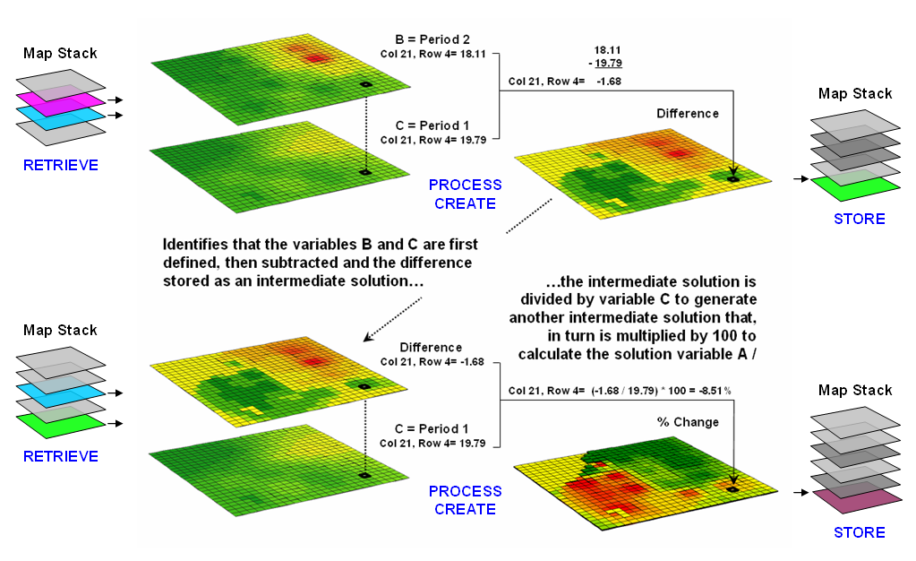
Figure 1.
An iterative processing environment, analogous to basic math, is used to
derive new map variables.
The processing
steps shown in the figure are identical to the traditional solution except the
calculations are performed for each grid cell in the study area and the result
is a map that identifies the percent change at each location (a decrease of
8.51% for the example location; red tones indicate decreased and green tones
indicate increased animal activity).
Map analysis
identifies what kind of change (termed the thematic attribute) occurred where
(termed the spatial attribute). The
characterization of what and where provides information needed for
further
Within this
iterative processing structure, four fundamental classes of map analysis
operations can be identified. These
include:
¾ Reclassifying
Maps
– involving the reassignment of the values of an existing map as a function of
its initial value, position, size, shape or contiguity of the spatial configuration
associated with each map category.
¾ Overlaying Maps – resulting in
the creation of a new map where the value assigned to every location is
computed as a function of the independent values associated with that location
on two or more maps.
¾ Measuring
Distance and Connectivity – involving the creation of a new map
expressing the distance and route between locations as straight-line length
(simple proximity) or as a function of absolute or relative barriers (effective
proximity).
¾ Characterizing
and Summarizing Neighborhoods – resulting in the creation of a new map
based on the consideration of values within the general vicinity of target
locations.
Reclassification
operations merely repackage existing information on a single map. Overlay operations, on the other hand,
involve two or more maps and result in the delineation of new boundaries. Distance and connectivity operations are more
advanced techniques that generate entirely new information by characterizing
the relative positioning of map features.
Neighborhood operations summarize the conditions occurring in the
general vicinity of a location. See the
Author’s Notes for links to more detailed discussions of the types of map
analysis operations.
The
reclassifying and overlaying operations based on point processing are the
backbone of current
The mathematical
structure and classification scheme of Reclassify,
Overlay, Distance and Neighbors
form a conceptual framework that is easily adapted to modeling spatial
relationships in both physical and abstract systems. A major advantage is flexibility. For example, a model for siting a new highway
can be developed as a series of processing steps. The analysis might consider economic and
social concerns (e.g., proximity to high housing density, visual exposure to
houses), as well as purely engineering ones (e.g., steep slopes, water
bodies). The combined expression of both
physical and non-physical concerns within a quantified spatial context is
another significant major benefit.
However, the
ability to simulate various scenarios (e.g., steepness is twice as important as
visual exposure and proximity to housing is four times more important than all
other considerations) provides an opportunity to fully integrate spatial
information into the decision-making process.
By noting how often and where the proposed route changes as successive
runs are made under varying assumptions, information on the unique sensitivity
to siting a highway in a particular locale is described.
In the old
environment, decision-makers attempted to interpret results, bounded by vague
assumptions and system expressions of a specialist. Grid-based map analysis, on the other hand,
engages decision-makers in the analytic process, as it both documents the
thought process and encourages interaction.
It’s sort of like a “spatial spreadsheet” containing map-matical equations (or recipes) that
encapsulates the spatial reasoning of a problem and solves it using digital map
variables.
Getting the Numbers Right
(GeoWorld,
May 2007, pg. 16-17)
The concept
that “maps are numbers first, pictures
later” underlies all GIS processing.
However in map analysis, the digital nature of maps takes on even more
importance. How the map values are 1)
retieved and 2) processed establishes a basic framework for classifying all of
the analytical capabilities. In
obtaining map values for processing there are three basic methods— Local, Focal
and Zonal (see author’s note).
While the
Local/Focal/Zonal classification scheme is most frequently associated with grid-based
modeling, it applies equally well to vector-based analysis— just substitute the
concept of “polygon, line or point” for that of a grid “cell” as the smallest
addressable unit of space providing the map values for processing.
Local processing retrieves a map value for a
single map location independent of its surrounding values, then processes the
value to derive and assign a new value to the location (figure 1). For example, an elevation value of 8250 associated
with a grid cell location on an existing terrain surface is retrieved and then
the contouring equation of Interval =
[Integer((MapValue - ContourBase) / ContourInterval)] = [int((8250 + 100) /
100)] = 83 is evaluated. The new map
value of 83 is stored to indicate the 83rd 100-foot contour interval
(8200-8300 feet) from a sea level contour base interval of 1 (0 to 100
feet). The processing is repeated for
all map locations and the resultant map is filed with the other map layers in
the stack.
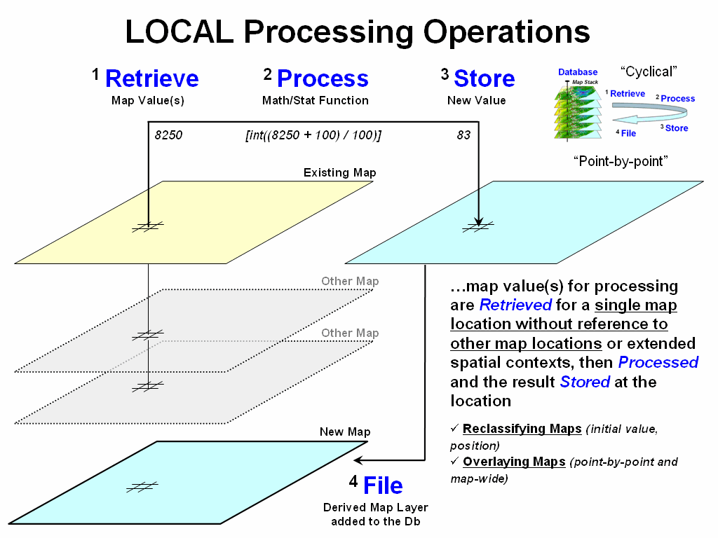
Figure 1.
Local operations use point-by-point processing of map values that occur
at each map location.
A similar
operation might multiply the elevation value times 0.3048 [ElevMeters =
ElevFeet * 0.3048= 8250 * 0.3048= 2871] to convert the elevation from feet
to meters. In turn, a generalized
atmospheric cooling relationship of 9.78 degC per 1000 meter rise can be
applied [(2871 / 1000 * 9.78] to
assign a value of 28.08 degC cooler than sea level air (termed Adiabatic Lapse Rate for those who are atmoshperic physics
challenged).
The lower
portion of figure 1 expands the Local processing concept from a single map
layer to a stack of registered map layers. For example, a point-by-point
overlay process might retrieve the elevation, slope, aspect, fuel loading,
weather, and other information from a series of map layers as values used in
calculating wildfire risk for a location.
Note that the processing is still spatially-myopic as it addresses a
single map location at a time (grid cell) but obtains a string of values for
that location before performing a mathematical or statistical process to
summarize the values.
While the
examples might not directly address your application interests, the assertion
that you can add, subtract, multiply, divide and otherwise “crunch the numbers”
ought to alert you to the map-ematical nature of GIS. It suggests a map calculator with all of the
buttons, rights and privileges of your old friendly handheld calculator— except
a map calculator operates on entire map layers composed of thousands upon
thousands of geo-registered map values.
The underlying
“cyclical” structure of Retrieveà Processà Storeà File also plays
upon our traditional math experience.
You enter a number or series of numbers into a calculator, press a
function button and then store the intermediate result (calculator memory or
scrap of paper) to be used as input for subsequent processing. You repeat the cycle over and over to solve a
complex expression or model in a “piece-by-piece” fashion—whether traditional
scaler mathematics or spatial map-ematics.
Figure 2
outlines a different class of analytical operators based on how the values for
processing are obtained. Focal processing retrieves a set of map values
within a neighborhood/vicinity around a location. For example a 3x3 window could be used to
identify the nine adjacent elevations at a location, and then apply a slope
function to the data to calculate terrain steepness. The derived slope value is stored for the
location and the process repeated over and over for all other locations in a
project area.
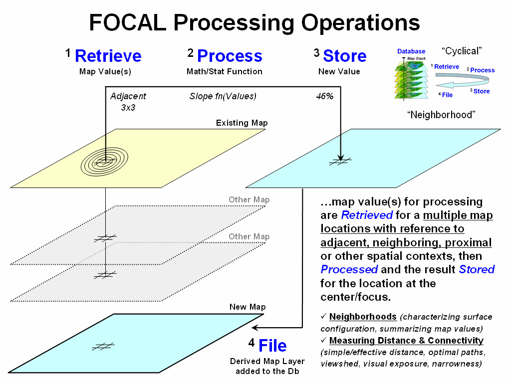
Figure 2.
Focal operations use a vicinity-context to retrieve map values for
summary.
The concept of
a fixed window of neighboring map values can be extended to other spatial
contexts, such as effective distance, optimal paths, viewsheds, visual exposure
and narrowness for defining the influence or “reach” around a map location. For example, a travel-time map considering
the surrounding street network could be used to identify the total number of
customers within a 10-minute drive. Or
the total number of houses that are visually connected to a location within a half-mile
could be calculated.
While Focal
processing defines an “effective reach” to retrieve surrounding map values for
processing, Zonal processing uses a
predefine “template” to identify map values for summary (figure 3). For example, a wildlife habitat unit might
serve as a template map to retrieve slope values from a data map of terrain
steepness. The average of all of the
coincident slope values is computed and then stored for all of the locations
defining the template.
Similarly, a
map of total sales (data map) can be calculated for a set of sales management
districts (template map). The standard
set of statistical summaries is extended to spatial operations such as
contiguity and shape of individual map features.
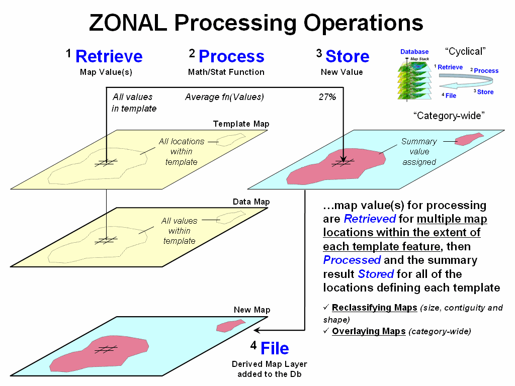
Figure 3. Zonal operations use a separate
template map to retrieve map values for summary.
The
Local/Focal/Zonal organization scheme addresses how analytic operations work
and is particularly appropriate for GIS developers and programmers. The Reclassify/Overlay/Distance/Neighbors
scheme I have used throughout the Beyond Mapping series uses a different
perspective—one based on the information derived and its utility (see, Use a Map-ematical Framework for GIS
Modeling, GeoWorld, March 2004, pg 18-19).
However, both
the “how it works” and “what it is” perspectives agree that all
analytical operations require retrieving and processing numbers within a
cyclical map-ematical environment. The
bottom line being that maps are numbers and map analysis crunches the numbers
in challenging ways well outside our paper-map legacy.
_____________________________
Author’s Note: Local, Focal and
Zonal processing classes were first suggested by Dana Tomin in his doctoral
dissertation “Geographic Information
Systems and Cartographic Modeling” (Yale University, 1980) and partially
used in organizing the Spatial Analyst/Grid modules in ESRI’s ArcGIS software.
Options Seem Endless When
Reclassifying Maps
(GeoWorld, April 2004, pg. 18-19)
The previous
section described a map-ematical
framework for
The
reassignment of existing values can be made as a function of the initial value, position, contiguity, size,
or shape of the spatial configuration of the individual map
categories. Each reclassification
operation involves the simple repackaging of information on a single map, and
results in no new boundary delineation.
Such operations can be thought of as the purposeful
"re-coloring" of maps.
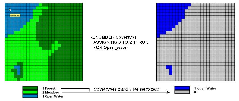
Figure 1.
Areas of meadow and forest on a COVERTYPE map can be reclassified to
isolate large areas of open water.
Figure 1 shows
the result of simply reclassifying a map as a function of its initial thematic
values. For display, a unique symbol is
associated with each value. In the
figure, the cover type map has categories of Open Water, Meadow and
The binary map
on the right side of the figure isolates the Open Water locations by simply assigning zero to the areas of Meadow and Forest and displaying as the categories as grey. Although the operation seems trivial by
itself, it has map analysis implications far beyond simply re-coloring the map
categories. And it graphically demonstrate
the basic characteristic of reclassify operations—values change but the spatial
pattern of the data doesn’t.
A similar
reclassification operation might involve the ranking or weighing of qualitative
map categories to generate a new map with quantitative values. For example, a map of soil types could be
assigned values that indicate the relative suitability of each soil type for
residential development.
Quantitative
values also might be reclassified to yield new quantitative values. This might involve a specified reordering of
map categories (e.g., given a map of soil moisture content, generate a map of
suitability levels for plant growth).
Or, it could involve the application of a generalized reclassifying
function, such as "level slicing," which splits a continuous range of
map category values into discrete intervals (e.g., derivation of a contour map
of just 10 contour intervals from an elevation surface composed of thousands of
specific elevation values).
Other
quantitative reclassification functions include a variety of arithmetic operations
involving map category values and a specified or computed constant. Among these operations are addition,
subtraction, multiplication, division, exponentiation, maximization,
minimization, normalization and other scalar mathematical and statistical
operators. For example, an elevation
surface expressed in feet couldt be converted to meters by multiplying each map
value by the appropriate conversion factor of 3.28083 feet per meter.
Reclassification
operations can also relate to location, as well as purely thematic. One such characteristic is position. An overlay category represented by a single
"point" location, for example, might be reclassified according to its
latitude and longitude. Similarly, a
line segment or area feature could be reassigned values indicating its center
or general orientation.
A related
operation, termed parceling, characterizes category contiguity. This procedure identifies individual
"clumps" of one or more points that have the same numerical value and
are spatially contiguous (e.g., generation of a map identifying each lake as a
unique value from a generalized map of water representing all lakes as a single
category).
Another
location characteristic is size. In the
case of map categories associated with linear features or point locations,
overall length or number of points might be used as the basis for reclassifying
the categories. Similarly, an overlay
category associated with a planar area could be reclassified according to its
total acreage or the length of its perimeter.
A map of water
types, for example, could be reassigned values to indicate the area of
individual lakes or the length of stream channels. The same sort of technique also could be used
to deal with volume. Given a map of
depth to bottom for a group of lakes, each lake might be assigned a value
indicating total water volume based on the area of each depth category.
Figure 2
identifies a similar processing sequence using the information derived in
figure 1. Although your eye sees two
distinct blobs of water on the OPEN WATER map, the computer only “sees”
distinctions by different map category values.
Because both water bodies are assigned the same value of 1, there isn’t
a map-ematical distinction that the computer cannot see the distinction.
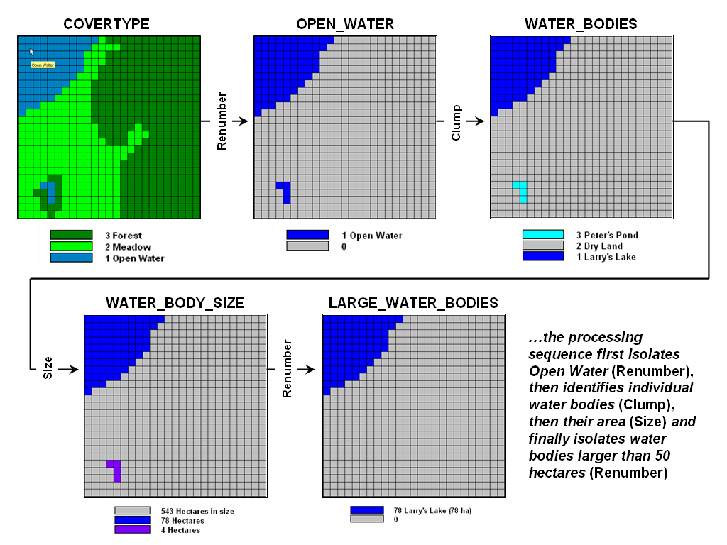
Figure 2.
A sequence of reclassification operations (renumber, clump, size and
renumber)
can be used to isolate large water bodies
from a cover type map.
The Clump operation is used to identify the
contiguous features as separate values—clump #1 (Larry’s
In addition to
the initial value, position, contiguity, and size of features, shape
characteristics also can be used as the basis for reclassifying map categories.
Shape characteristics associated with
linear forms identify the patterns formed by multiple line segments (e.g.,
dendritic stream pattern). The primary
shape characteristics associated with polygonal forms include feature
integrity, boundary convexity, and nature of edge.
Feature
integrity relates to an area’s “intact-ness”.
A category that is broken into numerous "fragments" and/or
contains several interior "holes" is said to have less spatial
integrity than categories without such violations. Feature integrity can be summarized as the
Euler Number that’s computed as the number of holes within a feature less one
short of the number of fragments. Euler
Numbers of zero indicates features that are spatially balanced, whereas larger
negative or positive numbers indicate less spatial integrity—either broken into
more pieces or poked with more holes.
Convexity and
edge, are other shape indices that relate to the configuration of polygonal
features’ boundaries. The Convexity
Index for a feature is computed by the ratio of its perimeter to its area. The most regular configuration is that of a
circle which is totally convex and, therefore, not enclosed by the background
at any point along its boundary.
Comparison of a
feature's computed convexity to a circle of the same area, results in a
standard measure of boundary regularity.
The nature of the boundary at each point can be used for a detailed
description of boundary configuration.
At some locations the boundary might be an entirely concave intrusion,
whereas others might be at entirely convex protrusions. Depending on the "degree of
edginess," each point can be assigned a value indicating the actual
boundary convexity at that location.
This explicit use
of cartographic shape as an analytic parameter is unfamiliar to most
A map of forest
stands, for example, could be reclassified such that each stand is
characterized according to the relative amount of forest edge with respect to
total acreage and the frequency of interior forest canopy gaps. Stands with a large proportion of edge and a
high frequency of gaps will generally indicate better wildlife habitat for many
species. In any event, reclassify
operations simply assign new values to old category values—some times seeming
trivial and some times a bit conceptually complex.
Contiguity Ties Things Together
(GeoWorld, March 2008)
The previous sections
described a map-ematical framework for
Our brain easily
assesses this condition when viewing a map but the process for a computer is a
bit more convoluted. For example,
consider the two spatial patterns in top portion of figure 1 (inset 1A). While both maps have the same number and size
of scattered forest parcels, the distribution pattern on the left appears more dispersed
than the relatively clumped pattern on the right.
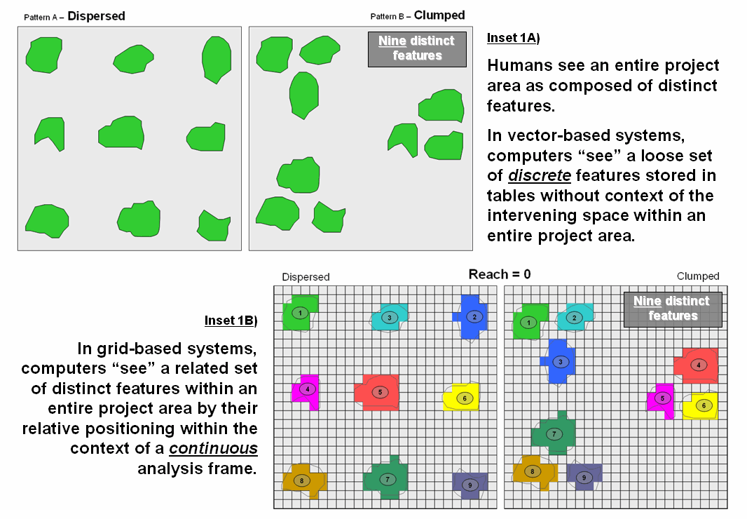
Figure 1.
Humans see complete spatial patterns sets, while computers “see”
individual features that have to be related through data storage and analysis
approaches imposing topological structure.
Since vector-based
systems store features as a loose set of discrete entities in a spatial table,
the computer is unable to “see” the entire spatial pattern and interveening geographic
space. Grid-based systems, on the other
hand, store an entire project area as an analysis frame including the spaces. Inset 1B represents the individual features
as a collection of grid cells. Adjacent
grid cells have the same stored value to uniquely identify each of the individual
features (1 through 9 in this case). Note
that both patterns in the figure have nine distinct grid features—it’s the
arrangement of the features in geographic space that establishes the Dispersed and
Clumped patterns.
Proximity establishes
effective connections among distinct features and translates these connections into
patterns. For example, assume that a
creature isn’t constrained to the edges of a single feature, but can move away
for a short distance—say one grid space for a slithering salamander outside its
confining habitat. Treking any farther would
result in an exhausted and dried-out salamander, akin to a raisen. Now further assume that the venturesome salamander’s
unit is either too small to support the current population or that he yearns
for foreign beauties. The Dispersed pattern
will leave him wanting, while the Clumped pattern triples the possibilties.
The top portion of
figure 2 (inset 2A) depicts how reaching out one grid space from each of the
distinct features can identify effective groupings of individual habitat units. The result is that the nine defacto “islands”
are grouped into three effective habitat units in the Clumped pattern. In practice, contiguity can help wildlife
planners consider the pattern of habitat management units, as well as simply
their number, shape and size.
Arrangement can be as important (more?) as quantity and aerial
extent.
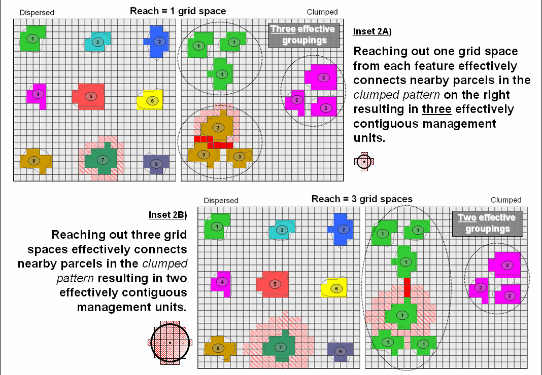
Figure 2. Contiguity uses relative proximity to
determine groups of nearby features that serve as extended management units.
The lower portion of figure 2 (inset 2b)
illustrates a similar analysis assuming a creature that can slither, crawl, scurry
or fly up to three grid spaces. The
result is three effective habitat groupings—two on the left comprised of six
individual units and one on the right comprised of three individual units.
Contiguity, therefore, is in the mind of
the practitioner—how far of a reach that connects individual features is a
user-defined parameter to the spatial analysis operation. However, as is the rule in most things
analytical, how the tool works is rarely how we conceptualize the process, or its
mathematical expression. Spatial
algorithms often are radically different animals from manual procedures or
simply evaluating static equations.
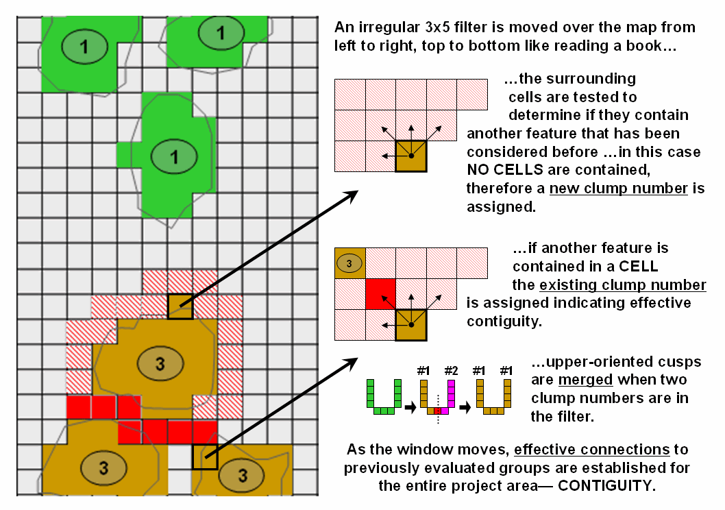
Figure 3. An irregular filter is used to establish effective
connections among neighboring features.
The “CLUMP” operation works by employing
a moving filter like you read a book but looking back and up at the grid cells previously
considered. For the 1-grid space reach
example, a 3x5 filter (figure 3) starts in the upper-left corner of the
analysis frame and moves across the row from left to right. The first grid cell containing a forest
parcel is assigned the value 1. If it
encounters another forest cell while an earlier clump is in the filter, the
same clump number is assigned—within the specified proximity that establishes
effective contiguity. If it encounters a
forest cell with no previous clump numbers in the filter, then a new sequential
clump number is assigned. Successive
rows are evaluated and if the filter contains two or more clump numbers, the
lowest clump number is assigned to the entire candidate grouping—merging the
sides of any U-shaped or other upward pointing shape.
The bottom line isn’t that you fully
understand contiguity and its
However, it is the blinders of disciplinary
stovepipes in companies and on campuses that often hold us back. Hopefully a
Overlay Operations
Feature a Variety of Options
(GeoWorld,
May 2004, pg. 18-19)
The general
class of overlay operations can be characterized as "light‑table
gymnastics." These involve the
creation of a new map where the value assigned to every point, or set of
points, is a function of the independent values associated with that location
on two or more existing map layers. In location‑specific
overlaying, the value assigned is a function of the point‑by‑point
coincidence of the existing maps. In category‑wide
composites, values are assigned to entire thematic regions as a function of the
values on other overlays that are associated with the categories. Whereas the first overlay approach
conceptually involves the vertical spearing of a set of map layers, the latter
approach uses one map to identify boundaries by which information is extracted
from other maps.
Figure 1 shows
an example of location‑specific overlaying. Here, maps of COVERTYPE and topographic
SLOPE_CLASSES are combined to create a new map identifying the particular
cover/slope combination at each location.
A specific function used to compute new category values from those of
existing maps being overlaid can vary according to the nature of the data being
processed and the specific use of that data within a modeling context. Environmental analyses typically involve the
manipulation of quantitative values to generate new values that are likewise
quantitative in nature. Among these are
the basic arithmetic operations such as addition, subtraction, multiplication,
division, roots, and exponentials.
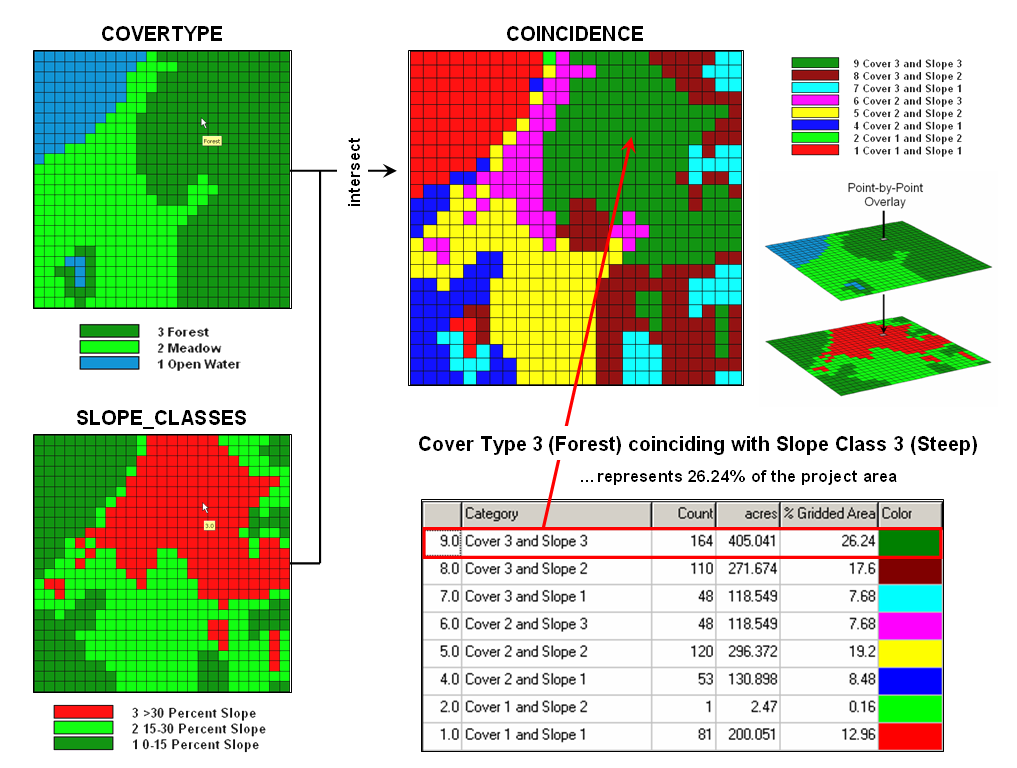
Figure 1.
Point-by point overlaying operations summarize the coincidence
of two or more maps, such as assigning a
unique value identifying the
COVERTYPE and SLOPE_CLASS conditions at
each location.
Functions that
relate to simple statistical parameters such as maximum, minimum, median, mode,
majority, standard deviation or weighted average also can be applied. The type of data being manipulated dictates
the appropriateness of the mathematical or statistical procedure used. For example, the addition of qualitative maps
such as soils and land use would result in mathematically meaningless sums,
since their thematic values have no numerical relationship. Other map overlay techniques include several
that might be used to process either quantitative or qualitative data and
generate values which can likewise take either form. Among these are masking, comparison,
calculation of diversity, and permutations of map categories (as depicted in
figure 1).
More complex
statistical techniques may also be applied in this manner, assuming that the
inherent interdependence among spatial observations can be taken into
account. This approach treats each map
as a variable, each point as a case, and each value as an observation. A predictive statistical model can then be
evaluated for each location, resulting in a spatially continuous surface of
predicted values. The mapped predictions
contain additional information over traditional non‑spatial procedures,
such as direct consideration of coincidence among regression variables and the
ability to spatially locate areas of a given level of prediction. Topic
12 investigates the considerations in spatial data mining derived by
statistically overlaying mapped data.
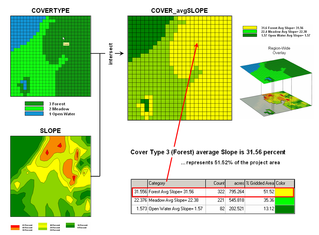
Figure 2. Category-wide
overlay operations summarize the spatial coincidence of map categories, such as
generating the average SLOPE for each COVERTYPE category.
An entirely different
approach to overlaying maps involves category‑wide summarization of
values. Rather than combining
information on a point‑by‑point basis, this group summarizes the
spatial coincidence of entire categories shown on one map with the values
contained on another map(s). Figure 2
contains an example of a category‑wide overlay operation. In this example, the categories of the
COVERTYPE map are used to define an area over which the coincidental values of
the SLOPE map are averaged. The computed
values of average slope within each category area are then assigned to each of
the cover type categories.
Summary
statistics which can be used in this way include the total, average, maximum,
minimum, median, mode, or minority value; the standard deviation, variance, or
diversity of values; and the correlation, deviation, or uniqueness of
particular value combinations. For
example, a map indicating the proportion of undeveloped land within each of
several counties could be generated by superimposing a map of county boundaries
on a map of land use and computing the ratio of undeveloped land to the total
land area for each county. Or a map of
zip code boundaries could be superimposed over maps of demographic data to
determine the average income, average age, and dominant ethnic group within
each zip code.
As with
location‑specific overlay techniques, data types must be consistent with
the summary procedure used. Also of
concern is the order of data processing.
Operations such as addition and multiplication are independent of the
order of processing. Other operations,
such as subtraction and division, however, yield different results depending on
the order in which a group of numbers is processed. This latter type of operations, termed non‑commutative,
cannot be used for category‑wide summaries.
Computers Quickly
Characterize Spatial Coincidence
(GeoWorld, June 2004, pg. 18-19)
As previously
noted,
Everybody knows
the 'bread and butter' of a
Let's compare
how you and your computer might approach the task of identifying
coincidence. Your eye moves randomly
about the stack, pausing for a nanosecond at each location and mentally
establishing the conditions by interpreting the color. Your summary might conclude that the
northeastern portion of the area is unfavorable as it has "kind of a
magenta tone." This is the result
of visually combining steep slopes portrayed as bright red with unstable soils
portrayed as bright blue with minimal vegetation portrayed as dark green. If you want to express the result in map
form, you would tape a clear acetate sheet on top and delineate globs of color
differences and label each parcel with your interpretation. Whew!
No wonder you want a
The
A raster system
has things a bit easier. As all
locations are predefined as a consistent set of cells within a matrix, the computer
merely 'goes' to a location, retrieves the information stored for each map
layer and assigns a value indicating the combined map conditions. The result is a new set of values for the
matrix identifying the coincidence of the maps.
The big
difference between ocular and computer approaches to map overlay is not so much
in technique, as it is in the treatment of the data. If you have several maps to overlay you
quickly run out of distinct colors and the whole stack of maps goes to an
indistinguishable dark, purplish hue.
One remedy is to classify each map layer into just two categories, such
as suitable and unsuitable. Keep one as
clear acetate (good) and shade the other as light grey (bad). The resulting stack avoids the ambiguities of
color combinations, and depicts the best areas as lighter tones. However, in making the technique operable you
have severely limited the content of the data—just good and bad.
The computer
can mimic this technique by using binary maps.
A "0" is assigned to good conditions and a "1" is
assigned to bad conditions. The sum of
the maps has the same information as the brightness scale you observe—the
smaller the value the better. The two
basic forms of logical combination can be computed. "Find those locations which have good
slopes .
In fact any
combination is easy to identify. Let's
say we expand our informational scale and redefine each map from just good and
bad to not suitable (0), poor (1), marginal (2), good (3) and excellent (4). We could ask the computer to INTERSECT SLOPES
WITH SOILS WITH COVER COMPLETELY FOR
Another way of
combining these maps is by asking to COMPUTE SLOPES MINIMIZE SOILS MINIMIZE
COVER FOR WEAK-
What would
happen if, for each location (be it a polygon or a cell), we computed the sum
of the three maps, then divided by the number of maps? That would yield the average rating for each
location. Those with the higher averages
are better. Right? You might want to take it a few steps
further. First, in a particular
application, some maps may be more important than others in determining the
best areas. Ask the computer to AVERAGE
SLOPES TIMES 5 WITH SOILS TIMES 3 WITH COVER TIMES 1 FOR WEIGHTED-AVERAGE. The result is a map whose average ratings are
more heavily influenced by slope and soil conditions.
Just to get a
handle on the variability of ratings at each location, you can determine the
standard deviation—either simple or weighted.
Or for even more information, determine the coefficient of variation,
which is the ratio of the standard deviation to the average, expressed as a
percent. What will that tell you? It hints at the degree of confidence you
should put into the average rating. A
high COFFVAR indicates wildly fluctuating ratings among the maps and you might
want to look at the actual combinations before making a decision.
A statistical
way to summarized coincidence between maps is a cross-tab table. If you CROSSTAB FORESTS WITH SOILS a table
results identifying how often each forest type jointly occurs with each soil
type. In a vector system, this is the
total area in each forest/soil combinations.
In a raster system, this is simply a count of all the cell locations for
each forest/soil combination.
For example,
reading across the first row of table in figure 1 notes that Forest category 1
(Deciduous) contains 303 cells distributed throughout the map. The total count for Soils category 1
(Lowland) is 427 cells. The next section
of the table notes that the joint condition of Deciduous/Lowland occurs 299
times for 47.84 percent of the total map area.
Contrast this result with that of Deciduous/Upland occurrence on the row
below indicating only four “crosses” for less than one percent of the map. The coincidence statistics for the Conifer
category is more balanced with 128 cells (20.48%) occurring with the Lowland
soil and 194 cells (31.04%) occurring with the Upland soil.
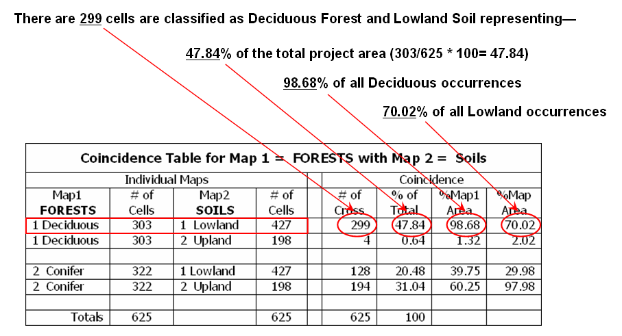
Figure 1.
A cross-tab table statistically summarizes the coincidence among the
categories on two maps.
These data may
cause you to jump to some conclusions, but you had better consider the last
section of the Table before you do. This
section normalizes the coincidence count to the total number of cells in each
category. For example, the 299
Deciduous/Lowland coincidence accounts for 98.68 percent of all occurrences of
Deciduous trees ((299/303)*100). That's
a very strong relationship. However,
from Lowland soil occurrence the 299 Deciduous/Lowland coincidence is a bit
weaker as it accounts for only 70.02 percent of all occurrences of Lowland
soils ((299/427)*100). In a similar
vein, the Conifer/Upland coincidence is very strong as it accounts for 97.98
percent of the occurrence of all Upland soil occurrences. Both columns of coincidence percentages must
be considered as a single high percent might be merely the result of the other
category occurring just about everywhere.
There are still
a couple of loose ends before we can wrap-up point-by-point overlay summaries. One is direct map comparison, or change
detection. For example, if you
encode a series of land use maps for an area, then subtract each successive
pair of maps; the locations that underwent change will appear as non-zero
values for each time step. In
If you are real
tricky and think map-ematically you will assign a binary progression to the
land use categories (1,2,4,8,16, etc.), as the differences will automatically
identify the nature of the change. The
only way you can get a 1 is 2-1; a 2 is 4-2; a 3 is 4-1; a 6 is 8-2; etc. A negative sign indicates the opposite
change, and now all bases are covered.
.
The last
point-by-point operation is a weird one—covering. This operation is truly spatial and has no
traditional math counterpart. Imagine
you prepared two acetate sheets by coloring all of the forested areas opaque
green on one sheet and all of the roads an opaque red on the other sheet. Now overlay them on a light-table. If you place the forest sheet down first the
red roads will “cover” the green forests and you will see the roads passing
through the forests. If the roads map
goes down first, the red lines will stop abruptly at the green forest globs.
In a
Key Concepts Characterize
Unique Conditions
(GeoWorld April, 2006, pg. 14-15)
Back in the
days of old
In these
austere conditions programmers searched for algorithms and data structures that
saved nanoseconds and kilobytes. The
concept of a Universal Polygon Coverage was a mainstay in vector-based
processing. By smashing a stack of
relatively static map layers together a single map was generated that contained
all of the son and daughter polygons.
This “compute once/use many” approach had significant efficiency gains
as coincidence overlay was solved once then table query and math simply
summarized the combinations as needed.
The top portion
of figure 1 shows a simplified schematic of the Universal Polygon
approach. The lines defining the
individual polygons on the three vector maps are intersected (analogous to
throwing spaghetti on a wall) to identify various combinations of the input
conditions as depicted in the large map in the middle.
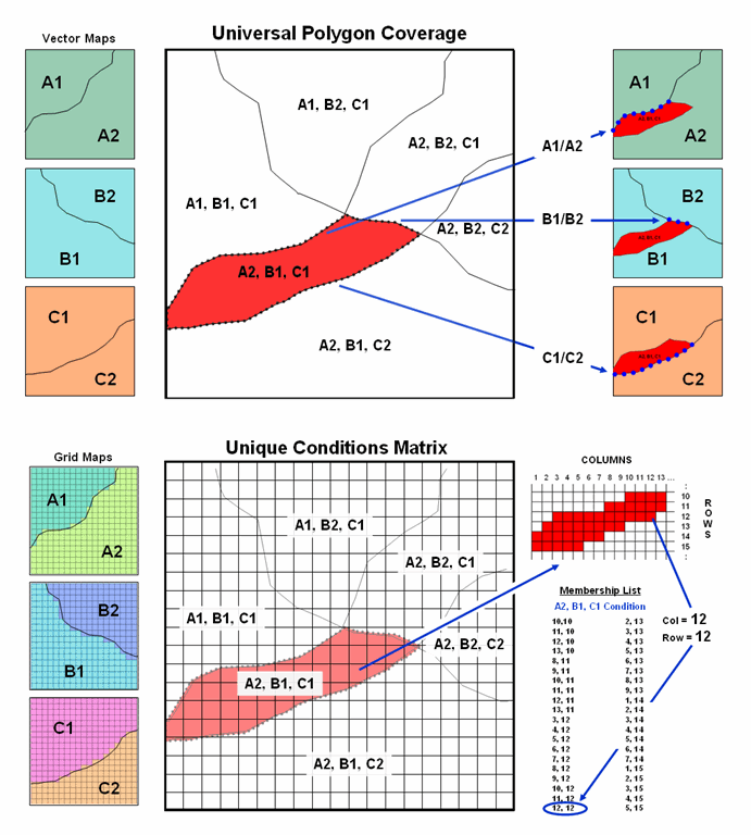
Figure 1.
Comparison of the related concepts of Universal Polygon Coverage
(vector) and Unique Conditions Matrix (grid).
For example,
consider the unique combination of A2, B1 and C1. The intersections of the lines identify nodes
that split the parent polygon boundaries into the segments defining the six son
and daughter polygons of the combined conditions. The result is a single spatial table
containing all of the original delineations plus the derived coincidence overlay
information. Its corresponding attribute
table can be easily searched for any combination of conditions and/or
mathematically manipulated to generate a new field in the table—fast and
efficient.
This
pre-processing technique also works for grid-based data (bottom portion of
figure 1). The Unique Conditions Matrix
smashes a stack of grid layers together assigning a unique value for each
possible combination of conditions. For
example, the A2, B1 and C1 combination (termed a cohort) is defined by the grid
cell block shown in the right portion of the figure. Grid location column= 12 and row= 12 is one
of the forty member cohort.
Figure 2
depicts a natural extension of the procedure involving two tables—a Value Attribute Table and a Cohort Membership Table. For example, given grid layers for
travel-time for six stores classified into proximity classes (1= close, 2, 3
and 4= far) results in 4096 possible combinations. Each combination, in turn, forms a single
record (row) in the Value Attribute Table (VAT) file. The record contains a unique cohort ID number
and a field (column) for each of the base map conditions (figure 2, step
1). The user can operate on this table
to derive new information, such as the minimum travel-time to the closest store,
which is appended as a new field (step 2).
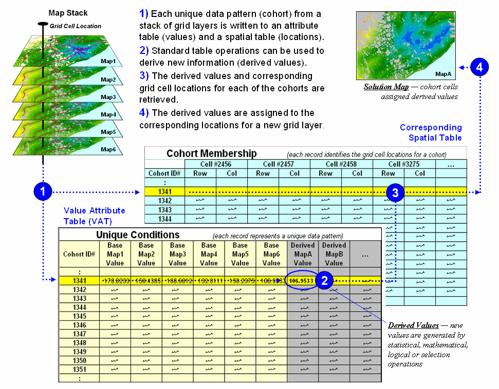
Figure 2.
Steps linking unique conditions and cohort membership tables for
efficient and fast coincidence analysis.
Note that the
VAT records identify unique conditions occurring anywhere a project area
whether the grid cells occur in few large clumps or widely dispersed. The Cohort Membership Table (CMT) contains a
sting of values identifying the column/row coordinates for each grid cell in
the list. Thoughtful organization of the
list can implicitly carry information about the spatial patterns within and
among the cohorts of cells.
Step 3 links
the attribute and spatial tables through their common ID numbers. Any of the fields in the VAT can be mapped by
assigning the derived values to the cells defining each cohort in the CMT (step
4).
Sounds easy and
straight forward but there are a few caveats.
First, the technique only addresses point-by-point coincidence overlay
and myopically ignores surrounding conditions.
Also, the conditions need to be fairly stable, such as proximity and
slope. Finally, it requires continuous
data to be reassigned into few discrete classes on a relatively small number of
map layers or the number of combinations explodes. For example, 20 map layers with only four
classification categories on each, results in over sixteen million possible
cohorts; a number that challenges most database tables.
The advantage
of the Unique Conditions technique in appropriate application settings is that
you calculate once (VAT) and use many (CMT)—efficient and fast grid
processing. In the early years this was
imperative for even the basic
Use “Shadow Maps” to Understand Overlay Errors
(GeoWorld, September 2004, pg. 18-19)
The past
discussions have focused on map overlay by describing some of the procedures, considerations
and applications. However, now is the
moment of atonement—the pitfalls of introduced error and its propagation. Keep in mind that there are two broad types
of errors in
Be
realistic—soil or forest maps are just estimates of the actual conditions and
geographic patterns of these features.
No one used a transit to survey the precise and sharp boundary lines
that delineate the implied distinct spatial objects. Soil and forest parcels aren’t discrete
things in either space or time and significant judgment is used in forcing
boundaries around them. Under some
conditions the guesses are pretty good; under other conditions, they can be
pretty bad. So how can the computer “see”
where things are good and bad?
That’s where the
concept of a “shadow map of certainty” comes in and directs attention to both
the amount and pattern of map certainty.
The left side of figure 1 depicts such an information sandwich of a
typical soil map with a shadow map of certainty glued to its bottom. In this way the relative certainty of the
classification is known for each map location—look at the top map to see the
soil classification, then peer through to the bottom map to see how likely that
classification is at that location.
In this
instance, any location with 100 meters of a soil boundary is assigned only 50%
certainty (orange) of correct classification while interior areas of large
features are assigned 100% certainty (grey).
The assumption reflects the thought that “there is a soil boundary
around here somewhere, but I am just not sure exactly where.”
A similar shadow
map of certainty can be developed for the forest information (right side of
figure 1). This simple estimate of
certainty accounts for one photo interpreter reaching out to add a tree along
the edge and another interpreter deciding not to. Both interpreters “see” the interior of the
forest parcel (certain) but discretion is used to form its border (less
certain). The 100m certainty buffer
reflects a bit of wiggle-room for interpretation.
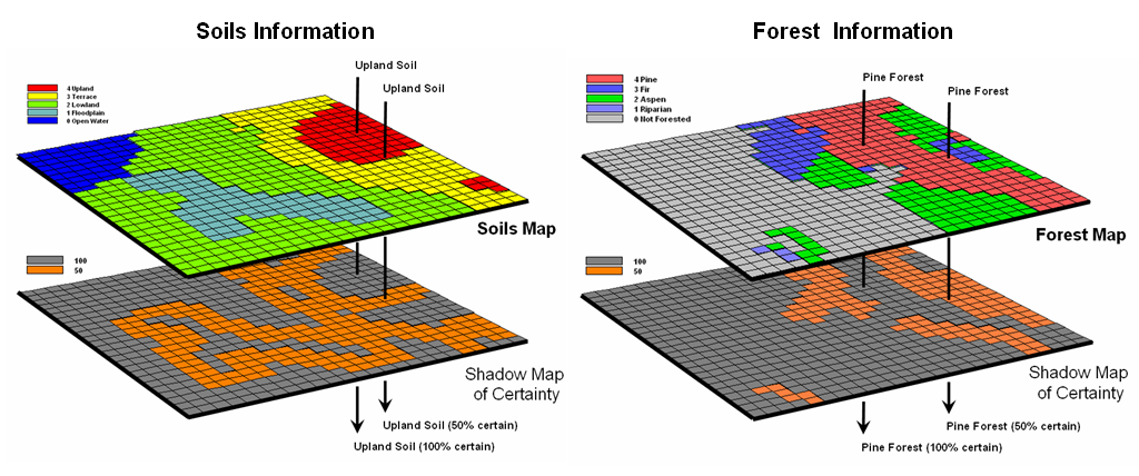
Figure 1. Thematic maps with their corresponding shadow
maps of certainty. The orange areas indicate “less certain” areas (.50
probability) that are adjacent to a boundary.
Remote sensing
classification, however, provides a great deal more information about map
certainty. For example, the “maximum
likelihood classifier” determines the probability that a location is one of a
number of different forest types using a library of “spectral signatures” and
multivariate statistics. In a sense the
computer thinks “given the color pattern for an area and knowledge of the
various color patterns for forest types in the area, which color most closely
matches the appearance of the area”—analogous to the manual interpretation process.
After a
nanosecond or so, the computer decides which known pattern is the closest,
classifies it as that forest type, and then moves on to consider the next grid
cell. For example, riparian and aspens
tend to reflect lighter greens while pines and firs tend to reflect darker
greens. The import point is that the computer isn’t “seeing” subtle color
differences; it is analyzing numerical values to calculate the probability that
a location is one of any of the possible choices.
Traditionally, the
approach simply chooses the most likely spectral signature, classifies it, and
then throws away the information on relative certainty of the
classification. Heck, the historical
objective was to produce a map, not data.
In addition, a spline function often is used to inscribe a seemingly
precise line around groups of similar classified cells so the results look more
like a manually drafted map. The result
is a set of spatially discrete objects implying perfect data for a warm and
fuzzy feeling, but disregarding the spatial resolution and classification
probabilities employed—sort of like throwing the bathwater out with the baby.
As
However, the
real power of a shadow map of certainty is in addressing processing errors that
occur during map overlay. Common sense
suggests that if you overlay a fairly uncertain map with another fairly
uncertain map, chances are the resulting coincidence map is riddled with even
more uncertainty. But the problem is
more complex, as it is dependent on the intersection of the unique spatial
patterns of certainty of the two (or more) maps.
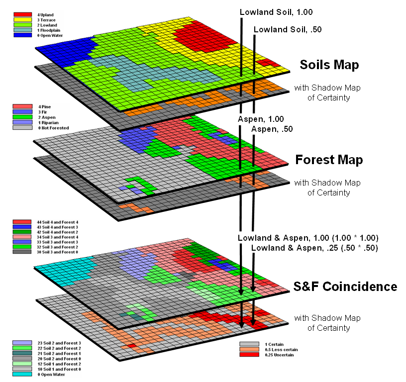
Figure 2. A shadow map of certainty for map overlay is
calculated by multiplying the individual certainty maps to derive a value
(joint probability) indicating the relative confidence in the coincidence among
map layers.
Consider
overlaying the soils and forest maps as depicted in figure 2. A simple map overlay considers just the
thematic map information and summarizes the coincidence between the two
maps. Note that both of the “speared”
locations identify Lowland soils occurring with
Now consider the
effect of certainty propagation. The
location on the left is certain on both maps, so the coincidence is certain
(1.00 *1.00= 1.00). However, the
location on the right is less certain on both maps, so the chance that it
contains both lowland soils and aspen is very uncertain certain (.50 * .50=
.25).
The ability to
quantify and account for map certainty is a critical step in moving
____________________________
(Back to the Table of Contents)