Beyond Mapping III
|
Map
Analysis book with companion CD-ROM for hands-on exercises and further reading |

The Average Is Hardly Anywhere
— discusses the
difference between spatial and non-spatial data distributions
Under the Hood of Spatial
Interpolation — investigates
the basic concepts in IDW and Krig interpolation procedures
Justifiable
Interpolation — describes
the "Residual Analysis" procedure for assessing interpolation
performance
Move Beyond a Map Full of
Errors — discusses
a technique for generating a "shadow map" of error
Comparing Map Errors — describes
how normalized maps of error can be used to visualize the differences in error
surfaces
Note: The processing and figures discussed in this topic were derived using MapCalcTM software. See www.innovativegis.com
to download a free MapCalc Learner version with tutorial materials for
classroom and self-learning map analysis concepts and procedures.
<Click here> right-click
to download a printer-friendly version of this topic (.pdf).
(Back to the Table of Contents)
______________________________
The Average is Hardly Anywhere
(GeoWorld May, 2006)
Remember your first encounter with statistics? In the days of old before politically correct examples, you might have calculated the average weight of the students in the class by adding up all of the students’ weights and then dividing by the number of students. The average weight gives you an estimate of how heavy a “typical student” is and the standard deviation tells you how typical that typical is.
Now imagine your old classroom with the bulky jocks in the back, the diminutive bookworms in front, and the rest caught in between. Two things should come to mind—1) not all of the students had the same typical weight (some were heavier and some were lighter) and 2) the differences from the typical weight might have followed a geographic pattern (heavy in the back, light in the front). The second point forms the foundation of surface modeling that “maps the variation in geographic data sets.”
Figure 1 illustrates the spatial and non-spatial character of a set of animal activity data. The right side of the figure lists the number of sightings at sixteen locations for two 24-hour periods (P1 in June; P2 in August). Note the varying levels of activity— 0 to 42 for P1 and 0 to 87 for P2 that can be reduced to their average values of 19 and 23, respectively. A wildlife manager might ponder these findings, and then determine whether the implied typical activity is too little, too much or just right for a particular management action.
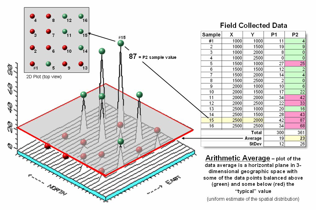
Figure
1. Comparison of the
spatial distributions of field samples (floating balls) and their arithmetic
average (horizontal plane).
But the average does not address the variation in the data set— that's the role of the standard deviation. As a general rule (termed the Coefficient of Variation) “…if the standard deviation is relatively large compared to the arithmetic average, the average cannot be used to make decisions” as there is too much unexplained variation in the data (i.e., the computed average isn't very typical).
Possibly some of the variation in animal activity forms a pattern in geographic space that might help extend the explanation. That is where the left side of figure 1 comes into play with a three-dimensional plot used to show the geographic location (X, Y) and the measured activity levels (Z). I'll bet your eye is “mapping the variation in the data” as high activity in the Northeast, low in the Northwest and moderate elsewhere.
The thick line in the plot outlines a horizontal plane at 23 (arithmetic average) that spatially characterizes the typical animal activity as uniformly distributed in geographic space (horizontal plane). But your eye tells you that guessing 23 around Sample #15 with a measured value of 87, is likely an understatement. Similarly, a guess of 23 around Sample #4 with a value of 0 is likely an overstatement. That is what the relatively large standard deviation indicated— guess 23 but expect to be way off (+ 26) a lot of the time.
The non-spatial procedure, however, doesn’t provide a hint as to where the average might be guessing too low and where it might be guessing high. That's the main difference between traditional statistics and spatial statistics— traditional statistics characterizes the central tendency (average) of data in numeric space; spatial statistics seeks to map the variation (standard deviation) of data in geographic space.
Figure 2 illustrates Map Generalization as an approach to mapping the spatial trend in the data using polynomial surface fitting. The average of 23 is depicted as a horizontal plane that does its best to balance half of the balls above it and half below it by minimizing the set of squared deviations from the plane to each floating ball (similar to curve-fitting regression techniques in traditional statistics).

Figure 2. Map Generalization can be used
to approximate geographic trends.
Now relax the assumption that the plane has to remain horizontal. Tilt it every-which-way until it better fits the floating balls (Tilted Plane). Or even better, the assumption of a flat plane can be relaxed and the surface can curve to better fit the ups and downs of the data points. The right portion of the figure fits a 2nd degree polynomial (Curved Plane).
Figure 3 shows an entirely different approach to fitting a surface to the data by using the Spatial Interpolation technique of iterative smoothing. Imagine replacing the floating balls with columns of modeler's clay rising to the same height as each ball. In effect this is a blocky first-order estimate of the animal activity throughout the project area derived by simply assigning the closest field sample to each map location.
Now imagine whacking away some of the clay at the top of the columns and filling-in at the bottom. In the example, a 3x3 averaging window was moved around the matrix of values to systematically smooth the blocky surface. When the window is centered over one of the sharp boundaries, it has a mixture of small and larger map values, resulting in an average somewhere in between... a localized whack off the top and a fill-in at the bottom.
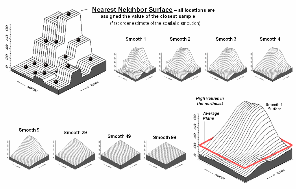
Figure 3. Iteratively Smoothed
approximations of localized geographic distribution.
<Click here to download an
animated slide set of Interactive Smoothing>
The series of plots in the figure show repeated passes of the smoothing window from once through ninety-nine times. Like erosion, the mountains (high animal activity) are pulled down and the valleys (low animal activity) are pulled up. According to theory, the process eventually approximates a horizontal plane floating at the arithmetic average.
The bottom line is that field collected data with geographic coordinates holds a lot more information than simply a reduction to a typical value. Next month’s column will investigate other more powerful methods for estimating the spatial, as well as numerical distribution inherent in mapped data.
Under the Hood of Spatial
Interpolation
(GeoWorld June, 2006)
Last month's article described how field collected data (discrete points) can be used to generate a map (continuous surface) of the data’s spatial patterns. The derived surface extends the familiar concept of central tendency to a map of the geographic distribution of the data. Whereas traditional statistics identifies the typical value in a data set, surface modeling identifies "where" you might expect to find the typical and not so typical responses.
The Iterative Smoothing approach described last time is a simple data-driven procedure. However, all of the interpolation techniques share a similar approach that generates estimates of a mapped variable based on the data values within the vicinity of each map location. In effect, this establishes a "roving window" that moves throughout an area summarizing the field samples it encounters within its reach. The summary estimate is assigned to the center of the window, and then it moves on. The extents of the window (both size and shape) influence the result, regardless of the summary technique. In general, a large window capturing numerous values tends to smooth the data. A smaller window tends to result in a rougher surface.
Three factors affect the window's configuration— its reach, number of samples, and balancing. The reach, or search radius, sets a limit on how far the computer will go in collecting data values. The number of samples establishes how many data values will be used. The balancing of the data attempts to eliminate directional bias by insuring that values are selected from all directions around the window's center.
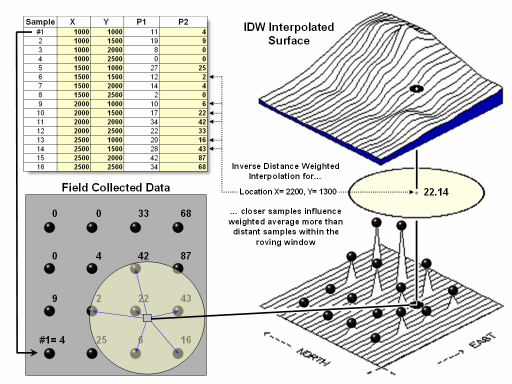
Figure 1. A roving window is used to identify and summarize nearby sample
values.
Once a window is established, the summary technique comes into play. The Inverse Distance Weighted (IDW) technique is easy to conceptualize (see figure 1). It estimates a value for a location as the weighted-average of the nearby data values within the roving window. The average is weighted so the influence of the surrounding values decrease with increasing distance from the location being estimated.
Figure 2 shows the IDW calculations for the location identified in figure 1. The Pythagorean Theorem is used to calculate the geographic distance between the location and the six sample values in the window. A weight for each sample is determined as 1/D2, then the weighted average of the samples is calculated and assigned to the location. The process is repeated for each location in the project area.
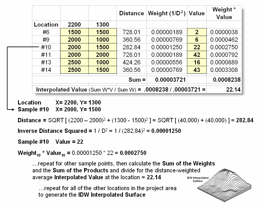
Figure 2. IDW calculations use simple geographic distance to weight the average
of samples within a roving window.
Because IDW is a static averaging method, the estimated values can never exceed the range of values in the original sample data. Also, it tends to "pull-down peaks and pull-up valleys" in the data. Inverse distance is best suited for data sets where the samples are fairly independent of their surrounding locations (i.e., no strong regional trend).
Another approach, Kriging (KRIG) uses regional variable theory based on an underlying variogram. That's techy-speak implying that there is a lot of math behind the approach. In effect, the technique develops custom weights based on trends in the sample data. The moving average weights that define the data trends can result in estimated values that exceed the field data's range of values. Also, there can be unexpected results in large areas without data values. The technique is most appropriate for fairly dense, systematically sampled data exhibiting discernable regional trends.
The center portion figure 3 illustrates how the Krig weights are derived. The distances between each sample point and all of the other sample points are calculated. At the same time, the differences in the sample values are recorded. Common sense suggests that “nearby things are more alike than distant things” and a plot of Distance versus Difference often looks something like the variogram in the center of the figure.
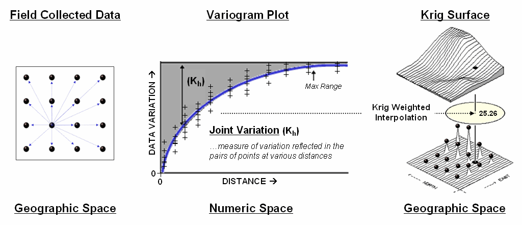
Figure
3. A variogram plot depicts the relationship between distance and
similarity between sample values.
The origin of the plot at 0,0 is a unique case. The distance between samples is zero; therefore, there shouldn’t be any dissimilarity (data variation = zero) as the location is exactly the same as itself. As the distance between points increase, subsets of the data are scrutinized for their dependency. The shaded portion in the idealized plot shows a rapid deterioration of the spatial dependency among the sample points. The maximum range (Max Range) position identifies the distance between points beyond which the data values are considered independent. This suggests that using data values beyond this distance for interpolation isn’t useful.
An equation is fit to the Distance-Difference data and used
to determine the weights and reach used in averaging the sample values within
the roving window. Whereas IDW uses a
fixed geometric function, Krig derives the weights by investigating the spatial
dependency in the sample data (see Author’s Note). Keep in mind that most analytical
______________________________
Author’s Note: Let me apologize in advance for such a terse treatment of a complex
subject. Topic 8, Investigating Spatial
Dependency of the online book Map Analysis ( www.innovativegis.com/basis/)
discusses in greater depth the various measures of spatial autocorrelation,
their interpretation and use in interpolation.
(GeoWorld,
February 1997, pg. 34)
Several previous Beyond Mapping articles have discussed the
basic considerations in generating maps from point data. Recall that both sampling design and
interpolation technique greatly affect the results when converting discrete
point samples (e.g., soil samples) to continuous map surfaces (e.g., map of
phosphorous levels throughout a field).
The only thing for certain is that there isn’t a single best procedure
that covers all situations. Some rules
of thumb and general considerations have been discussed, but the only good way
to determine the “best” map is to empirically verify the results. This involves generating several maps under
different sampling/interpolation procedures, then testing the results against a
set of known measurements, aptly termed a “test set.” As in horseshoes and boche ball, the closest
one wins.
The accompanying table show large differences among three interpolated surfaces
generated from the same set of point sampled data, termed the “interpolation
set.” The algorithmic nuances and
relative advantages and disadvantages of the Inverse Distance, Kriging and
Minimum Curvature techniques where discussed in GW Vol 7, No 1-3. What should spring to mind at this point is
“OK, they’re different, so how can I tell which is best?” An empirical verification technique, termed
residual analysis, summarizes the differences between interpolation estimates
and actual measurements for each test location.
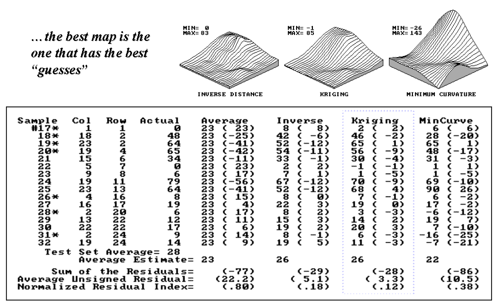
Figure 1. Residual table identifying
actual and estimated values.
The table in figure 1 contains a test set of sixteen random
samples (#17-32) used to evaluate three maps.
The “Actual” column lists the measured values for the test locations
identified by “Col, Row” coordinates.
The difference between these values and those predicted by the three
interpolation techniques form the residuals shown in parentheses. The “Average” column
compares the whole field arithmetic mean of 23 (guess 23 everywhere) for each
test location.
For example, the first sample (#17) guessed 23 but was
actually 0, therefore it’s off by 23.
Note the sign of the residual indicates whether the guess was too high
(positive) or too low (negative). If it
was a perfect data world, you would expect the Sum of the Residuals to be 0
(just as many high as low misses— balanced boo-boo). However, in this case there is a net residual
of -77 indicating a strong bias to under estimate. The Average Unsigned Residual is simply the
average magnitude of mistakes, regardless whether they’re over or under. For the “Average” estimate expect to be off
by about 22.2 each time you guess. The
Normalized Residual Index is simply the ratio of the Average Unsigned Residual
to the Test Set Average. An index of .80
(22.2/28) indicates that the “Average” technique isn’t very good at spatial
estimates.
Now take a look at the residual analysis for the three interpolation
techniques. All three are considerably
better than the whole field average (Normalized Residual Indices of .18, .12
and .38, respectively, compared to the whopping .80 for the simple whole field
average). The “Kriging” technique is
best, having a 3.3 Average Unsigned Residual with a tendency to under estimate
(a Sum of the Residuals of -28). The
“Inverse” technique is a close second with an Average Unsigned Residual of 5.1
and a nearly identical under estimate bias of -29. The “MinCurve” technique indices indicate
that it is a distant third, but still much better than using the whole field
average for spatial estimates.
However, we haven’t considered other potential affects. The asterisks identify test measurements
outside the set of samples used for generating the map surfaces. Estimating these values is termed spatial
extrapolation and some techniques are better than others. I wonder if there are significant differences
among the three techniques in their spatial interpolation and extrapolation
estimates (get out your calculator)?
Would you expect the conclusions to change if the “test” and
“interpolation” data samples were swapped and another residual analysis
performed? What if different sampling
designs were tried. What about different
interpolation parameters (window reach, number of samples and balancing)? At least residual analysis gives us a place
to start looking for answers.
Move Beyond a Map Full of Errors
(GeoWorld, March 1997, pg. 28)
Last month’s article
described a procedure for checking the reliability of maps generated from field
samples, such as a map of phosphorous levels derived from a set of soil
samples. The data could have as easily
been lead concentrations in an aquifer from a set of sample wells, or any other
variable that forms a gradient in geographic space for that matter. The evaluation procedure suggested holding
back some of the samples as a test set to “empirically verify” the estimated
value at each location. Keep in mind, if
you don’t attempt to verify, then you are simply accepting the derived map as a
perfect rendering of reality (and blind faith isn’t a particularly a good basis
for visual analysis of mapped data). The
difference between a mapped “guess” (interpolated estimate) and “what is”
(actual measurement) is termed a residual.
A table of all the residuals for a test set is summarized to determine the
overall accuracy of an interpolated map.
The residual analysis described last time determined that the Kriging
interpolation procedure had the closest predictions to those of the example
test set. Its predictions, on average,
were only 3.3 units off, whereas the other techniques of Inverse Distance and
Minimum Curvature were considerably less accurate (5.1 and 10.5,
respectively). The use of an arithmetic
average for spatial prediction was by far the worst with an average boo-boo of
22.2 for each guess. The residual table
might have identified the relative performance of the various techniques, but
it failed to identify where a map is likely predicting too high or too low—
that’s the role of a residual map.
The table in Figure 1 shows the actual and estimated values from Kriging for
each test location, with their residuals shown in parentheses. The posted
values on the 3-D surface locate the positioning of the residual values.
For example, the
value 1 posted in the northeast corner identifies the residual for test sample
#19; the 4 to its right identifies the residual for test sample #25 along the
eastern edge of the field. The map of
the residuals was derived by spatially interpolating the set of residuals. The 3-D rendering shows the residual surface,
while the 2-D map shows 1-unit contours of error from -9 (under guessed by
nine) to 4 (over guessed by four). The
thick, dark lines in both plots locates the zero residual contour— locations
believed to be right on target. The
darker tones identify areas of overestimates, while the lighter tones identify
areas of underestimates.
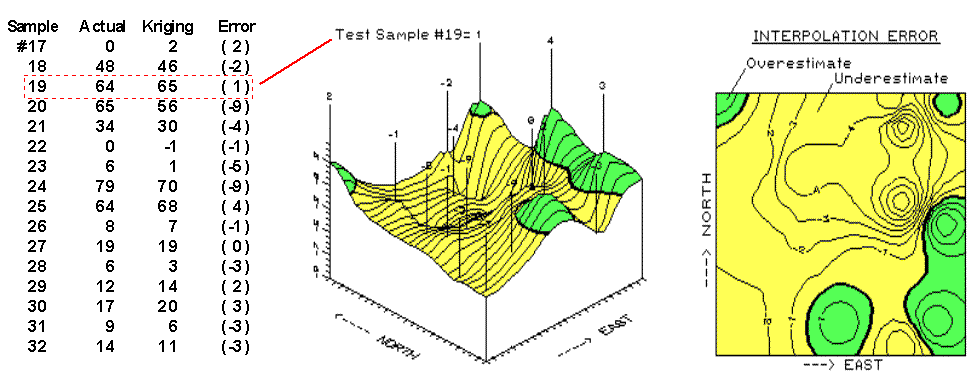
Figure 1. Map of errors from the Kriging
interpolation technique.
As explained last
time, the sum of the residuals (-28) indicates a overall tendency of the
Kriging technique to underestimate the data used in this example. The predominance of lighter tones in the
residual map spatially supports this overall conclusion. While the underestimated area occurs
throughout the center of the field, it appears that Kriging’s overestimates
occur along the right (east), bottom (south) and the extreme upper left
(northwest) and upper right (northeast) corners.
The upper right portion (northeast) of the error map is particularly
interesting. The two -9 “holes” for test
samples #20 and #24 quickly rise to the 1 and 4 “peaks” for samples #19 and
#25. Such wide disparities within close
proximity of each other (steep slopes in 3-D and tight contour lines in 2-D)
indicate areas of wildly differing interpolation performance. It’s possible that something interesting is
going on in the northeast and we ought to explore a bit further. Take a look at the data in the table. The four points represent areas with the
highest responses (65, 56, 70 and 78).
Come to think of it, a residual of 1 on an estimate of 64 for sample #19
really isn’t off by much (only 1.5%).
And its underestimated neighbor’s of 9 on 65 (sample #20) isn’t too bad
either (14%).
Maybe a map of “normalized” residuals might display the distribution of error
in a more useful form. What do you
think? Are you willing to “go the
distance” with the numbers? Or simply
willing to “click” on an icon in your
_____________________________
Comparing Map Errors
(GeoWorld, April 1997, pg. 26)
The previous article
challenged you to consider what advantage a normalized map of residuals might
have. Recall that an un-normalized map
was generated from the boo-boos (more formally termed residuals) uncovered by
comparing interpolated estimates with a test set of known measurements. Numerical summaries of the residuals provided
insight into the overall interpolation performance, whereas the map of
residuals showed where the guesses were likely high and where they were likely
low.
The map on the left side of figure 1 is the “plain vanilla” version of the
error map discussed in the previous article.
The one on the right is the normalized version. See any differences or similarities? At first glance, the sets of lines seem to
form radically different patterns. A
closer look reveals that the patterns of the darker tones are identical. So what gives?
First of all, let’s
consider how the residuals were normalized.
The arithmetic mean of the test set (28) was used as the common
reference. For example, test location #17
estimated 2 while its actual value was 0, resulting in an overestimate of 2
(2-0= 2). This simple residual is
translated into a normalized value of 7.1 by computing (0-2)/28)*100= 7.1, a
signed (+ or -) percentage of the “typical” test value. Similar calculations for
the remaining residuals brings the entire test set in line with its
typical, then a residual map is generated.
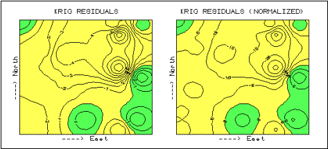
Figure 1. Comparison of error maps (2-D)
using Absolute and Normalized Kriging residual values.
Now let’s turn our
attention back to the maps. As the
techy-types among you guessed, the spatial pattern of interpolation error is
not effected by normalization (nor is its numerical distribution)— all
normalizing did was “linearly” re-scale the map surface. The differences you detect in the line
patterns are simply artifacts of different horizontal “slices” through the two
related map surfaces. Whereas a 5%
contour interval is used in the normalized version, a contour interval of 1 is
used in the absolute version. The common
“zero contour” (break between the two tones) in both maps have an identical
pattern, as would be the case for any common slice (relative contour step).
Ok… but if normalizing doesn’t change a map surface, why would anyone go to all
the extra effort? Because normalizing
provides the consistent referencing and scaling needed for comparison among
different data sets. You can’t just take
a couple of maps, plop them on a light table, and start making comparative
comments. Everyone knows you have to
adjust the map scales so they will precisely overlay (spatial
registration). In an analogous manner,
you have to adjust their “thematic” scales as well. That’s what normalization does.
Now visually compare
magnitude and pattern of error between the Kriging
and the Average surfaces in figure 2. A
horizontal plane aligning at zero on the Z-axis would indicate a “perfect”
residual surface (all estimates were exactly the same as their corresponding
test set measurements). The Kriging plot on the left is relatively close to this ideal
which confirms that the technique is pretty good at spatially predicting the
sampled variable. The surface on the
right identifying the “whole field” Average technique shows a much larger
magnitude of error (surface deflection from Z= 0). Now note the patterns formed by the light and
dark blobs on both map surfaces. The Kriging overestimates (dark areas) are less pervasive and
scattered along the edges of the field.
The Average overestimates occur as a single large blob in the
southwestern half of the field.
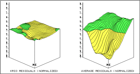
Figure 2. Comparison of Residual Map Surfaces (3-D) Using Residual Values
Derived by Kriging, and Average Interpolation Techniques.
What do you think
you would get if you were to calculate the volumes contained within the light
and dark regions? Would their volumetric
difference have anything to do with their Average Unsigned Residual values in
the residual table discussed a couple of articles ago? What relationship does the Normalized
Residual Index have with the residual surfaces?
…Bah! This map-ematical side of
_____________________________